MASTERNODE STATISTICS

The Omni Analytics Group has released an interesting graph.
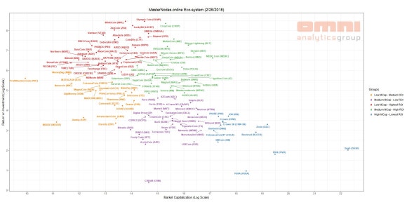
The above graph shows the market cap and the ROI of the masternode coins. The X axis is the market cap and the Y axis is the ROI. This graph can give you a rough idea of what coin you should invest in.
First, coins which are lower than DASH in Y axis do not have a investment value. Because the ROI is too low.
Generally, most of the masternode coins are born in the red group, and then gradually descend as the ROI decreases. Coins born in the red group will be the green group as time goes on, and depending on the fate of the coin will be included in the yellow or purple group.
Prospective coins belong to the purple group. If they level up, they can be in the blue group.
If you are interest in the value investment, I recommend the green group. If coins belonging to the green group turn yellow, just sell it. If not, you can profit!
Omni Analytics Group에서 흥미로운 자료를 발표했습니다.
위 그래프는 마스터 노드를 구동할 수 있는 코인들을 시가총액과 ROI로 구분한 것입니다. X축은 시가총액이고, Y축은 ROI입니다. 이 그래프를 통해서 어떤 코인에 투자해야 할 것인지를 대략적으로 알 수 있습니다.
우선, 가장 오른쪽에 있는 DASH보다 Y축 위치가 낮은 코인들은 마스터 노드 투자 가치가 없습니다. ROI가 너무 낮기 때문이죠.
일반적으로 대부분의 마스터 노드 코인들이 붉은색 그룹에서 탄생한 후, ROI가 낮아짐에 따라서 점점 밑으로 내려오게 됩니다. 붉은색 그룹에서 탄생한 코인은 시간이 지남에 따라 녹색 계열로 내려온 후, 코인의 운명에 따라서 노란색 그룹에 포함될지 보라색 그룹에 포함될지 갈리게 됩니다.
장래성 있는 코인들은 보라색 그룹에 속한다고 할 수 있습니다. 이들이 더 레벨업을 한다면 푸른색 그룹에 속할 수 있겠죠.
가치 투자를 하신다면 녹색 그룹을 추천합니다. 이 그룹에 속한 코인들이 노란색으로 방향을 튼다면 손절, 그렇지 않다면 뜻밖의 대박을 노릴 수 있지 않을까요?
https://twitter.com/OmniAnalytics/status/968141712584560641
원문입니다. 그래프는 여기서 확인하시는게 편합니다.
Disclaimer: I am just a bot trying to be helpful.
원문 링크가 잇나요!
원문 첨부했어요^^
Xmcc는 보라색이군요. 푸른색이 되길 ㅎ
^^