Bitcoin Retrodictions
Retrodiction involves (virtual?) travel back in time.
Or memory mining, which is its equivalent, where the attended content gets reprocessed in order to extract some dynamic patterns.
Even if possible, backwards time travel possesses the inherent disadvantage that its prognostic payback is limited to between the Back Then (the travel destination) and the Now (the travel starting point), cause the After Now is yet the same non-compressible future , even if there exists only one timeline. If many - then it is all future ahead, irregardless of observer changing positions. The non-compressibility of the future comes straight from the 2nd Law - for future being inherently (entropically) bigger than the past, measured in bits. Past fits into the future, but not vice versa.
In that sense there is only retrodiction - futurology is merely a branch of history. We know only the past. Not all of it is instantly accessible, but time brings asymptotically more and more of it. Just like in:
Yet, within the limits of practical precision and resolution of performance, as far as useful trends could be outlined and defined, retrodiction returns quite useful trends and patterns - dynamic patterns which can serve us to project ahead into the unknown. To a degree.
And higher prediction value should have those dynamic patterns which have been observed to hold for longer than for shorter time, no?
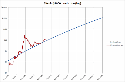
Few months ago, doing some superficial google-search Bitcoin projections 'archaeology', I encountered a piece of pretty insightful and remarkable graphics with date: ''Posted 17 Sep 2012''. (See the head of this essay). I was specifically looking for a log-scale one, because it gives perspective on things in the move.
Yes, this is before the MtGox implosion, before the bumpy 2014, and the sluggish 2015-2016, and before the shitcoin storm of Q2 2017, and before the Dec 2017 ATH.
Price is where demand and supply meet. This is the alphabetical truism we all know. The other ones are.:
- BTC is limited supply, which is even further limited by the loss of coins. ~17m mined and ~4m lost. Private keys out of control. The non-zero chance of keys loss means that even if the rate of losing coins decreases, at some point it will overwhelm the rate of mining new ones. Because mining is capped, but losing is not. That means that actually the BTC supply goes down with time. ( What does it mean? That the last bitcoin will be actually lost but not mined? :) )
- Metcalfe teaches us that doubling the population quadruples the economy, and Szabo adds that it is not only the number of nodes but the cost of links which is inversely proportional to the value. Squared again. So double the population and make links twice cheaper corresponds to ^4 increase of value of the network. These network scaling laws reflect the increase of demand, which seems insatiable.
Demand grows as far as the thing is worthy. If it has the utility of ... money, the only utility of money is what money can buy. And native network coin buys ... network. The bigger the network - the more the coin can buy. The higher value it has.
Steep and steeper uphill of demand, and gentle sloping downhill of supply ... naturally draws a picture of price increase.
So far, so good. Lets go back to this Sept 2012 neat little graphics.
It visualizes this: << Some people have tried to distill various metrics down and have come up with a current growth rate around .46% per day with a growth decay of .024% per day. This is what a log 10 scale chart looks like extrapolating based on actual metrics. >>
0.46% growth rate per day gives (roughly) half an year doubling time and (roughly) an order of magnitude increase every year and a half.
It forecasts at about:
$10 - Oct 2012
$100 - Apr 2014
$1000 - Nov 2015
$10 000 - May 2017
$100 000 - Nov 2018...
$1m - Mar 2020 !!??
(our) ''Past'' (=graphic's future) - bolded, (our) ''Future'' - italicized.
Interestingly, this dynamics seems to hold from the beginning to ... today.
Intuitively the Blue Line seems like a trajectory of a barycenter - like an orbit of a planet orbited on its turn by ... the price - the red line. The planetary orbit resembles parabolic (escape) orbit.
The price-orbiting-the-planet analogy rhymes well with the price bouncing up and down - the stronger it is pushed in one direction away from the Blue Line, the further it goes after the push on the other side of the line. Pumps and dumps 'dialectically' bounded. Exactly like in series of gravity assists where our Bitcoin spaceship passes by big heavy dark celestial bodies...
Of course, this blog post has ZERO analytic, prognostic or (god forbid!) advisory claims into it.
It is just 'stream of consciousness' sharing of my repercussions out of and onto a discovered piece of ancient literature.
Things never so simple. Everything to be taken with a grain of salt. All questions must be kept open.
Only the future can tell ... :)
On the limits of growth, some next time(s).
18qSKUUTAGw1uL53simrSiZ6pJpfxKACvj for research support. Thanks.
Copyright © 2018 Georgi Karov. All rights reserved.


Good
I still keep the couple of BTCs I've mined back in the laptop days :D Very interesting perspective you got there! My head's spinning now lol
Oh, vintage, genuine and not ''tainted'' ones. Keep them! If at the end of the year BTC nears $100k these chaps from the distant 2012 would appear to be right! :)