THE TALE OF TWO CHARTS BITCOIN VS. USD

The art of charting has been around for, well, a long, long time. Traditionally chartists will create their charts according to the value each asset is traded in. For example, in the U.S. stocks, bonds, futures, and commodities are traded in U.S. Dollars (whole or fractional). With the emergence of the cryptocurrency Bitcoin in 2009 and other digital currencies appearing later a divergence from the normal way of doing things presents itself.
Bitcoin is traded in several fiat forms. However, many, if not all, digital currencies are traded in increments referenced to the value in Bitcoin. Since Bitcoin consists of 100,000,000 satoshi (satoshi =1/100,000,000) it has been a standard by which all other cryptocurrencies are traded. For the purpose of this article and showing the difference in charting by two different and distinct methods I have chosen DigiByte (DGB) as My example.
DigiByte has been traded on cryptocurrency exchanges since on or before February 9, 2014. It's a well establish coin with a roadmap that has a vision well in to the 2030's. DGB is traded in increments of Bitcoin, EURO, ETH, LTC and Doge. Until recently, I only tracked DGB/BTC. I don't know if I've stumbled upon something that will eventually be very rewarding as a chartists or just an anomaly which has no value.
What I'm referring to is "the tale of two charts", hence the title, Last night, I visited the website coinmarketcap.com to check on the price of DigiByte and review how well some of my other crypto investments were doing when I decided to chart DGB's price for the last year. So, I went to the Historical Price Data page for DGB on coinmarketcap and found that I would have to chart not in DGB/BTC form as I would normally do. No, I was presented with historical data in DGB/USD form.
It took Me a couple of hours to collect the data from the site and create My chart. What I realized is that there appears to be a very noticeable difference in the chart's bar formation between the chart from the Bittrex weekly chart I screenshot and the chart I created by hand.
Below you'll see the Bittrex screenshot first. Below it, the chart I created. If You notice the last bar (this weeks) it looks as though the DGB/USD form of charting is experiencing a breakout to the upside while the Bittrex chart, DGB/BTC, shows a sideways move inside the high-low of the previous week.
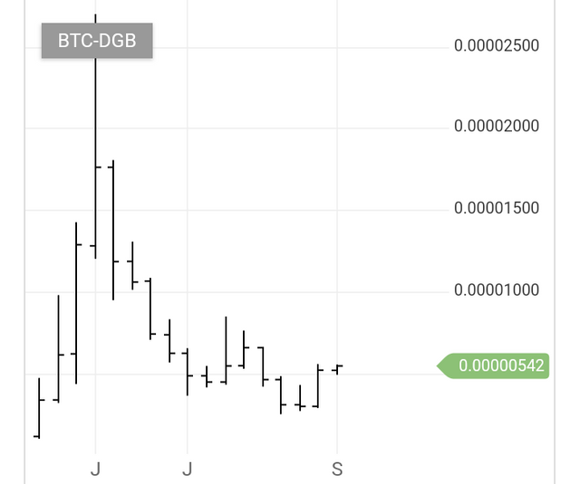
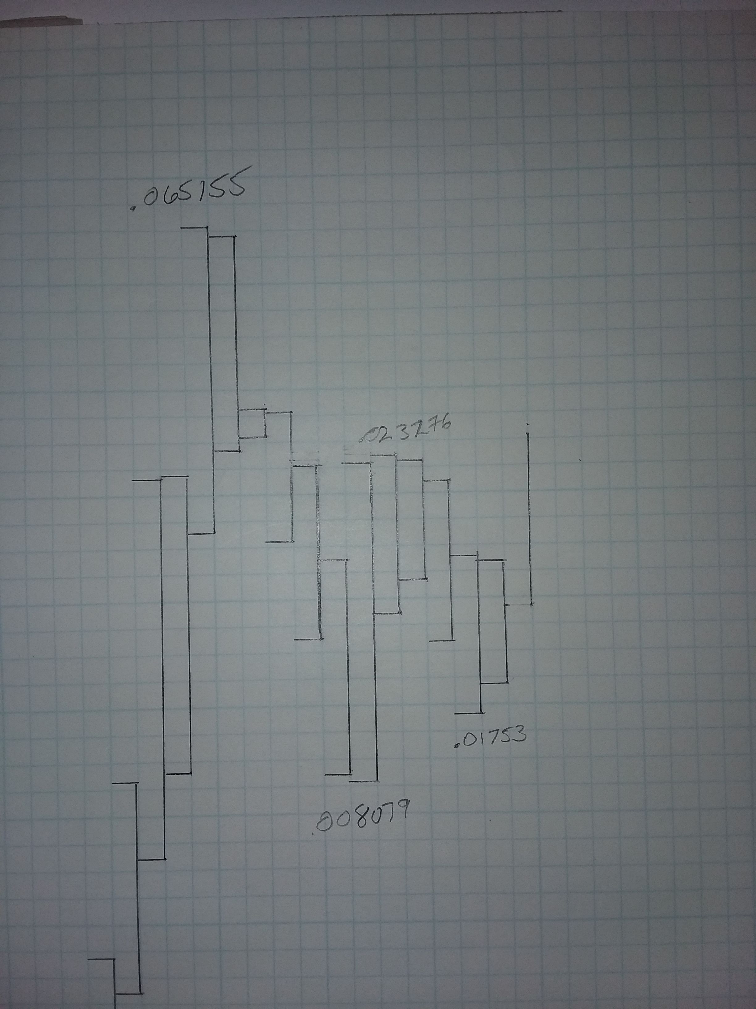
I thought the difference in the chart formation was notable between the two to pass along. I know many out there only view the DGB/USD chart or whatever coin they trade in ???/BTC form.
I'll continue to chart the DGB/USD in to the future just for curiosity sake. Hopefully it will turn out to be a positive tool in my trading tools.
If You decide to give this a go please message Me and let Me know how it turns out for you.
Disclaimer: This is not trading advise. Please do your own research and due diligence. Trading is risky.
Donate BTC:
15DGN9fMgjaitGA7geqKt4A6dBpLvYASdD
Donate ETH:
0x8b09f1f330652a72afc64293ba58d946626cadbb
Donate DGB:
DRsF8bodwMipvrtdeFusP2VDswVSuedJmd