Pie Charts vs Tree Maps - What should you use?
What type of chart should you be using to visualize your cryptocurrency portfolio?
Most would argue a pie chart is best, but is it? Pie charts are fun, I get it and some of the time they do work...
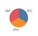
So if your looking at a small number of measures, alright you win, Pie Chart it is... ya little visualization noob ;)
...now let's look at another example...
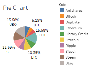
Anyone care to guess how much Ripple this represents?

Now I'd like to present the best visual aide to show this data more clearly....
The Tree Map

boom goes the dynamite

Anyone care to disagree?
Now I deem the winner of this argument the TREE MAP!

Going forward, I'd like to see more Tree Maps out there... getting sick of all these hard to visualize pie graphs for your 10+ coin long term portfolio!
I like the way you're organizing it with the tree map! If I may and you're not using it yet, a good app to check your coins is "Blockfolio".
Good luck out there man! :)
Thanks for the suggestions and I am on Blockfolio, I use it to follow my favorite coins mainly (or the ones I see you posting about on twitter, I'm not in yet... usually kicking myself for not listening). Blockfolio recently posted on twitter that they would be adding Pie Maps soon... I responded suggesting Tree Maps! I'm all about the fun and easy to see visuals!
Thanks for the comment my friend. I'll be posting more soon! (I don't really work any more haha)