Secrets and strange ideas behind the logos of global brands, and stages of development
The design of logos in its simplest principles can literally express what it represents, and this method may be successful if applied properly. Think for a while in a handful of coffee in the Costa logo, for example, iTunes music keys, Woolmark's wool ball.
At other times, a brand name - even if it is not relevant to the product or services provided - is a key factor in inspiring and assisting the designer, for example: Step up Red Cross, Shell and Apple, and many animal-inspired signs such as Puma, Jaguar, He replied.
At present, a culture of simplism or minimalism has spread in many aspects of life, including design. We see simple and clean logos in order to arrange items intelligently and using the San Serif line. However, we also see that some of the tags have a long history associated with the elements they represent, which seem to be random and unrelated to the mark itself, and are in fact worth further research. About their history of evolution and evolution.
Starbucks and McDonalds are the best-selling American brands, and they are also associated with the strangest elements of their characters. Before the world of Starbucks, the emerging world of Seattle, would connect a green and personalized mummy to a coffee novel?
McDonald's Golden Arch is similar to the Mim, which is a sign of the McDonald's chain of restaurants, which you always see in front of streets and roads.
In this article, we will explore the brands of families whose emblems carry amazing stories ...
Nestlé: Last name
The Story of Nestlé
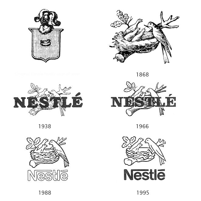
Nestlé's bird nest is actually a distinctive simulator with a simple change to the founder's family name.
Have you ever thought about the relationship between the international food company and the bird's nest? The secret lies in the legacy of the family of the founder Henry Nestlé, the first Swiss manufacturer to develop a logo for his trade, and he used his family name to draw inspiration. The word Nestlé in German means nest, and perhaps without coincidence carrying the logo of his company as a bird and bird.
Because the company produces many kinds of food and beverages, including infant and infant food, the improved logo comes in 1868, giving the impression of caring and incubation by embodying the mother bird feeding and nurturing its young, thus creating a link between the name and the purpose of the mark.
As the years progressed, the logo was simplified further and further. In 1988, the number of young birds was reduced to only two to give an impression of the "modern family" through birds.
Colored peacock
The story of the NBC logo
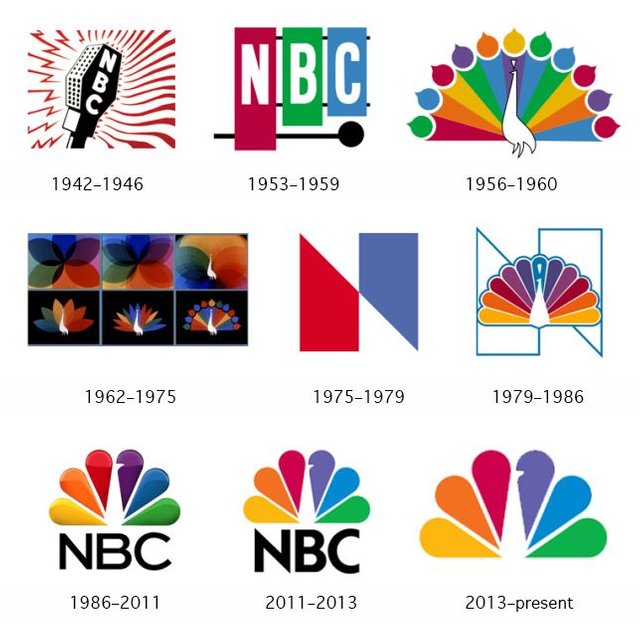
The NBC logo has been associated with the peacock since 1956;
In our time, connecting a television channel to a peacock may seem strange and difficult to understand, but in 1956, NBC wanted to express its enthusiasm for the invention of color television!
The first versions of the logo look like a rainbow-colored peacock, each of which has 11 feathers for a colored drop. The final shape is colored with vibrant colors to encourage non-colored TV owners to buy color TVs to enjoy the full experience.
Along with the famous tail, the word "proud peacock" comes to symbolize the pride of the network with its colored system. This logo was used with the letter N in various forms until the network contracted with Chermayeff & Geismar in the 1970s and early 1980s Full.
Even as color television has become common, not distinctive. The design agency Chermayeff & Geismar decided to keep the peacock with the number of feathers down to 6, to represent the six NBCs. In a clever solution to keep the peacock idea, a small space was placed in the middle symbolizing the peacock. Without the need to draw it, a more elegant and beautiful solution than his predecessor in the fifties.
Domenes: How many points?
The Story of Dominoes Logo
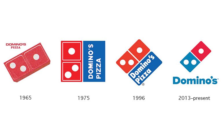
The idea of the pizza company "Dominoz" was to add a point for each branch is opened ... which did not happen at all.
Domino's Pizza today may be one of the most popular pizza chains around the world, but its beginning was modest and very simple. It began as a small restaurant named Dame Nikes after the name of its owner Dominique Divarti, and in 1960 Tom Monaghan and his brother James bought the restaurant from Devarty. The restaurant was sold in exchange for the Volkswagen Beetle they used to deliver orders.
In 1965, the brothers opened two more branches, but were not able to use the name "Dummy Nikes" without Divarti's permission, which was not granted to them. One staff member suggested that they change the name to Domenoz, and immediately the new name was admired. The brothers saw the great potential to transform this simple-impacted name into a brand inspired by the same name.
The three points in the logo are the original main sites of the Domino's restaurants, and the plan was to add a point each time a new branch was opened. It is a good idea, but it is impossible to investigate the wide spread of the restaurant. It is my imagination to add these points to the slogan, but if the brothers insisted on their idea, the logo will carry more than 10,000 points today.
MGM logo: King of the jungle
MGM logo story
Is there a more interesting way to attract attention from the lion's snarl? Especially in filmmaking, where the first shots represent the most important moments of my life,The motto of the Metro Goldwyn Mayer - known as MGM - has been associated with the voice of the famous grunge with childhood memories and other memories we make to this day.
Many generations of filmgoers made the dramatic introduction, the huge lion's voice as he roars to start the film, swirling around him in a film that expresses the company, which came by chance - almost. The king of the jungle has been the original symbol of the company since 1916, and is a symbol of the sports team of advertising chief Howard Ditz, called the Black Team when he was a student at Columbia University.
When the merger of the giant Goldwine Bakers, the Mega Bakers, and the Louis B. Mayer Bacthers took place in 1924, Asad - the so-called SLATZ - remained the official trademark of MGG, and the Slats was first heard by the Gramophone in 1928 at the premiere For the silent film "White Shadows" in South Seas.
After the death of Assad Slats in 1928, he was replaced by a long list of blacks including Jackie, Talley, Coffey, Tanner, George, and finally Leo's famous and beloved Leo in 1957. Can you imagine that such a commercial heritage began because the head of advertising was a student At Columbia University?
Toblerone: mountain and bear
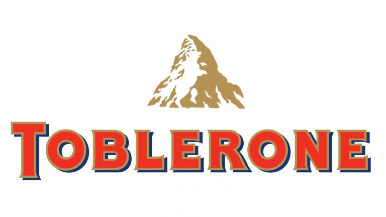
Since 1908, the Toblerone logo has two main components: the Matterhorn and the Bear.
Many brands emerge from the history or heritage of the town or country in which they originated, and Toblerone is an excellent example. The logo does not in any way represent a trademark of chocolate, but embodies the geographer of the landmark in Switzerland, the Matterhorn.
The shape of the chocolates, which look like a layer of mountains, is inspired by the idea of the logo itself, but that is not all. On the top of the snow, the shape of Bear Bern, the official symbol of the Swiss city of Tupeloron, Their territory.
Congratulations @abdelkader91! You have completed some achievement on Steemit and have been rewarded with new badge(s) :
Click on any badge to view your own Board of Honor on SteemitBoard.
For more information about SteemitBoard, click here
If you no longer want to receive notifications, reply to this comment with the word
STOP