Confessions of a random writer - an analysis of Steemit posts using Steemtracked
I think like many steemians I have my fair share of interests and steemit.com has given me a lot of interesting communities and people to discover. Unfortunately it seems to go against most rules of blogging to write about lots of things in various levels of detail. So I have written lengthy analyses on bisteemit, utopian.io and my ideas about mental-fitness and whatever else I happen to have a serious thought about. On the other hand, sometimes all you need to get an idea across is a good infographic or quote.
I often look up statistics on steemtracked.com (a great tool created by @shango) when I am not busy wallet watching or responding to replies (I write way more comments than posts), and I try to figure out if there's anything that I have been writing that is worth spending more of my time and attention on. As you will see from this post, I don't think there is but then again people keep telling me that I could be getting more payout if only I focus on certain things and try to promote myself more (but I am too lazy for that).
Anyway, let me tell you how I analyze my writing on steemit.com, using the three basic metric of Upvotes, Earnings and Comments. And if anyone wants to develop a nice infographic or data visualization to display this information (what do you think @datatreemap?) then I am more than happy to help.
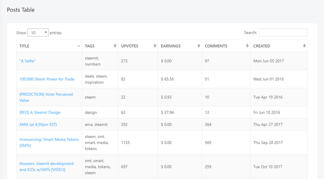
So if you go to the Post section of steemtracked.com
You will see a table which contains a lot of useful information about your posts that can be sorted by a number of different values (those are not from my account - illustrative purposes only):
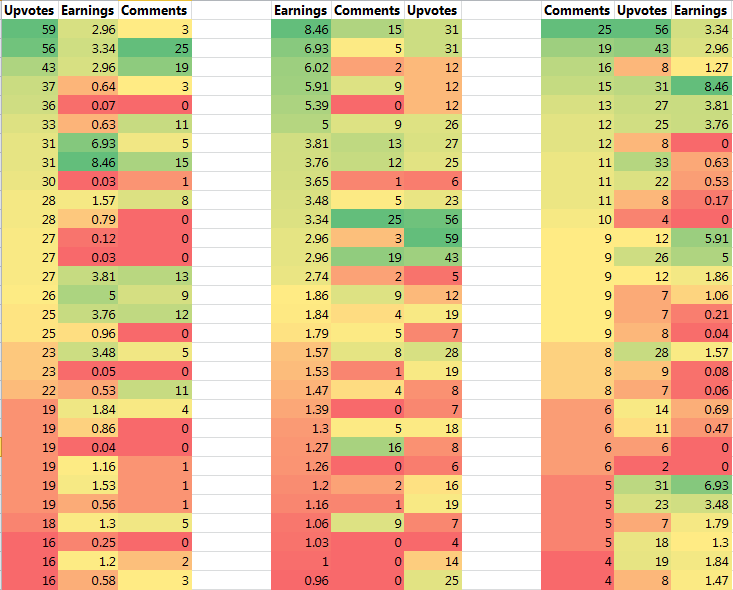
So I have decided to take the top thirty post by the number of upvotes, earnings and comments to see if I can find any patterns that will show some relationship between the three for my posts, because the rule of thumb is that more upvotes equals better earnings, more comments mean more engagement and also more upvotes.
Those of you familiar with my 'conditional formatting' analysis will probably pick up on what this means:
Basically I have created three tables containing the top 30 posts I published ranked by upvotes, earnings and comments. For each table, I create a colour scale that shows the range of values from the highest to lowest for the column that the table is sorted by for reference, and then I do the same for the two other column values. I know, my earnings are pretty low but that's something that I am not so worried about at this stage of my steemit journey :D
What you would expect to see if there are some patterns or relationships between these three variables then there will be some similarity in the colour scales for each column. Interestingly enough I didn't find the earnings to be that much related to the comments and upvotes, and the same is true when I look at the earnings from posts with the highest upvotes and comments.
Another way to visualize this lack of pattern between the three values is to use a bubble chart, where two values are plotted on a normal chart axis while the third value is expressed as the size of a point on the chart:
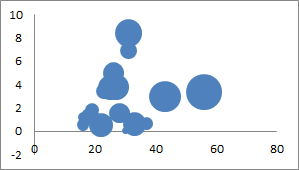
Bubble chart illustrating relationship between earnings (x-axis) and upvotes (y-axis), size of bubble indicates number of comments. I think this means that some posts that I write seem to get more payments without much upvotes, and some posts I write seem to get more upvotes without much payout (ideally you want them to correlate better).
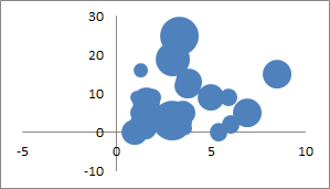
Bubble chart illustrating relationship between comments (x-axis) and earnings (y-axis), size of bubble indicates number of upvotes. Again there are no real patterns between comments and earnings either.
However, the number of upvotes seem to be closely related to the number of comments at least (it looks roughly linear, at least much more so than the other two charts).
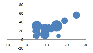
Bubble chart illustrating relationship between upvotes (x-axis) and comments (y-axis), size of bubble indicates earning payout.
So this is how you can look at your efforts in terms of posting on steemit, but I admit it is a little bit laborious to be copy and pasting from steemtracked.com. However, this is a very interesting way to visualize the same information that is contained in the table, and probably more useful to the author when trying to work out what to focus on with their writing.
Of course, this data doesn't make a lot of sense without some additional context, such as the distribution of voting influence of my followers, the number of followers I have and the number of people that I follow, the tags that I post under, etc.
In terms of the distribution of followers, steemtracked.com provides a nice breakdown in a donut chart: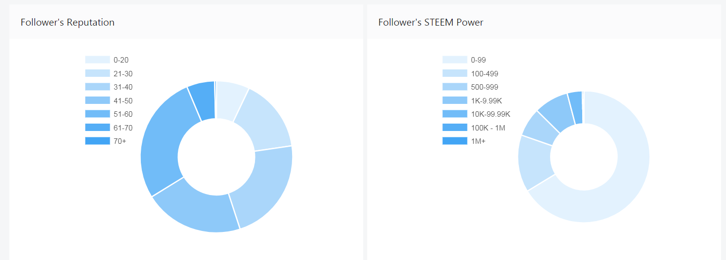
So it is always worth doing a little bit of digging into your own posting data if you want to get better payouts for your posts, or if you just want to write a more in-depth analysis on getting more results from your posts. We should not be afraid of data or become misled by what it can tell us, because there is a lot you can learn from it, even if you are not posting to try and make a big payout!
I have noticed a little bit of difference in the performance of steemtracked since I have increased my followers from 100 to over 250, and also because the number of posts I have made has increased a lot as well. I hope @shango is working on some optimization because this is a really great tool and I would love to see it used by more people as part of feature improvements in projects like utopian.io.

Resteemed your article. This article was resteemed because you are part of the New Steemians project. You can learn more about it here: https://steemit.com/introduceyourself/@gaman/new-steemians-project-launch