Bio of the day: Massimo Vignelli - If you do it right, it will last forever
Bio of the day 1: Massimo Vignelli – If you do it right it will last forever
There are the few that redefine how humans perceive ourselves, the world, and the people around us. We may make pretty quotes from what they have said, put their pictures on buildings, or write a book about them. But rarely do we take them time to view them as teachers, because to learn something takes focus and depth.
So, I mad it a habit to slow down and really research and understand the people I admire. To follow their successes and hopefully learn from their failures. The bio of the day series is my attempt to highlight some of these amazing people that you normally wouldn’t have heard of. I will provide a brief bio into the person’s philosophy and view of the world. What made them who they were and why. And, how they fundamentally changed our interaction with world and each other.
Minimalism – the essence of perception
“There are many ways of making a knife, and more or less all knives cut. But some knives cut better, and some knives not only cut better but are beautiful objects. Integrity is beautiful. Things that are ugly, it’s because they have no integrity."
Massimo Vignelli lived and embodied the essence of minimal design. Whether a chair, a poster, or knife his goal was to break down everything to its most intimate parts. In doing so, he discovered that great design inspires action and what draws the mind’s eye is simplicity. To be beautiful is to have integrity and to discover this integrity is the essence of good design.
In the 60's, when design was under threat to be absorbed the advertising industry. Men in suites directing and robbing the integrity of design with neon lights and flashy, flamboyant images. Massimo Vignelli refused. He became one of the many icons of that era who showed an undeniable contrast between good design and an an advertisement. So much so, he resigned from a top job at Unimark to hone his minimal aesthetic and start his own firm Vignelli Associates. By doing so, he reduced the noise of design and captured the mines of millions.
Reducing Chaos – The New York City Metro Map
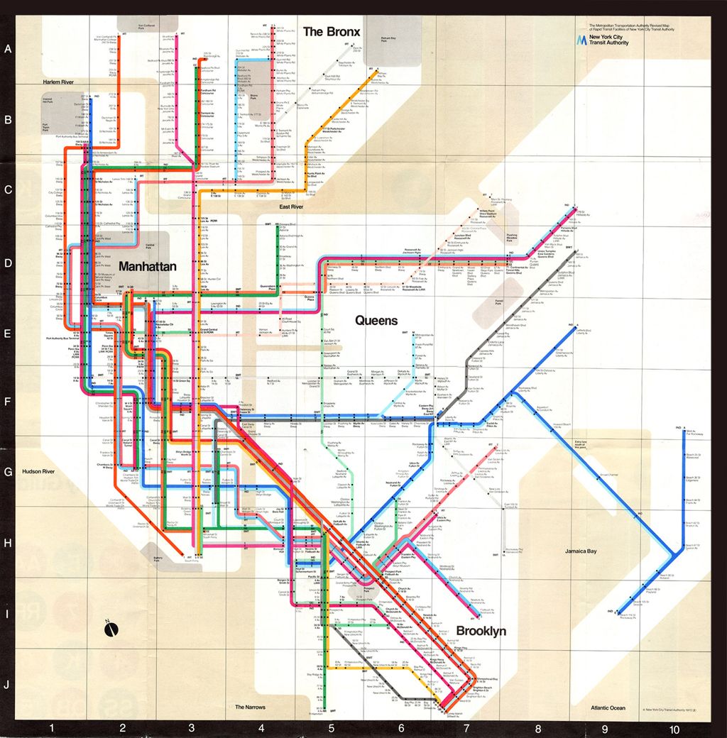
In the mid 1960’s ,the New York City Transport Authority faced a daunting problem. There were inconsistent maps being used by the public before the old operating companies were consolidated into the NYC TSA. 52 Million visitors came between April 1964 to October 1965 clogging and creating hours of delays for months. Vast improvements to the network weren’t reflected on the maps. Vignelli was hired to solve this problem in 1972 while he was still at Unimark.
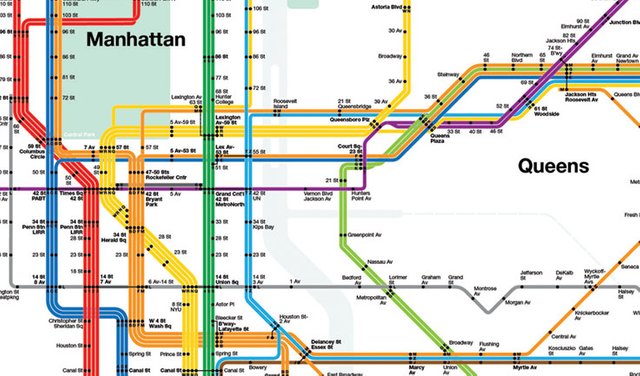
The 1972 map was met with heavy criticism saying it did not look as pretty. There was no reflection of the vegetation or what was above ground. There was too much white. He was asked to make it prettier?
His response? “Of course I know the park is green and not gray. Who cares? You want to go from Point A to Point B, period. “ Savage. Massimo Vignelli saw himself as an information architect and humans best understand the simple. Things should be functional and beautiful. 30 years later he was proven right.
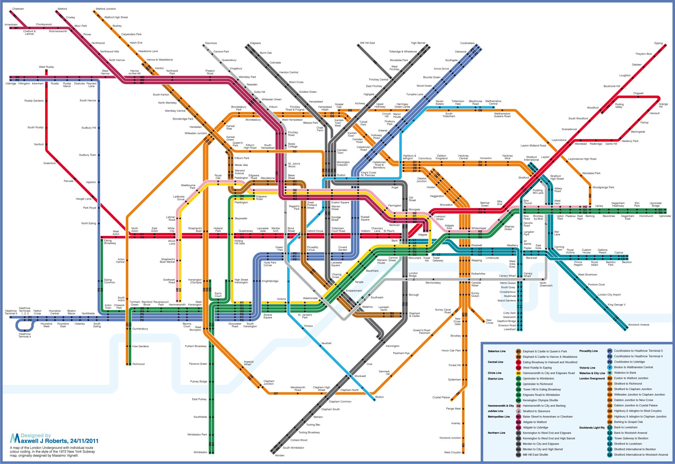
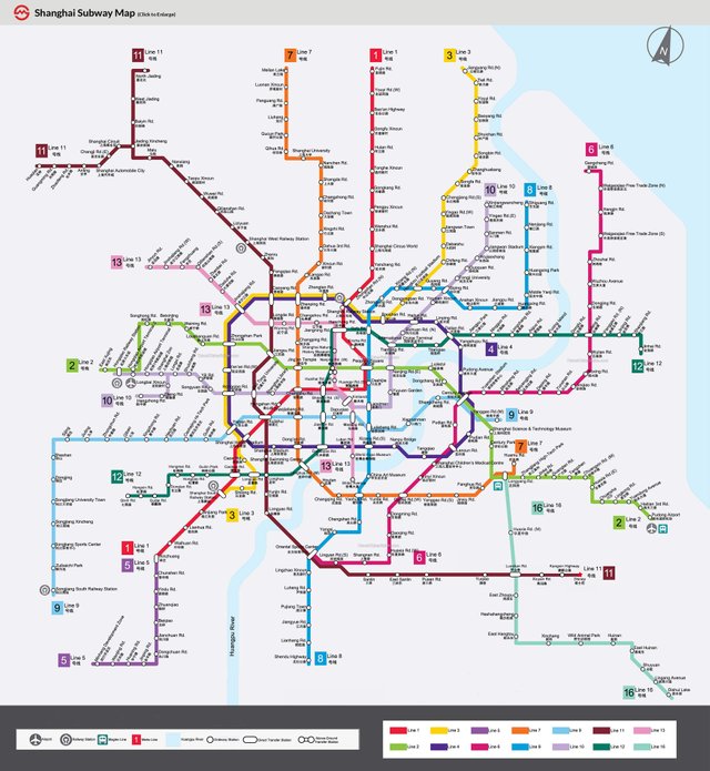
As his own firm, he designed the 2002 version after TSA realized how good the 1972 one was. This version has been replicated in cities all over the world creating the standard on how to represent complex transit systems through the common language of enduring design.
What else did he work on?
Well, I'm posting pictures because you probably have seen these before.
O and One More Thing
Even in his later years, after he designed the NYC map and developed some of the most iconic brands in the world, he fundamentally changed the way we view typefaces. Massimo described that people believe they can control what we react to. When we see we think we are ignoring typefaces over the much more "attractive" image or color. But it is the words that are burned into the mind as an image that moves people: "Yes we can." "Don’t cry because its over, smile because it happened." "C'est la vie." He showed good typography is how we visualize these words in our minds and wear them in our hearts.
Even after all this, he wanted to do one more thing:
I want to design “the corporate identity for the Vatican. I would go to the pope and say: Your holiness. The logo is O.K., but everything else has to go. Not that I haven’t tried. I’ve tried, but unsuccessfully. “


good work
Thank you @bcyz =D. Enjoyed your challenge of the future post. Followed =D
Nice info. Glad to read about such a personality. Keep it up. Upvoted and following...
Glad you enjoyed it =D Looking forward to reading your posts soon!