Contest - My BeyondBit Contest Entry
A couple of days, I bumped in the contest of @officialfuzzy on my feed. I decided to join.
As I was brainstorming over the logo, I saw the entries leaping in. Cool ones! I needed to pick up some speed.
I struggled some with the BitShares thing, but finally managed to get my hands on an account!
Then, I opened Figma, my beloved vector-based program and started doodling around. I came up with something, which has three variations in itself. Those three variations each have options when it comes to color and shading.
Enough talking, I wanna see what you made!
@officialfuzzy explained the vision of BeyondBit in his Contestpost:
The Vision of BeyondBitcoin Hangout Series is to give communities a voice to speak about their favorite projects in the blockchain and disruptive tech space.
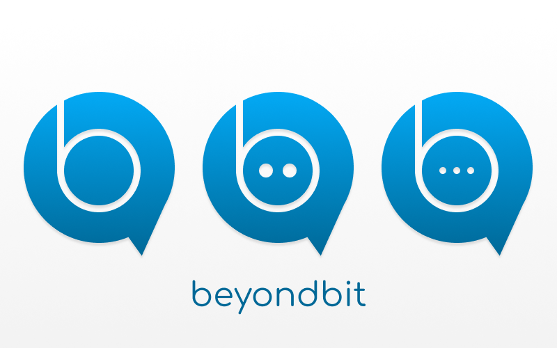
This means, that he wants people to have a voice, say something, do something with it. Hence I subtly turned the circle into a speechbubble. When you have a speechbubble, you want to say something - the dots.
Like I said, I have three variations since I am not sure which one @officialfuzzy would prefer the most.
EDIT: Due to the new announcement of @officialfuzzy, I added minimal additions - hopefully it meets the requirements now. So I guess this will be variation 0, hehe.
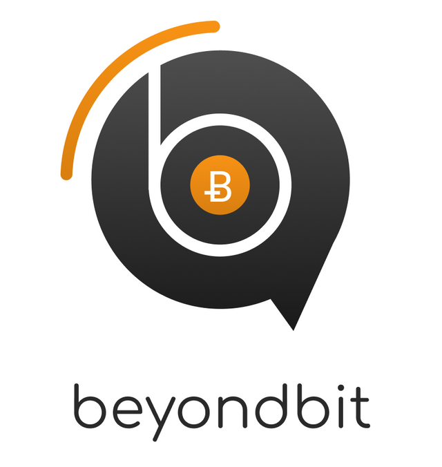
Variation 1
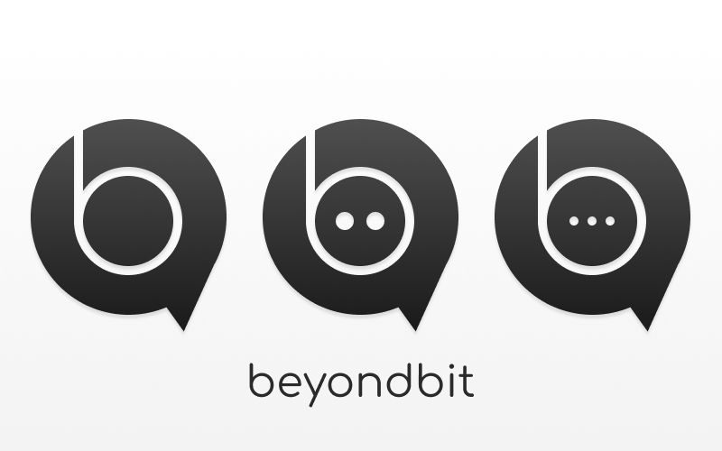
The first one doesn't have any dots. It is the simplest of them three and the most clean one.

Variation 2
The second one has two dots. I wanted to add dots and stopped at two since it makes a cute face as well as it represents speech. This is the most playful of the variations.

Variation 3
The last one has three dots, representing the voice of the community.

What about those colors and shades you mentioned?
That's right. Here they are.
Inverted
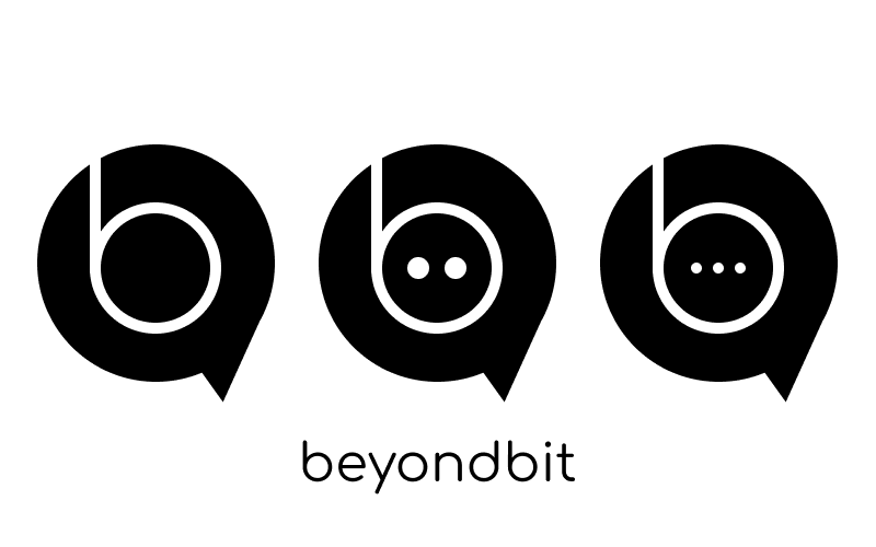
Flat - Black on White
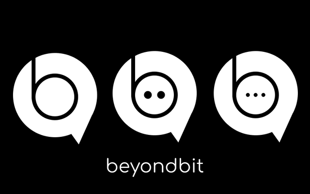
Flat - White on Black
Sea
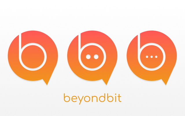
Sunrise
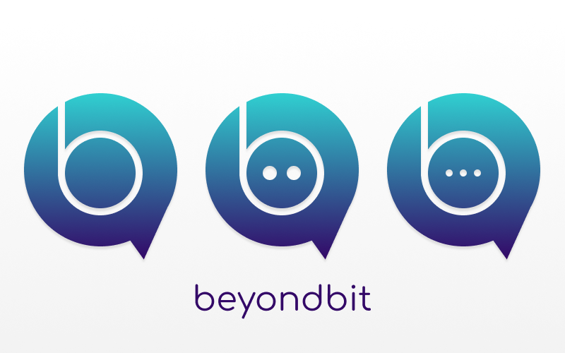
Deepsea
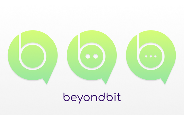
Flashy Green
I am happy to alter this design ends up being chosen as well as other justifications to get the desired result.
Thanks for reading this, I hope you liked it! Cheers and Steem on!

great post. thanks
Amazing design @sjennon! Feel like we have the winner here...
Cheers
@progressivechef
Haha, let's hope so! Thanks for the support :D
Nice work! Your designs are flawless. I'm jealous haha
Thank you so much <3 It means a great deal to me, haha!
This looks GREAT! I didn't know you use figma for your works! I've always been interested in trying it out. ^^
Also, all your variations is so splendid! I love the B&W versions, along with the gradient colored ones as well! My favorite has to be the flat white version on black background. ^^ Love seeing stuff like this <3
Thank you so much :>
Yeah, I find it the easiest ˆˆYou should! It's easy and free up untill a certain usage.
Thank you so much, I am glad you like it :>
Awesome! Yea, I'll definitely look into it. ^^
<3
Love your design. I hope you win.
Best of luck.
Thank you so much! I hope so too! Haha. It's great to have all this support :)