Artzone Mula Token Logo Contest
Hi!
My thought process was "Hm... the logo has to look well on coinmarketcap or coingecko, so it better be round" :P.
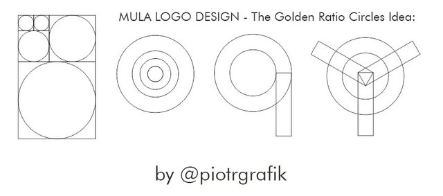
The idea was to use the famous golden ratio.
In the end, I used only two circles and that gave me basic proportions and the line thickness to work with.
I'm "the less is more" type of guy.
And then I walked two ways with the color scheme:
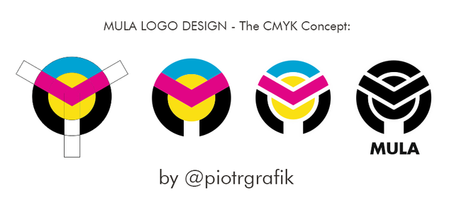
The 4 color - CMYK (Cyan, Magenta, Yellow, blacK)
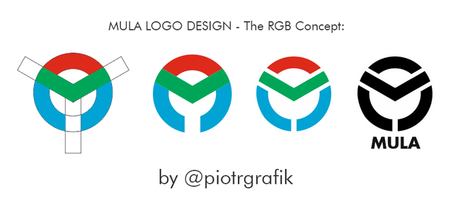
And The 3 colors - RGB (Red, Green, Blue)
Actually, I prefer 3 colors because the monochromatic version is lighter (less is more :))
The design allows to see Letters M.U.L.A in it and it's readable even as a small icon.
I think this logo serves the purpose well.


Hey, @piotrgrafik.
For what my opinion is ultimately worth, I think your instincts to go with a circular kind of logo are sound, and so is the concept of less is more. To that end, I think the second logo from the left of the RGB group is the best. It is the least busy, the colors show up well and you definitely get as strong letter M.
Plus, it reminds me in design of the helmet the Marvel villain Magneto wears. :)
Maybe that's not necessarily a plus, but I still think it's cool. :)
You got a 31.89% upvote from @ocdb courtesy of @piotrgrafik! :)
@ocdb is a non-profit bidbot for whitelisted Steemians, current max bid is 45 SBD and the equivalent amount in STEEM.
Check our website https://thegoodwhales.io/ for the whitelist, queue and delegation info. Join our Discord channel for more information.
If you like what @ocd does, consider voting for ocd-witness through SteemConnect or on the Steemit Witnesses page. :)