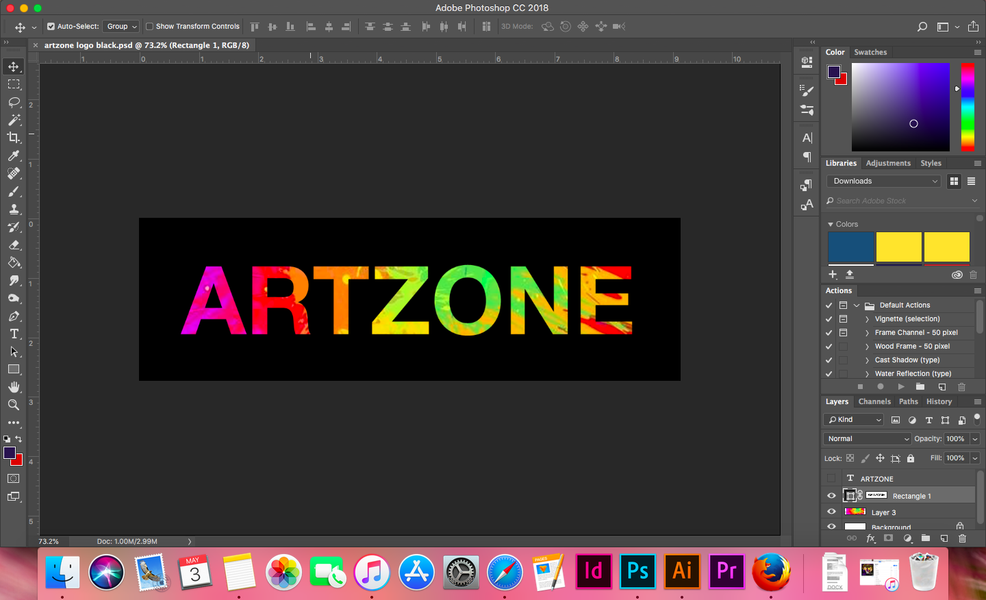
Artzone logo contest
Today, I am sharing my logo design idea for the @artzone contest.
Find out more here https://steemit.com/artzone/@artzone/artzone-logo-contest-30-sbd
My idea of art is a combination of beauty and chaos.
In my logo design, I have used bright colours with a very clean text outline. The bright colours represent the chaos and the clean outline represents beauty.


Evidence of work. Font used: Helvetica Neue - Bold. And I used a stock photo of paint splatter.

I would love your feedback!

Love the design, especially with the black backdrop.
wow..that's such a lovely design ..i love your colour combinations it's really great… and simple
Thank you!
Congratulations @michellejones! You have completed some achievement on Steemit and have been rewarded with new badge(s) :
Click on any badge to view your own Board of Honor on SteemitBoard.
For more information about SteemitBoard, click here
If you no longer want to receive notifications, reply to this comment with the word
STOPGood job nice logo congratulations that great community greetings
Thank you!
very nice :)