Lettering: Step By Step
Regards Steemians, I hope you are well, I want to start by thanking you for your visits and support in my previous publications, that has served as motivation to continue publishing and every day learning a little more about the platform, today I bring you a publication dedicated to the realization of a labeling of freehand calligraphy, in simple steps so that what you put into practice, then I will show you the process.
Materials
- 1 graphite pencil 2H
- 1 graphite pencil 3B
- 1 Marker Fine tip (RapidoGraff)
- 1 Thick Point Marker
- 1 White Sheet
Process
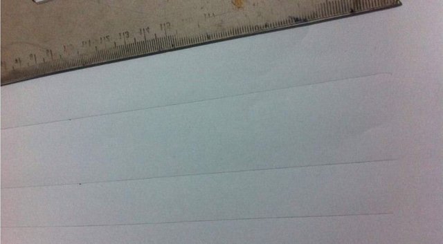
To start with the process of letter tracing we must know the average size we want for each of the letters that make up the lettering, for this we draw a standard lines on the white sheet.
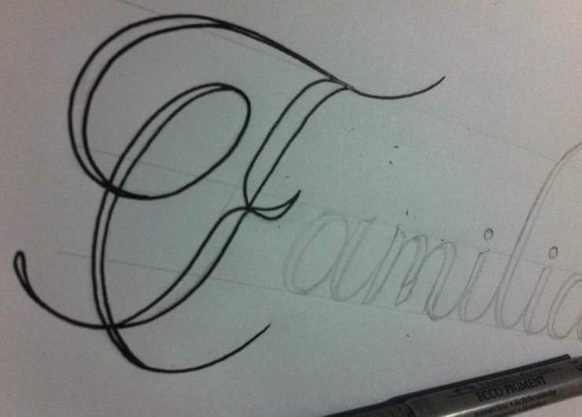
These guide lines are used to differentiate the size of the small letters to the size of the initial letter of the word, in the case of this design, my small letters measured 2 cm, that is to say the space between the first and the second pattern line have that measure, while the initial capitalized has an approximate height of 4cm or 5cm, since it is composed of details in free form that make it larger, these pattern lines can also be used to determine and control the width of each letter .
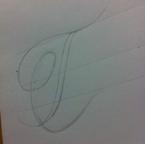
The cursive lines that are part of the body of the letter should also have a margin of thickness, once we have defined the path of the curves we can start to give thickness following the pattern we already have and respecting the details that, if they remain with a thin line, which make the thickness contrast.
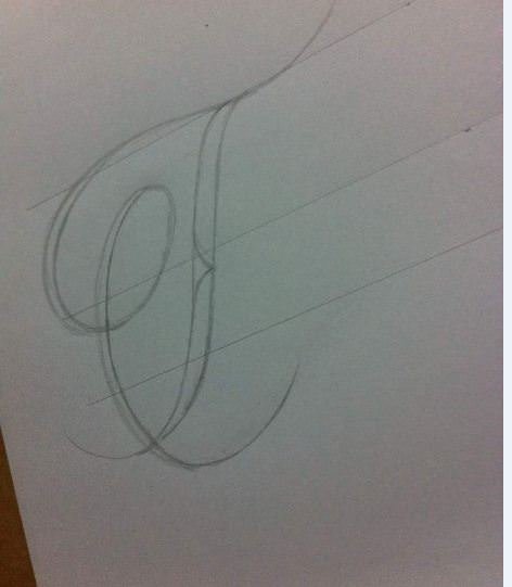
Giving continuity to the rest of the design, we start with the small letters of the word, applying the same process previously exposed, but in this case by size and design it is a little simpler, first we make the shape of the letter and later we add thickness.

When shaping all the remaining small letters we will obtain the definitive form of the design that we want to capture, in order to proceed to make the final trace in marker
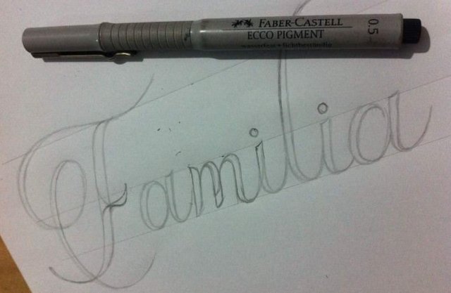
I recommend that you start the final stroke with the body of the letter and the thickest parts of the initial letter, this will be done with the fine point marker
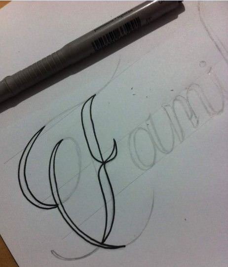
Leaving for the final step the trace of the fine lines, since they merit a clean stroke and with their margin of concentration to obtain a good result.
At the time of making the stroke in these designs, you should be in concentration with the work and in confidence with your pulse, since there are lines that merit a long and firm stroke closing in rest points, rest points are part of the body of the letters and those parts whose shape is composed of a thick line where the fine lines can end there or rest from the line, because resting in the middle of the fine line and then starting again implies that you see the restart point as well as you can start with a thickness different from the one you brought and it would be noticed at the end of the trace, the experience little by little gives us a little more confidence and practice so that when you touch a line that was left halfway, start with the marker furthest from the sheet to start with the thickness that had been working. Next, I will show you a short video of how to trace part of the letters that merited a long stroke:
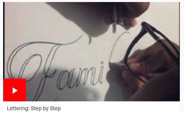
Applying this same process in the rest of the other letters, we will obtain a design already ready to proceed to be filled
When we finally enter the filling process, we go to the use of the thick point marker, since the letters for being of a somewhat extensive thickness can not be filled with the same marker with which it was drawn, a large tip in filling speeds up the work and help to keep blank spaces or notorious lines of revisions in the filling technique
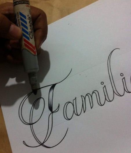
The same process will be applied in the rest of the letters that make up the design, taking into account that there are parts of the letters that, being small, should be filled with the marker with which we draw, and thus keep the design clean and without distortions in the trace by a bad filling

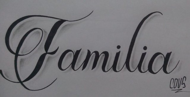
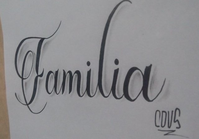
Once we finish with the whole design, to add a bit of shadow as a detail, with the 2h graphite pencil we mark in the inner areas of the letter depending on the direction they choose as light that gives shade, in my case the light comes from the left side and therefore make the shadow in the opposite direction

Having already the shadow areas marked and faded a bit with the 2H pencil, we mark the middle of each shadow with the 3B pencil to give contrast and depth to the shadow through a blur that matches the dark tone of the 3B pencil with the clear hue of 2H.
This is all for today Steemians, I hope you liked my post and if you like you can vote and leave me your criticisms and comments about it, see you soon, Good Vibes to All.

Awesome artwork @cdvs
Nice work, clean and very precise