#18 Animation - How much is TOO MUCH? (Animation Principle - Exaggeration)
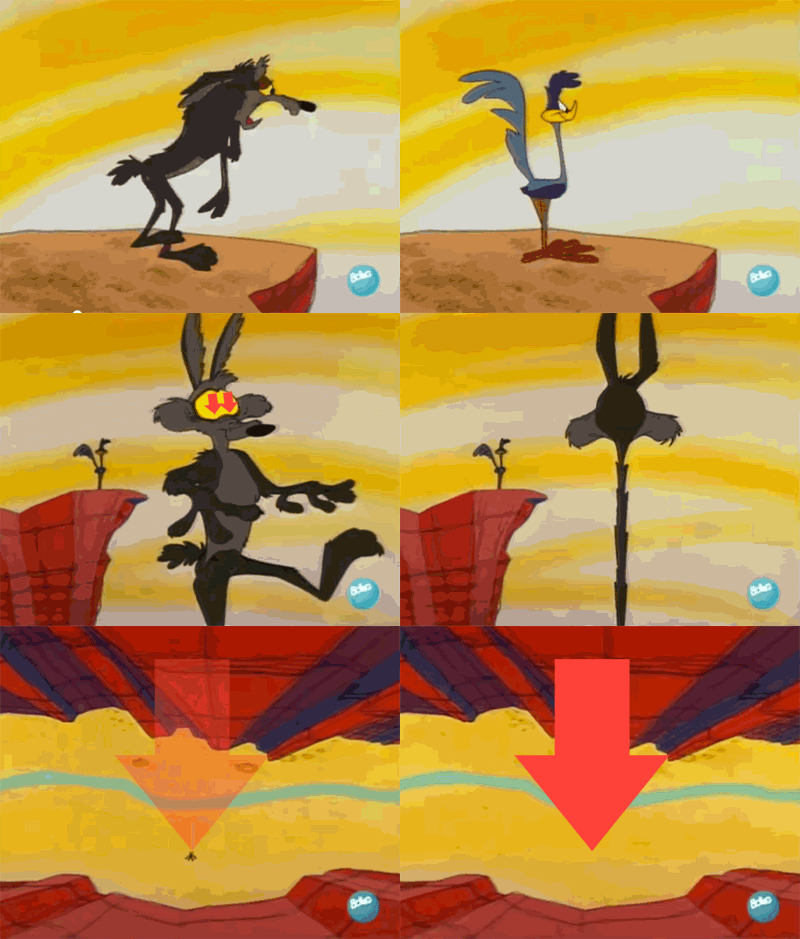
Ahhh, so we're back again here with one of the most important animation principle. A few weeks back, I've posted a post about the 12 animation principles and it's different uses. How to properly apply all the principles in every project you're being thrown at. The animation principles are like the basic necessity of every thing animation. If you've missed it, I'll link you the post below but please don't upvote it! It is way passed it's payout time.
The 12 Animation Principles
But today, I would want to narrow in on a very specific animation principle which I still often struggle in properly applying it in my animation works. So what I'm about to share here are some of the lessons I've learned from mentors and also some methods that I used to improve on my animation.
Exaggeration - How much is TOO MUCH?
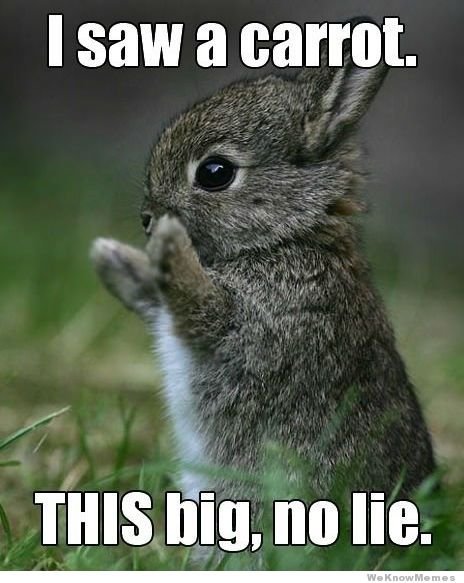
I've searched the web for this particular principle and many times the question 'How much is too much?' pops out. Apparently, I'm not the only animator that tries to answer this question myself everyday as I'm animating.
When I was in university working on my projects, I often get told by my mentors that my animations are too stiff. Their movements can be bigger, more dynamic, and exaggerated. These were the words often used to describe my animations. Nodding my head, I walked back to my desk to do the necessary amendments, realizing that I had NO CLUE how big, how dynamic and how exaggerated they wanted my animation to be. The worst part was, I thought I exaggerated the actions and poses enough when submitting to them.
I was left there clueless for hours trying to maybe tweak a miracle.
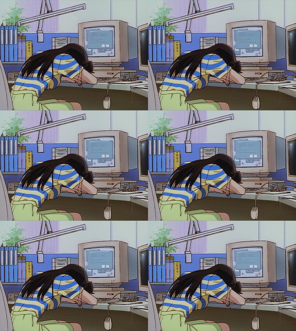
After the first few years in my animation journey, this question comes up every now and then. "How much is too much?". Of course, I did find some tips which i would love to share with you guys who are also having this problem.
It is too much when it becomes confusing
First of all, we have to understand why we use Exaggeration in our animation. We must also understand the situation it's being used in. The plot or the story that is trying to be delivered. As an animator, you are given the task to create art that delivers the message to the audiences through moving picture frames. To emphasize or reinforce a key storyline or pose to tell the story.
It also depends on the project you're also working on. Does it carry the slapstick cartoon-ish style like Despicable Me? Or is it a more realistic animation?
As I've mentioned in my previous post before, "Exaggeration done right would still make the scene believable at the same time evoking a point across."
But @zord189.... I already know all this. I just want to know how much is too much?
Ah yes, after you've FULLY understood your story and the style given by the art director for your animation. One of the most effective way I've found to be able to answer this question of yours and mine is to ask feedback/critique from someone.
I know, it's that simple. You can ask your peers and people who are NOT in the animation industry. It will be easier for your peers to understand your story because they might be working on the same project with you. Thus, understanding the full story before they look at your scene. But on the other hand, the challenge comes when your sister, brother or friends do not understand what your scene is trying to tell.
When your shot is overkilled with exaggerated poses and timings, it becomes really messy and confusing. Most of the times, really painful to look at. It is always good to let your friends watch the scene without telling them the plot, to see if they get it after. If they do, then you've done a good job.
A good job exaggerating a realistic scene is when it is believable that it doesn't take your mind off for a second from the story. Instead, it enhances it and makes it more beautifully dynamic.
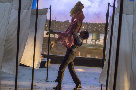
If you remember this scene in 'The Greatest Showman', where they were dancing on the rooftop with sheets all around. The sheets were animated to accentuate the dance flow. If you noticed, there was a part in this scene where the sheets flutter along with the camera tilt and dance moves.
That is exaggeration.
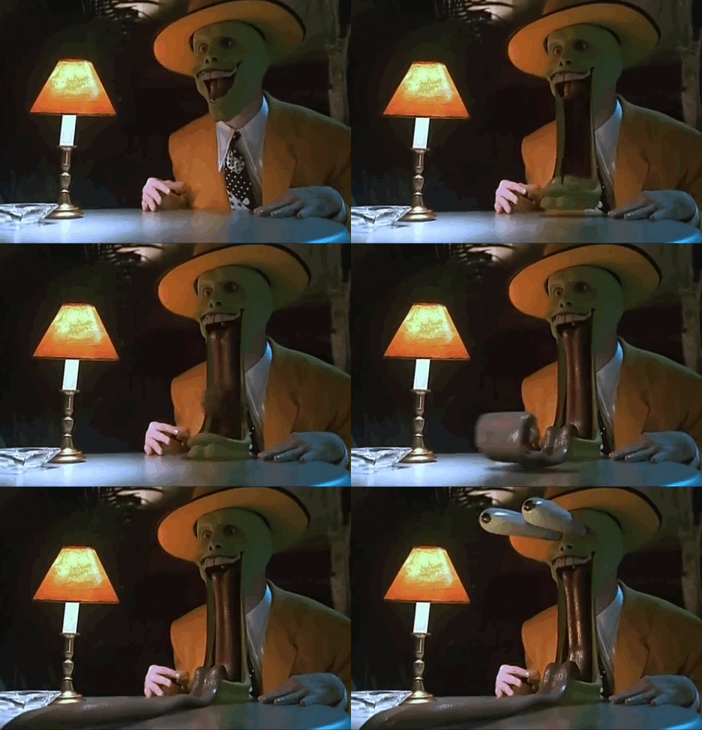
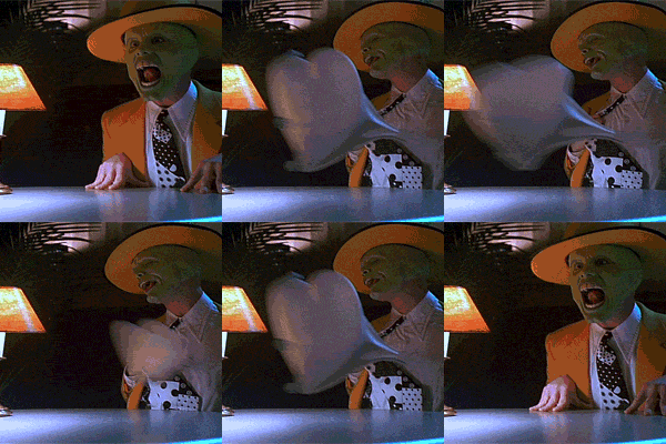
Other ways of exaggeration can be seen in a totally different style of the movie "The Mask". "The Mask" often over-exaggerates his actions to get a message across strongly. Like when he sees a hot girl walks into the bar. Or when in this scene, his heart beats fast when he sees the girl. Which of course, impossible to show if the style was realistic.
"Don't make it real, make it believable" - Oliver Martin Johnston, Jr.
Oliver Johnston, an american animator, who is also recognized as a Walt Disney Legend. Who has done works for Pinnochio, Bambi, snow white and the seven dwarfs and many more.
And this applies to all the animation when you're about to use exaggeration. It all depends how much do you need to use. Check the story again, the characters, the style that is wanted from the director. And when you've done your animation passes, always remember to get feedback from your peers.
Make sure they understand the story, and every movement of it, subtle and big. That it doesn't look like the whole scene is being taken up by a hurricane. Get a few eyes to look at your shot over and over again.
Thank You
If you like what I do, check out my other posts on my artworks, photography & animations.
I'm also open for
Personalized Steemit Profile Banner,logos & GIFs
Credits to @pinstory & @coloringiship for this lovely photo of me.


Hey @zordi89 I am a curator from the Whaleshares Curation Team. I have selected your post to be presented in a live curation discussion on Monday 29th January. Your post will be awarded with a 100 Whaleshares vote on the night. I do hope you can come along and spectate. The event will be held in The Curation Lounge on the Whaleshares server. Here's a link which explains things:https://steemit.com/steemit/@nikflossus/the-whaleshares-curation-show-tomorrow-night-23-59gmt-or-6-59est-featuring-reko
Thank you @nikflossus for selecting my post!!! :O I will do my best to spectate when it is live!!! THANK YOU SO MUCH!!!
You seem like someone worth following ;-)
I am glad i found you!
I have followed you back! Your paintings are amazing! Very different type of style. I like!
How much is TOO MUCH for me is a very subjective question. Each person's 'TOO MUCH' might be different. Yes, sometimes we need to listen to advises, but to be able to fully release our own potential, we gatto be ourself.
In this case, as animators, you can't simply add too much or too little. It is more of a controlled exaggeration. The style have to be consistent across the board.
For example, you don't see docmcstuffin doing something like this
But in Docmcstuffin's case, she does have her Exaggerated poses to deliver a certain message.
MUHAHAHA... got you!
if docmcstuffin do this, i will straight switch channel liao.. LOLLL
I am no animator, but it would make sense to me if you showed your work to "normal" people who are not animators as in the end they are your target audience and can be your proof check. What is too much or too little is up to for you to decide really? As you are the author.
But, I believe you just have to find a balance between pleasing your professors, audience, and yourself. Not an easy thing to do, but it is a challenge for every artist out there no matter what they do.
At least this is my humble opinion. Great post. Well written. Keep up the amazing job :)
Ahhh, yes, I will try my best to take your advice into account for my following posts. Thank you. As Exaggeration is a pretty BIG topic itself, I've only scratched the surface of it. Usually the style is decided by the art director, so in order to have animation consistency across the whole project, THAT is what would decide your exaggeration amount.
But yes I do agree that I should cater more towards the non animators. Shall try my best to do that next round.
Thank you
Very interesting post :) I liked reading the comments where more people discussed and gave examples (like the minions vs frozen animation style and whether it could be exaggerated) That really made a lot of sense to me! It definitely depends on the mood of the piece!
and congratulations for your whaleshare vote!!! :)
Thank you very much @dreemsteem! I'm so fortunate to be curated by whaleshares. Yea, I like when the comments are so engaging.
I also love conversations in the comment section!!! :)
Hope you do very well in steemit! :)
That's very nice of you. :) I wish you well too! followed you
Awwwe that's very kind of you! I will return the follow :)
Thank you :D
Well written. Clear message. Simple and to the point. Worthy of 100% upvote :)
Thank you!
Congratulations for this post being spotted by the Whaleshares Curation team. 🎉🎉🎉🎉yuhoo!!!
This post is so well written. Indeed it is a subjective matter, I mean in our life. Everyone's definition varies. Just like coffee. how many cups per day is too much? 🤔
You brought this topic to another level of thoughts. So good!
Thank you!!! Best support ever! Always! :D
True, not only in animation, but in life - literally. There are definitely some things that we may miss out and another pair of eyes, or two, can point it out for us. Great post here! :)
Thank you for always supporting me :D
I really like the insight your post brings to us. You make animate to a new level of learning I didn't really know about or was even aware of.
@kubbyelizabeth! Thanks for dropping by. I was actually listening to the talk for the first time and loved it. Was so excited. Thank you for the lovely comment. :)
Creative thinking. Liked it.
thank you
Pleasure mine