'Undead Samurai' - Painting Process Tutorial
From Sketch to Wall. Bringing an Undead Warrior to life.
Katana? Check. Samurai Armor? Check. Undead Warrior? Yep. Adolescent fascination with Japan? Most definitely.
I'd like to shed a little bit of light on my creative process while turning an initial sketch into a finished painting. I'll be using a piece of mine that I made in 2007 (Oh my how the time flies!), while the drawing may not be new (and I have in fact posted it in my early steemit days albeit without much explanation), the process is still more or less the same. Only now I have more practice. :)
Suppose that samurais, swords, undeath and vague Kanji is just part and parcel for many aspiring artists/nerds at that age. The great thing is that these things are still fun ten years later! It's a good idea to warm-up with some practice sketches before tackling the big one, but the nature of creativity sometimes jumbles or omits certain steps because you just gotta draw that thing right now. Over time you develop the discipline and skills to stick to certain steps and techniques that allow you to develop an idea more fully. I think particular piece is a good example because it includes a full figure/character, a mid level and a background that are all fairly basic and were then all added in separate steps. I'll be showing you guys some more recent work soon and how the process has evolved since then!
The painting eventually turned into one of my favorite ones I've ever made and it still hangs at my brother's place in Salzburg today.
Enjoy!
 |
|---|
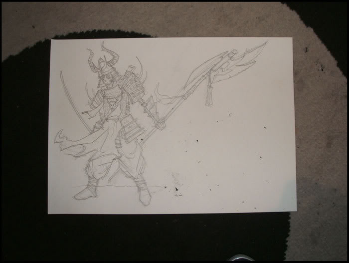
| The first draft (actually the third but the other two found themselves crumpled up in a bin in frustration! I like using a semi-hard pencil for this stage using either stock printer paper or higher quality sketchbook pages which tend to be a bit heavier. On the A4 paper I usually draw stuff a little larger without worrying about the "negative space" and composition so much yet as we are still gonna move to a larger canvas. The aim here is to produce a clean enough sketch that we can then improve in the next round. At this point I am thinking a lot about how to pose him, what the costume/outfit still needs and getting the proportions somewhat correct. |
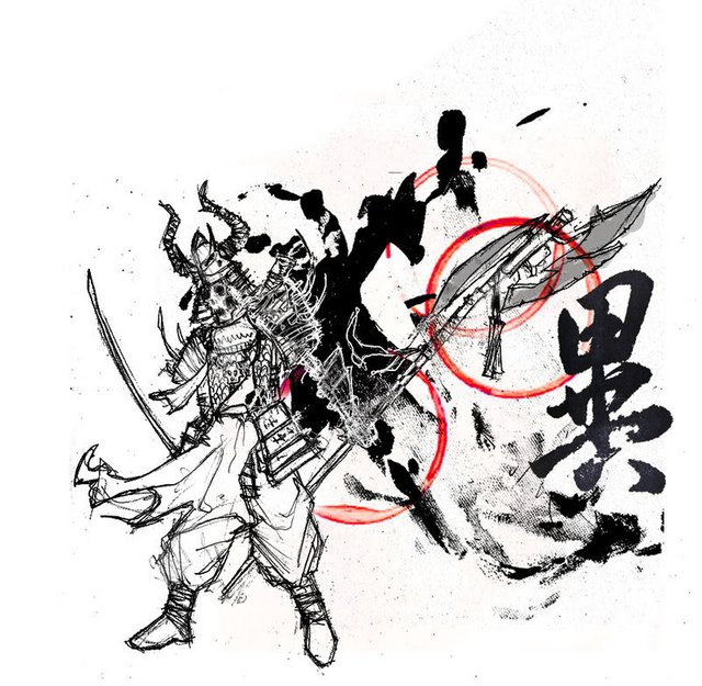 |
| The first draft digitalised. At some point when I'm happy with the sketch I'll take a photo of it or preferably scan it in and start doing some compositional work in photoshop by combining a couple of different elements like the sketch, the ink and the red circle elements.. Some of the process pics are missing but I was actually using CDRoms as a round stencil for the red circles and a soft broad brush for the ink (which is actually acrylics mixed with ink). |
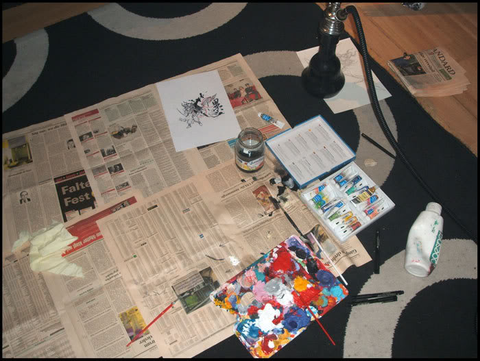 |
| Moving to the next stage. Ghetto newspaper, an array of whatever medium I had (watercolor, ink, acrylics, gloss and a shisha pipe). Nowadays I have a fancier computer and a bigger desk but when you are a student you gotta work with what you got! I liked spreading out on the floor with my sketches and my paints. My mom was often rather cross with me for leaving paint stains on the carpet! As always, it is recommended to work with higher quality (read expensive) material both in paint and in brush. The difference really shows. |
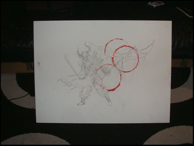 |
| The finished second draft sketch with the red CD-ROM zen circles. The second (or preferably THIRD) time round your drawing will be a lot more organic and swooshy already. My first drafts tend to be a bit stiff. Generally for commissioned work nowadays I will produce three drafts. Also notice how I left our undead Samurai some space now that we have a bigger canvas. For this one I used a wooden board sized 100 x 60cm so it's quite large! |
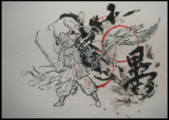 |
| In the next stage I inked the lines of the samurai first, using a fine tipped brush. I tried to make it a little "rough" on purpose. Then I used the black inks and acrylics to add the "Ink splashes" with a soft semi-broad paintbrush and the Kanji (which means Unity I think.). Next I took some grey water color to add a bit of dimension to his weapon. Finally I added white paint in the "shadow realm" to produce an inverse effect. |
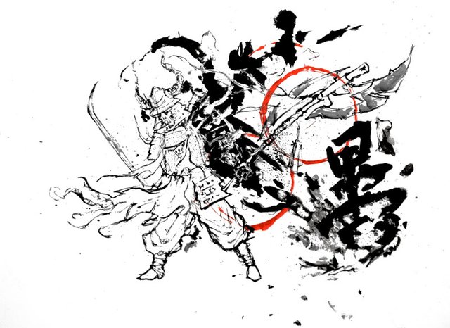 |
| The digitalised final product. Take a high resolution picture or scan of your finished work and get it into Photoshop! Now we can clean up the background, adjust the levels, bring out the colors and separate the lines from the background. In the digital clean-up stage you usually use some of the "humanity" of the piece as smudges, imperfections and tiny flaws are burned into oblivion by cold hard metal under current. Still, this kind of style has its own merits and is useful for presentation or if you want to use your image as a future digital asset. We'll be having a look at individual Photoshop techniques in future episodes if you guys like! |
| Click for higher resolution image |
Hint of the Day:
Photoshop is a great and powerful piece of software as long as you have access to it. For all the rest of us there is GIMP which is a terrific (and free) open-source photo editing program with a lot of the same functionality.
Hope you guys feel positively illuminated at this stage. It ain't magic, it's sweat and practice. It's old newspaper, sitting on the floor for hours in awkward positions and using whatever colorful thing you find that leaves a mark. Don't forget to have fun too while you're at it!
I'll still be archiving my stuff for a while, still got tons of character studies, life drawings, illustration exercise and graphic design bits to show, watch this space for additional pieces in the future. Back to the drawing board.
Hold her steady,
ZeroOoC

Oh I feel illuminated alright. Great artwork and great read as always! I love your hints of the day. I'm going to try out Typora. I was wondering, do you happen by any chance to have experience with Affinity Designer or Affinity Photo? I used GIMP and Inkscape, they're great, but I'm thinking about Affinity.
Yeah I've used Affinity a little bit and it's pretty good, especially the Vector one. I'd rate it somewhere in the middle between GIMP and Photoshop. Personally I've been with Adobe for almost 20 years.
Thanks for your kind words, Typora is very swish!
I guess the next step would be a more recent painting.
Thanks! I' will be working with Typora today for the first time. Wish me luck hihi!
Have a nice day ;)
Good Luck @shinyforest! I'm sure with this your posts will be even better!
<3
wow looks great, how much work did u put into this?
Cheers!
I think around 12 hours. Making a few sketches, working with different mediums (and waiting for them to dry), taking it into photoshop etc. It adds up!
I def. wanna see more drawings! :)
It shall be so. :)
upvoted
#untalented
@originalworks
The @OriginalWorks bot has determined this post by @zeroooc to be original material and upvoted it!
To call @OriginalWorks, simply reply to any post with @originalworks or !originalworks in your message!
Very cool! The process makes the product!!! Also, your style has echoes of old Japanese zen paintings! Probably by design? I haven't been to Japan since 1989... Someday! (I upvoted, followed, all that!)
Well I practice a form of pseudo skateboarding zen, so even then it was fairly intentional. Add to that an innate obsession with Dragonball, Zelda and Akira and stuff like this comes out :)
Thank you, I appreciate it!
I put the monkey back into monk, as well!
Hahaha! You sir, have earned yourself a new follower.
LOL!
Thanks for the hints. I've heard a lot of good stuff about gimp. Beautiful artwork as well!!
<3 glad you got something out of it @chelsea88. Your consistency is very motivating!
great art
Merci :)