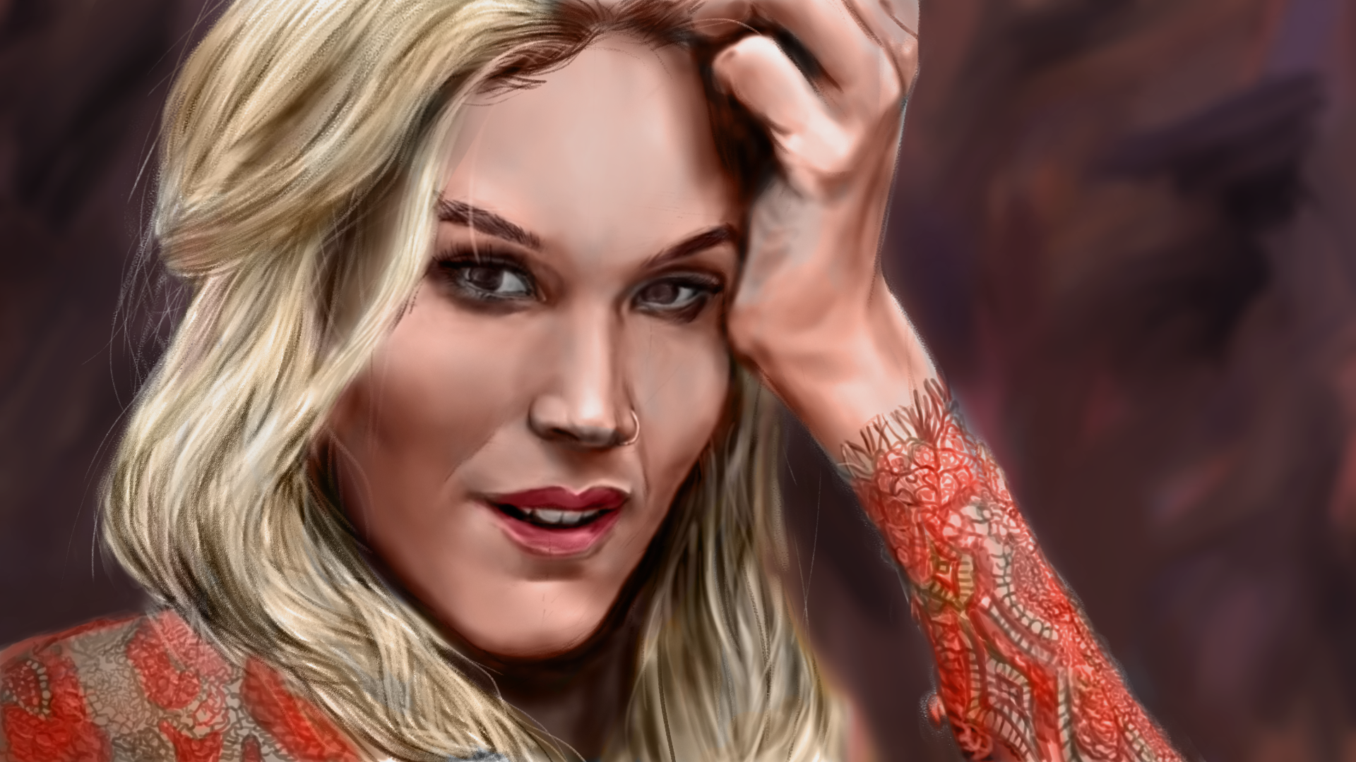
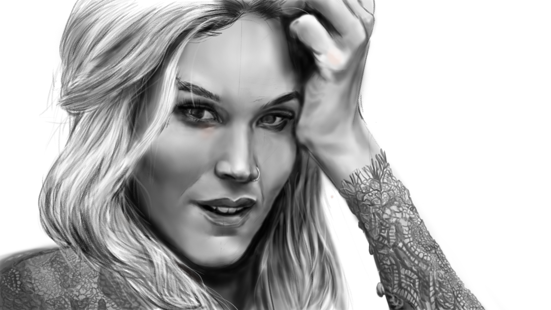
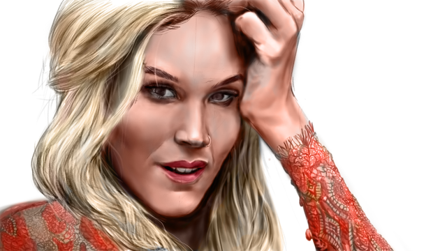
Portrait of Joss Stone, by me
Hey guys! followers and Steemians, how have you been?
I've been away from STEEm for sometimes.. just couldn't find the time to post yet, and I've been working on some stuff if like to share with you.
I know it's a common practice to present this kind of post (the one I'm writing) as a 'tutorial' even it's not. Honestly, my purpose is just to showcase artwork and boast a little bit 😁. some people feel that tutorial has an added value.
Sure, it may be possible for you to learn something from it and I'll be glad if you do. the fact is that I do learn a lot from just looking at other's artwork. The key for me is to meet the right content at the right time on your learning journey. It's like Dr. Jordan Peterson said once- it is optimal to learn from a subject that's prefixed with what you already know. So at this moment, my tips would be relevant to you.
Anyhow.. getting straight to it: here's a digital portrait I've done of the British soul singer Joss stone. I've become enamored with her voice (pretty easy on the eyes too..) so I thought it'll be a good place to start at drawing celebrities. I want to draw a bunch of celebs because I've been wanting to do commision drawing and my mom advised me that it's easy for people to measure my skill that way. It's because when you recognize a celebrity in a drawing you can reference his face/look at what you remember and draw a conclusion on the likeness.
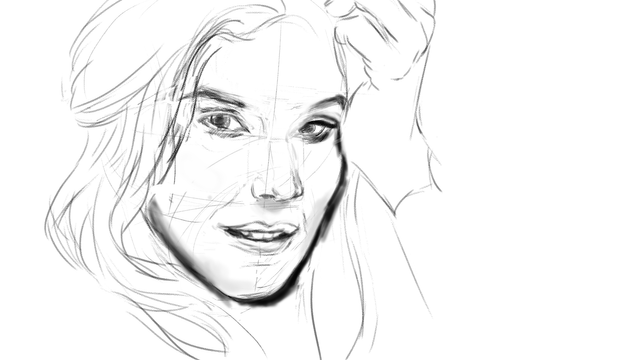
Here are some steps: I've started sketching digitally this time. I have a Wacom Intuos Comic tablet. I used a pencil like brush with pressure sensitivity settings. You can use one of the defaults. Brushes REALLY don't matter. Okay, this is an important tip from me- just select the brush for your purpose. I'll get to this later. At this stage, I'm not coloring or filling anything. Just sketching the general form. If you have a background already you can sketch on separate layer in Photoshop with the blending mode set to multiply. Once again I mention the Reiley method of abstraction. This is a super nifty thing I've picked up from Stan Prokopenko's yt channel. It's a method used by the 20'th century American painter ** Reilly. So first I draw the face from observation, then I Trace over it with the Reiley method rhythm lines to make sure I've got the anatomy right. This is a good thing to use for quickly correcting mistakes before you move on to render. I should have started with a 50% gray background as it is much more recomended, but I didn't. maybe next time...
ale round brush would do for most cases, even for textures. that's because you can "scumble" or doodle with a simple brush to get a texture going. The important thing is to work zoomed out far in the beginning, and zoom in as the level of detail increases. If you start working zoomed in, you may get "muddy" patches or confusing detail. The key to three-dimensionality in drawing is to keep the edgework determined and clean. So when one color spot meets another- the edge between them should be as hard or soft as the actual form dictates.
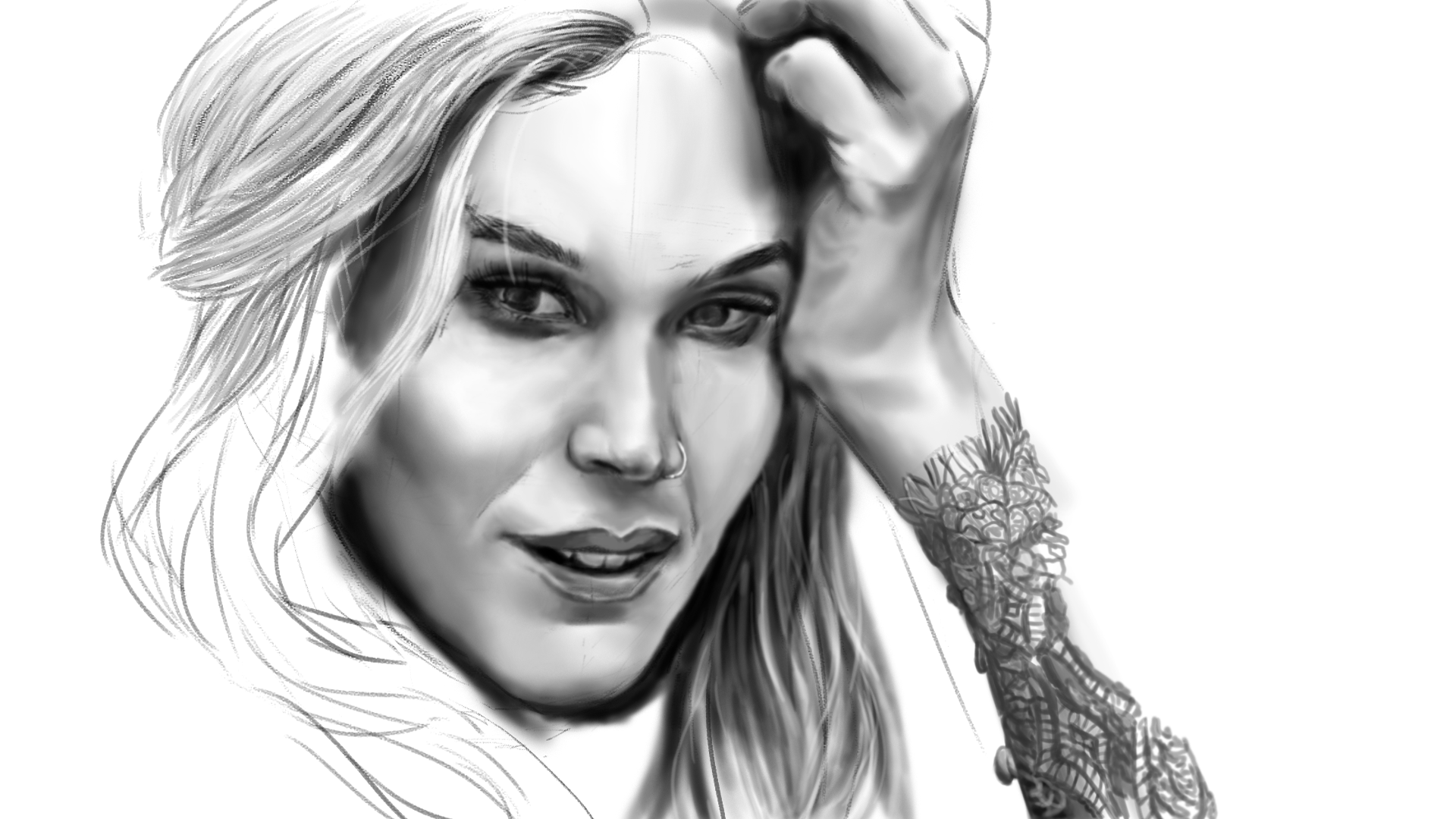
After sketching, I begin "blocking in" major forms. this approach is so ubiquitous in drawing tutorials that I feel like I shouldn't explain it too much, but if you're new to this- then the rule of thumb is work in large low-detail shapes and try to capture the relationship, value and/or colorwise, between them. the importance of this step is that it helps you establish both a local key for either value or color. if you're not sure about what I'm talking about: value is brightness-darkness and color relate to hue which is the color position on the color wheel.
when you've done this step correctly- you get into "simultaneous contrast" territory". this means that your mind cant make the observation, for example, the the darkest dark value in one area cannot be darker then brightest light in another area. another way to look at it is to establish value steps and then subdivide them by making sub-steps.
I've used another layer with the blending mode set to "multiply" in order to correct some shading mistakes I have made
in the beginning.
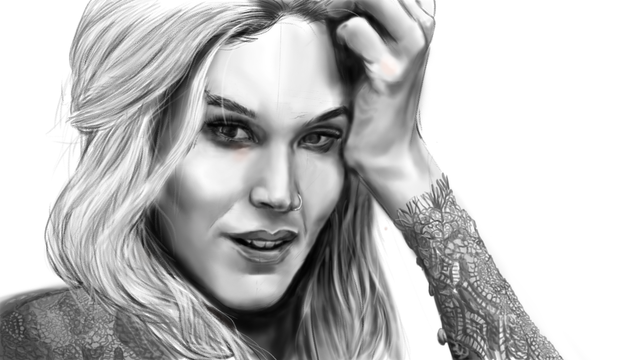
You could either start with color or in grayscale and later color the values with a color layer. this is the method that I worked with in this case. note that this layer represents only the 'pure' color hue position and doesn't take into consideration the tone of the color that you have selected.
here it is very important to note that it's not simply enough to paint over large areas with the same local color on the color layer. this is because light shifts to dark alongside HUE and saturation. it took me a long time to come to grips with this knowledge, and I'm still struggling with color. there are folks that have a more intuitive understanding of color and contrast but I have to go through a lot of articles and tutorials to hone my understanding of color. it is, however, not so complicated if you understand the basics of color theory (which I will not go into in this post, but feel free to educate yourselves on it).
In the face, for example, there are areas of different tones and a multitude of colors. they are affected by numerous factors like the light in the scene and the anatomy of the skin and the bone of the surface of the face. generally, humans with a caucasian complexion tend to have more muted or green looking areas around their lower eyelids or'bags' of the eyes. the also have more yellowish or bluish tones on the tip of their noses and forehead. the lips are a more acidic red tone than the rest of the skin. in men, the area of the chin tends to be greener or more desaturated because of facial hair stubs or thin beards. in any case, light the is reflected from objects sometimes carry with them the color of that particular object (since it is the lightwave frequency that is reflected).
For the background, I've just put together some colors that complement the subject i.e. colors that are to the cool and dark and desaturated side. This is so that the subject can 'pop-out' visually.
So anyway, that's it for now. message me below if you want to know anything else or to inform me of something. anything you have in mind. I'll try to be more consistent with Steemit in the future as I develop more things that I'm planning to. thank you so much for your attention and support, keep on Steemin' guys and have a great week!
Hello @uv10, thank you for sharing this creative work! We just stopped by to say that you've been upvoted by the @creativecrypto magazine. The Creative Crypto is all about art on the blockchain and learning from creatives like you. Looking forward to crossing paths again soon. Steem on!
Congratulations! This post has been upvoted from the communal account, @minnowsupport, by uv10 from the Minnow Support Project. It's a witness project run by aggroed, ausbitbank, teamsteem, theprophet0, someguy123, neoxian, followbtcnews, and netuoso. The goal is to help Steemit grow by supporting Minnows. Please find us at the Peace, Abundance, and Liberty Network (PALnet) Discord Channel. It's a completely public and open space to all members of the Steemit community who voluntarily choose to be there.
If you would like to delegate to the Minnow Support Project you can do so by clicking on the following links: 50SP, 100SP, 250SP, 500SP, 1000SP, 5000SP.
Be sure to leave at least 50SP undelegated on your account.
Your Post Has Been Featured on @Resteemable!
Feature any Steemit post using resteemit.com!
How It Works:
1. Take Any Steemit URL
2. Erase
https://3. Type
reGet Featured Instantly & Featured Posts are voted every 2.4hrs
Join the Curation Team Here | Vote Resteemable for Witness