A Simple Trick: Creating Distance and Depth in Landscape Art by Using the Colors Themselves
How do artists make those massive, distant mountains look so massive and distant in their paintings?
While there are numerous ways to suggest distance in a landscape painting, one of the ways that this illusion of depth is created on a flat canvas is by using the colors themselves to give the appearance of distance, and thereby making the painting's scenery deeper and more exciting to explore.
Here, I'll show how that is done, simply by using black and white paints mixed with all of the other colors on the pallet, and by incorporating value and intensity.
The Trick, Explained in Black and White
In order to create the illusion of depth in an illustration, artists will often incorporate lines into scenes which give perspective to things, so that objects in the foreground look closer than the other objects that are visible in the background composition.
There is another trick to the creation of depth in a painting besides perspective, and it involves using a combination of value and intensity in the composition, or simply making things lighter in shade, and also gradually adding grey with distance.

Value and Intensity
Value and intensity are the terms which describe certain qualities in shading and in color, and by incorporating these qualities into our artwork, we can begin to see a new edge to the illusions of depth in our landscape paintings.

- VALUE: Value is simply how light or dark the mixture of paint is; how much light is reflected from a given surface is determined by that surface's value.

- INTENSITY: Intensity describes how much grey is in a color. Straight out of the tube, a paint will usually be it's most intense, while adding grey to that color will lower it's intensity.
The Rule of Depth
As a general rule; the further from the eye an object becomes, the lighter it's value. Further, as an object becomes more distant, it will lose it's intensity of color, or become more grey.
The Theory in Practice
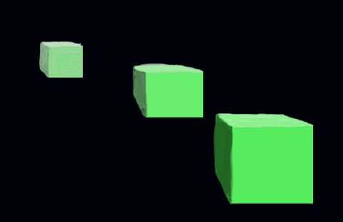
A good way to practice incorporating value and intensity into landscape art is to sketch three cubes, pick a color, and then practice mixing grey and white into that color on the gradually receding cubes, so that the three cubes appear to be more separated by space. (as an example of this study, see the image at the top of the page for my attempt at this exercise on my old Photoshop :)
As a review then, and generally speaking; distant objects are lighter in value, and show less intensity than the foreground objects.
Add white and grey as objects recede in distance. The closer an object is, the darker and more colorful it should appear.
Thanks to Wikimedia Commons, below are some landscape paintings which might serve as examples of the power of this technique, by combining value and intensity to show depth and distance:


Tricks of the Trade
Aside from the use of perspective lines and size or scale to show distance, the use of value and intensity in the colors themselves can create a stunning illusion of depth in landscape art, and can even give a sort of 3D effect when combined with perspective in a composition.
With an understanding of how to use value and intensity in our art, the illusion of distance can easily be portrayed in any landscape painting, allowing the viewer to explore the space that is created.
I hope this was helpful, and have fun making space with value and intensity!
educational graphics above by me, while all following photos of paintings thanks to Wikimedia Commons

Very cool! I always wondered how that was accomplished.
Looks like our friend hasn't seen this post yet, I'll drop him a line.
I hope I explained it well; it was some of the best stuff I got from college art classes, value and intensity changed everything for me in my artwork.
This is really well done!
I appreciate it!
This is great. I'm wondering how I can incorporate this into my film compositions. Thanks!
I see it used in the digitally rendered backgrounds in lots of movies, and theater sets will incorporate the theory in their backgrounds to make the stage appear deeper. Thanks for commenting!
wow something great to learn thanks for tips :D
Yes you true artist like a mountainer he look mountain it's looking beautiful when he climb it's very hard same that painting .
Great job dear . Love it
Namaste
Nice try.