The Dark Knight Alternative Movie Poster
Hello Steemit! So this one is basically just for fun. I was recently commissioned to draw a Bernie Wrightson style illustration of the Boris Karloff Frankenstein. This was basically a dream commission for me, as Wrightson and Frankie are two of my favorites of all time. And more importantly it was something I knew I had to do by hand, with ink and nibs on paper. With how much illustrating I’ve been doing on my iPad as of late. While I am not posting that one at this time, I do have other goodies.
I also got me itching to do more physical media based work. So why not a stylized triptych of the Nolan Batman Flicks? First up, The Dark Knight. I’m exhausted and have much to do yet tonight, some enough jabbering and let’s get to the art!
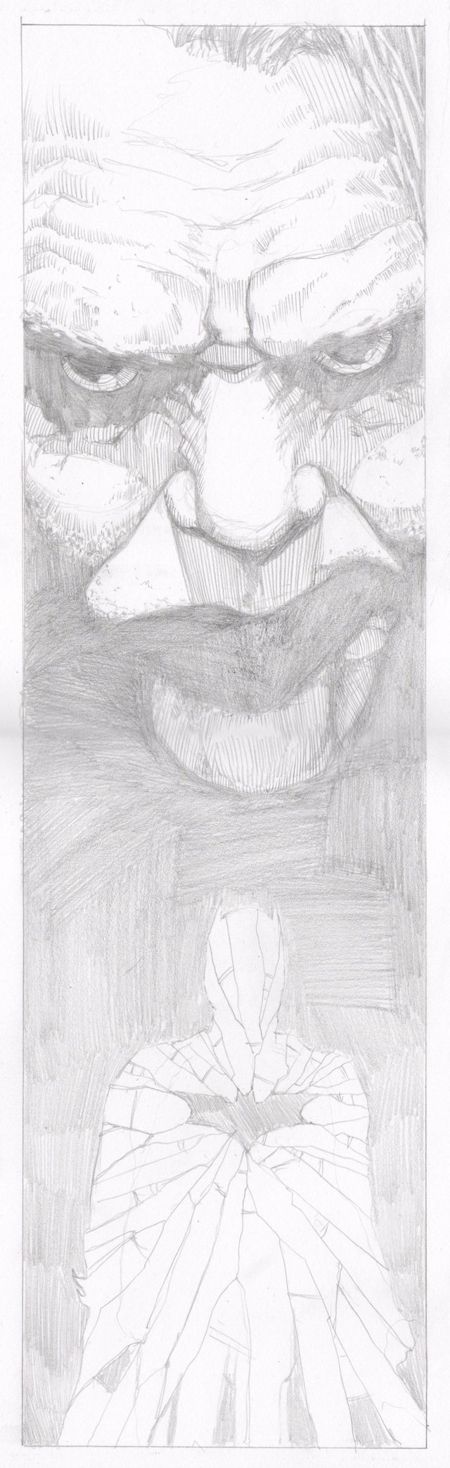
I knew I wanted a lot of black and lots of detail. So I laid out the pencils at 5x16in.
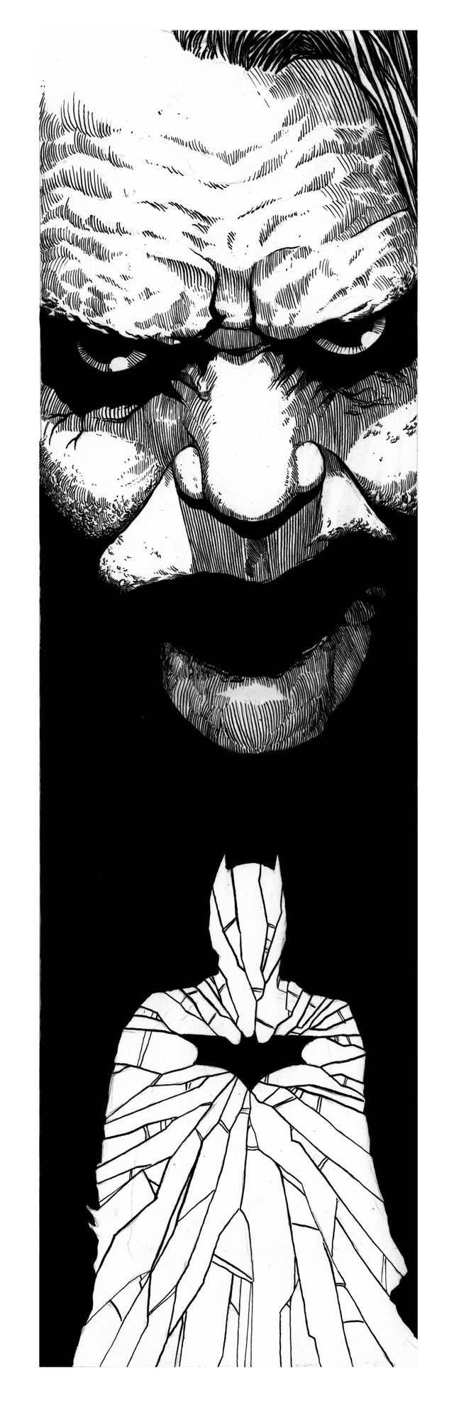
Next up was inking. Speedball superblack ink, which I typically will leave open for a few days when I buy it. This lets some of the water evaporate, its a trick I learned from reading Sam Kieths blog (samkieth.blogspot.com). I used a two different sized nibs and a dirt cheap brush.
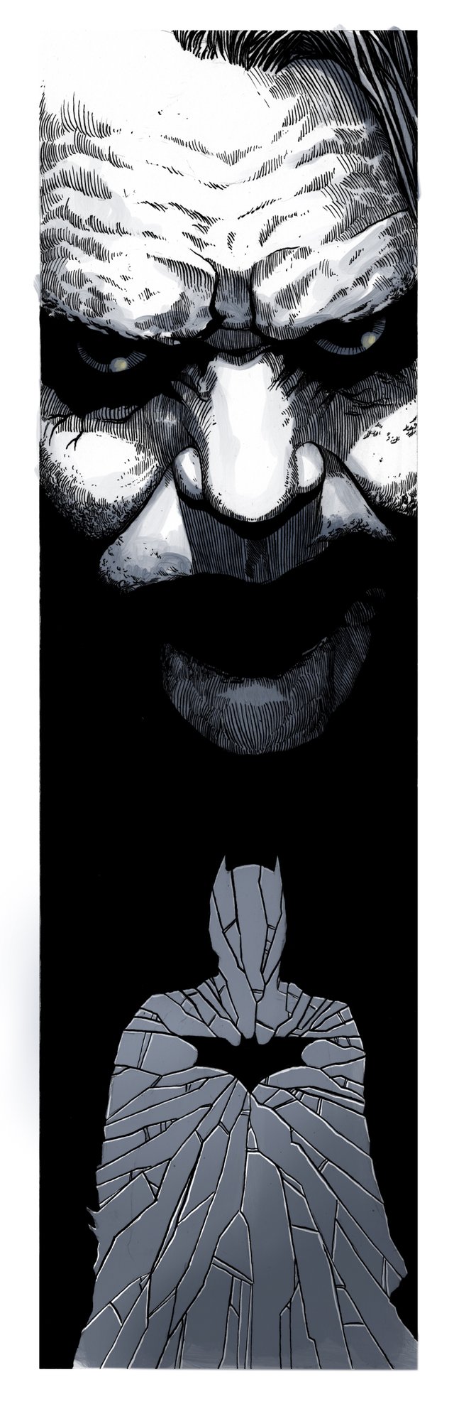
And then, because sometimes I make choices, I decided to add a bit of color on Procreate.
And that’s that! I’m nearly finished with The Dark Knight Rises, then on to Batman Begins. I’m still split on which villain to feature for Batman Begins, so opinions on that? Once all three are done, I may do a small run of prints. But I already have more trilogies in mind. Thanks for looking!!,
Gorgeous poster <3.
The ink and slight blue tint colour is especially good looking. I love how you cross hatched Joker and his expression in this picture.
Thank you! I was really hesitant about adding color but I’m quite happy with the end result. Here’s to hoping I don’t screw up the next one!
This post was shared in the Curation Collective Discord community for curators, and upvoted and resteemed by the @c-squared community account after manual review.
Awesome! Thank you!
That's some piece of art. It even looks pretty scary lol.. but great job here!
Thanks for checking it out!
Love this, @swarddraws !!! The contrast between the villain and the hero is amplified by the framing * ___ * Amazing piece <3 Gorgeous crosshatching and very sleek design <3
Much appreciated! I’m really happy with the composition. Stay tuned for The Dark Knight Rises next week!
I love how you captured the essence of the villain in the eyes. Besides, I love how the villain loses his mouth with the background Amazing work!
Thank you kindly! The harsh light sourceand stark fields of black were a lot of fun. Really allowed me to focus on the details
well done! and with nibs, no less! impressive! what kind of paper are you using when you use nibs?
Thank you very much sir! I did this on strathmore smooth Bristol. Same stuff I draw comics on. With a light hand there isn’t too much in the way of fiber accumulation in the nib tips.
Yeah, the tips cutting into the paper is what gives me hell. I saw Gebhard (from Cerberus) at a con and he had original that he did with nibs. They were really thick cardboard that was smooth as your laptop screen...must have taken forever for ink to dry on that.
For sure. These triptych style posters are purely for enjoyment/zone out time. If I had a deadline I’d have to switch it up. But inking of smooth giant white card stock sounds pretty dang satisfying. I’m working on getting more comfortable with brushes. Just never make it a point to take care of them after. Which gets expensive and annoying. What do you do for brush maintenance?
I used that pink mona lisa brush soap and a run the brush back on forth under the running fawcett across a metal spring...it's hard to explain. I'll show you if I come to MN in the fall.