Examples of how to effectively present your artwork on social media.
Examples of how to effectively present your artwork on social media.
In this article I'll show you the ways I have found to effectively present art that you create on social media such as Facebook, Instagram, Twitter and more. I am an artist with a following of 15,000 people on facebook and 7,000 people on Instagram. All of the examples you will see below are my own work, taken with a cellphone (mobile phone).
Social media is awash with art. It's everywhere. How do you make yours stand out? I have fellow artists and coloring book authors messaging me regularly asking how I get so much interaction on facebook and instagram. Aside from engaging with commenters (which I have gone into detail about here), the most important thing is how you present your images. I'm not talking about finished scans - I'm talking about progress shots or WIPS (work in progress). Here are some examples of mine which have proved really popular - some have gained well over 2,000 likes on facebook. I hope you find some inspiration in these.
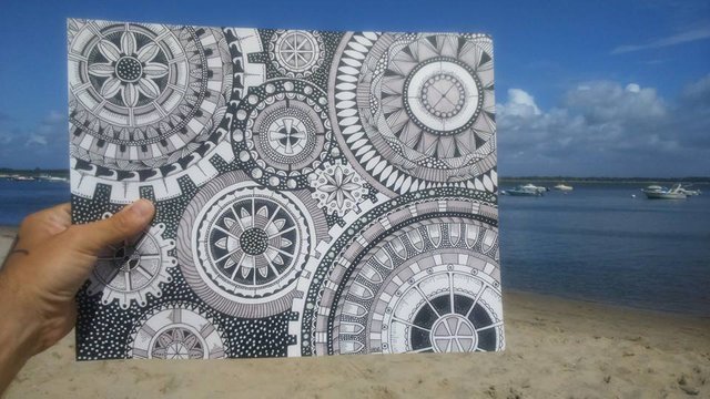
1) The Beach Shot
I created this piece using sharpies and pens on bristol board. I was on vacation in my campervan at the time so I took it down to the beach to get some background action. It's cliched - but everyone loves the contrast of a bright blue sky and sandy beach.
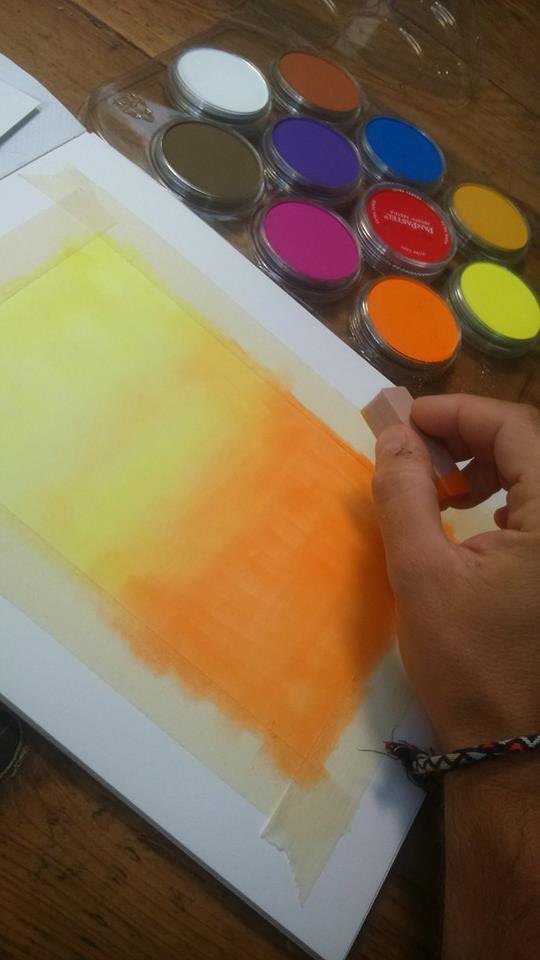
2) The Preparation Shot.
This piece had come at a time when I was only posting black and white pictures. You gotta mix it up. The good folk at Pan Pastels sent me some stuff for review so I quickly crashed out this colourful background using masking tape as a border. It's nothing special - but it got noticed.
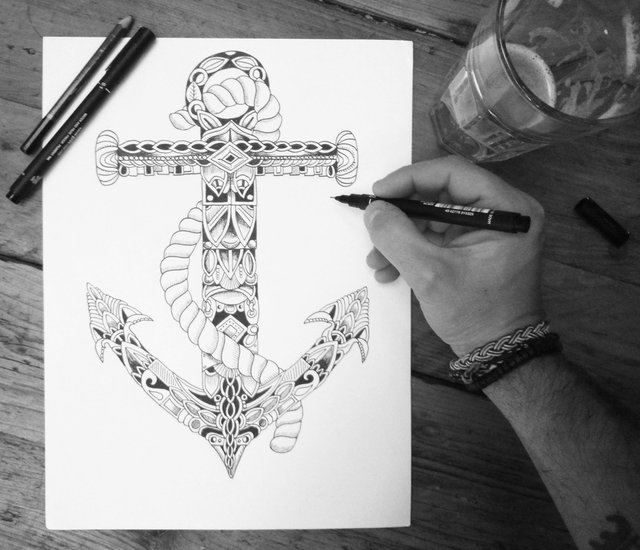
3) The black and white overhead.
I was drawing this ornate anchor for a coloring book - set on top of my wooden dining table, beer to one side, pens on the pad.
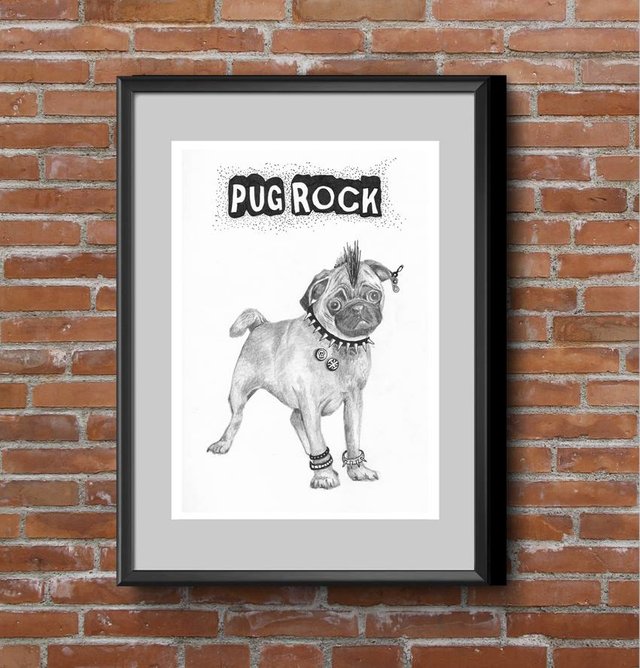
4) The mock-up.
I'd finished this drawing of a punk rock pug - PUG ROCK! and wanted to sell prints. Using a free mock-up I made it look like it was in a smart black frame on a bare brick wall.
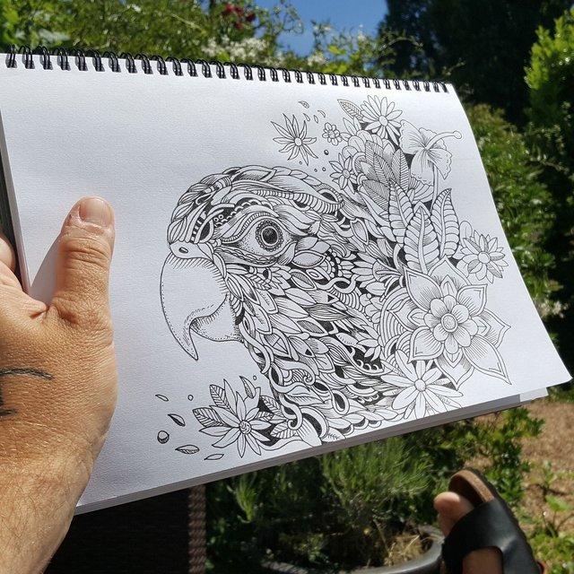
5) The Summer Garden shot.
Much like the beach shot, location is everything here. I was working in my garden in the summer so the bushes in the background made it all very eye-catching.
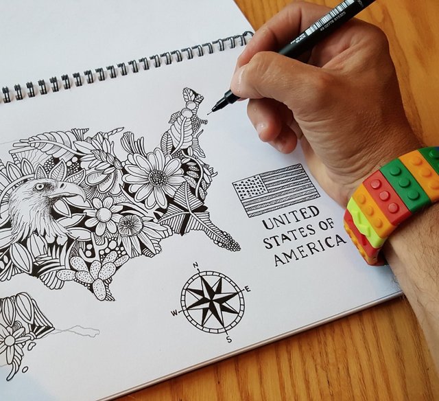
6) The Accessory Shot.
It's a cheap trick - I posted this photo of a drawing from my upcoming coloring book and said something along the lines of "new piece in progress, and don't be too jealous of my lego watch". Yep. That got people talking about the watch - facebook's algorithms place importance on posts that have a lot of interaction. So that worked well for me.
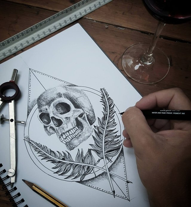
7) The Stationary Shot.
This tattoo design was going well - I thought I'd present it by also showing my pair of architect's compasses and a technical ruler with pencil.
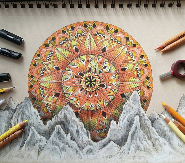
8) The Colored Pencil Shot
Much like the stationary shot above - this one works well with all the colored pencils around the edge. Not only is is eye-catching, but it draws you in - it's almost as if the pencils are pointing at what you should be looking at.
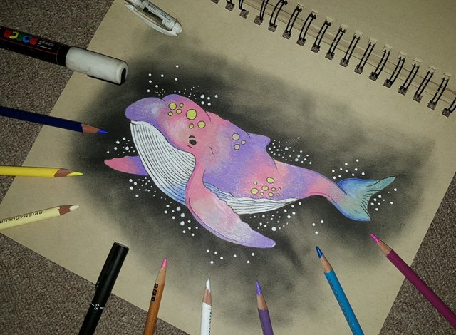
Much the same - but with added pens.
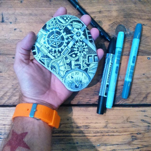
9) Holding the object.
This was just a bit of fun - a stone found on the beach, coloured in and doodled.
Once again, I hope you enjoyed my article. Please reply to let me know what you think, and vote or resteem.
Thanks!
Steve Squidoodle
xxx
Thank you for the great tips! You really make some amazing drawings!
Thank you so much! :)
Inventive and a bit different approach... that is what art is intended to do depict and to provoke.
I agree!! I like to approach things differently. It's important to stand out.