Photo Tips: Colour Schemes - 1.- Complementary Colours
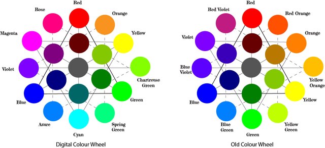
Hello Dear Stemians, in a previous post we told about the colour wheel, in fact we mentioned the digital colour wheel... today we are going to start talking about some colour schemes you can use not only in your photography but of course in any design too, no matter if you are designing clothes, a garden or a room you can use these ideas.
Today we are going to talk about complementary colours which is a very popular colour scheme and it is when you choose two colours opposite one another in the colour wheel, this is to take two diametrically opposite colours.
Remember we can use Red, Green and Blue as primary colours to obtain what we are calling in here the digital colour wheel or use Red, Yellow and Blue as primaries and then get the old colour wheel. In the first figure I am showing both colour wheels, of course the colour scheme you use will change according to the colour wheel you are using, although the old colour wheel have no scientific bases, like the digital one, it is widely used by artists and designers, so I'll try always to use example applying each case.

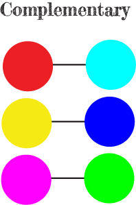
Next figure is showing some examples of complementary colours taken from the Digital color wheel , you gotta notice that in the case of the digital colour wheel the addition of complementary colours when they are fully saturated will produce the colour white therefore they complement each other.
It is apparent that complementary colours are pleasant to the eye and the possible reason comes from the way we perceive colour, we have four types of photoreceptors cells and among them, three are responsible to perceive colours, they are called cones because their shape. Cones allow us to perceive Red, Green and Blue (short, medium and long wavelengths), so our vision is trichromatic and this is why some people think the Digital Colour Wheel which uses the same primary colours that our vision system should be more accurate.
The case is that when, for instance, and image has a portion of a colour over its complementary colour as the background (we can imagine a yellow leaf falling down over a blue background) we are using all our photoreceptors getting a maximum contrast (particularly when colours are fully saturated) and a pleasant feeling. It is a nice colour scheme particularly when you want something to stand out, It is a lot better therefore to use this scheme with a small area of one of one colour and its complementary colour as the background.

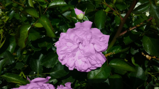
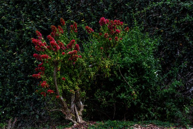
Here is an example of this colour scheme on one photograph using the digital colour wheel and another using the old colour wheel

Camera: Canon EOS 700D.
Camera Lens: EF50mm f/2.5 Compact Macro.
Settings: ISO-100 50 mm. f/7 1/100 sec

Camera: Canon EOS 700D.
Camera Lens: EF50mm f/2.5 Compact Macro.
Settings: ISO-100 50 mm. f/6.3 1/40 sec
I hope you like this post
Thanks to share this interesant and important bases of color, useful as you said for any design making!
You got a 40.11% upvote from @dailyupvotes courtesy of @malenapechi!