New Abstract Painting [incl. Making-of]
Dear friends and followers,
I just finished a new abstract painting, which I made using acrylic colors on canvas.

Acrylic on Canvas 100 x 81cm (39.37 x 31.89 in)
Here is a bit of a making-of:
After I painted some green-brownish camouflage background, I first dripped some red, followed by some blue on the canvas. As you can see, I sometimes try to drip some faces or the like, only to smear them with the brush again in the next step.
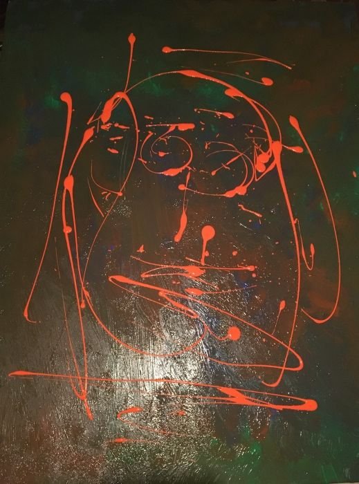
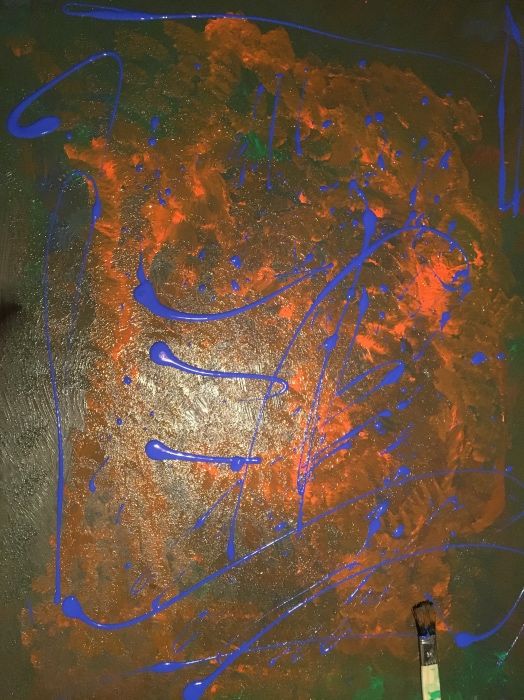
This gave me an interesting abstract background again.
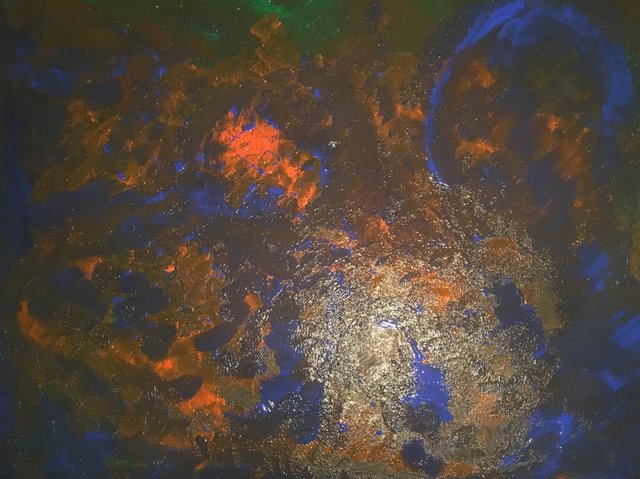
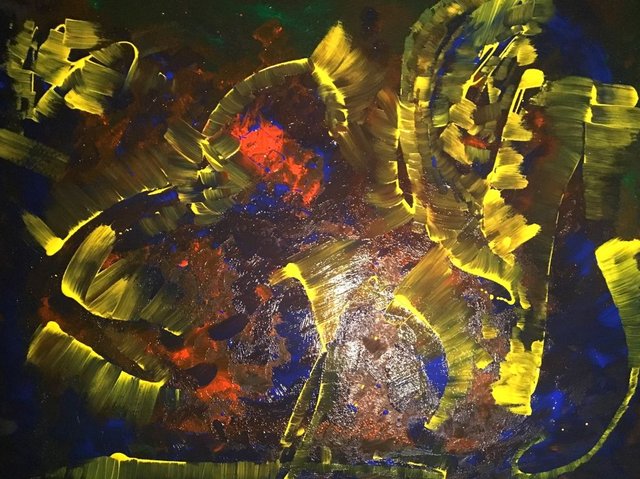
Time to add a few yellow highlights...

... and smear them with a broad brush again.
Now I added some black for the shadows.
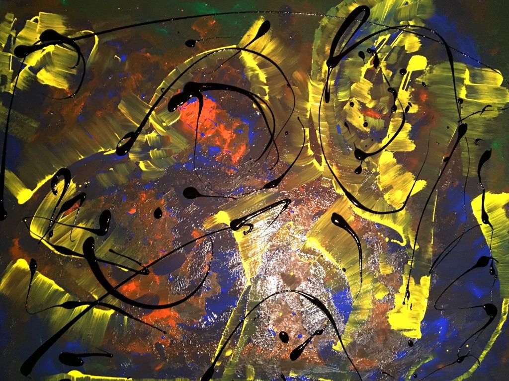
But instead of smearing them, I decided to dapple on the blacks with different sized brushes.
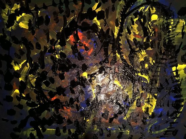
This way I got an interesting look, that has some similarities with hatching and also with impressionism.
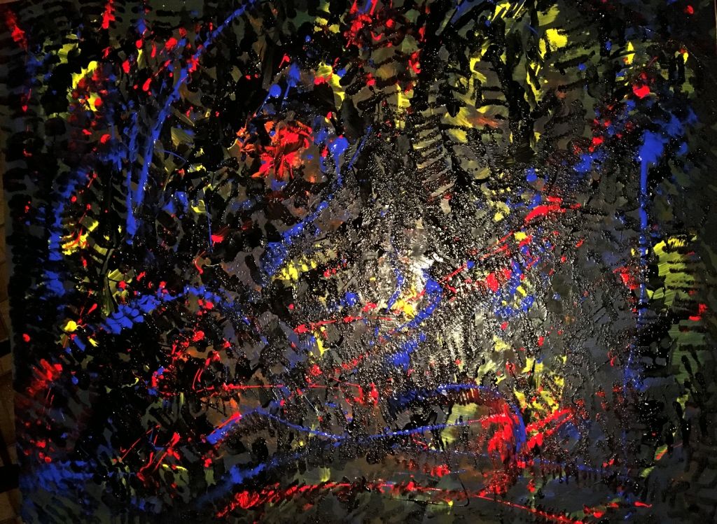
After the colors had dried, I was able to view the painting in daylight for the first time.
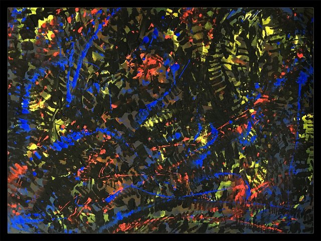
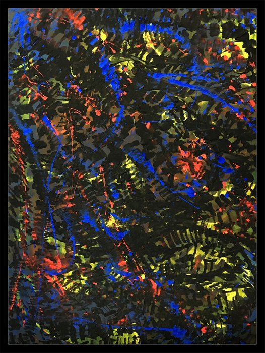
I guess, it would also work vertically:
I'm still a bit undecided, if the work is finished or if I should add another (lighter) layer.
What do you think? - Please let me know in the comments.
Thanks for watching and have a great sunday!
@shortcut - I'm posting about art, photography and other creative stuff.

Tolles Werk :) Ich habe das Gefühl da hüpfen einige fröhliche Zebras in einem Club mit bunten Farbscheinwerfern umher.
Oh, danke! Das ist mit Abstand die schönste und kreativste Beschreibung, die ich zu dem Bild bekommen habe. Big smile :-))
Awesome! Great to see the progress and how it evolves. Did you start with the end-result in mind, or just went with the flow?
I like how the different layers of colour interact with eachother. I, personally would add some white in there, but hey, maybe it's just as strong as it is and white would ruin it all the same. The choices an artist has to make, right? :)
Thanks for your valuable feedback! I just went with the flow (that's basically what I always do). And you're right, a white layer could really help giving it more structure and depth, but also could ruin it.
I guess, if I continue painting, the end-result will become totally different, so I just wanted to make sure, that nobody cries afterwards ;-)
Well, looking at it again after reading your comment, adding white could work, with a few more layers (as @basilmarples said) so as to blend in with the structure you already have. Then again, on second view, it does look like a finished work on it's own - there's already so much detail in there. So... Do what you feel you should do :)
And let us know! ;)
Thanks again Maarten! I guess I will leave it as it is, until I have a clear vision ;-)
In the meantime I just start painting another one.
It's so cool to get feedback from other artists and viewers. I never had this kind of conversation on the internet before :-)
Das Making Of finde ich super dazu! Interessant wie aus 'ein paar Farbklecksen' ein fertiges schönes Bild entsteht :-)
Vielen Dank! Freut mich, dass dir das Making-of gefällt. Es ist zwar immer ein bisschen schwierig während des Malens die Kamera zu zücken, aber ich denke auch, dass das für meine Leser einen Mehrwert darstellt.
Auf jeden Fall! Das solltest du öfters machen :-) Ich finde es jedenfalls schön zu sehen wie ein Bild entsteht. Manchmal sehen Bilder vorher ja komplett anders aus und man erwartet gar nicht das Endresultat. So etwas habe ich auch schon bei Landschaftsbildern gesehen und war dann überrascht was am Ende herauskam ;-)
Mach ich ;-) Aus eigener Erfahrung weiß ich, dass Posts, die ein Making-of enthalten, im Schnitt deutlich höher gevoted werden, als 1-Bild Posts des fertigen Resutats.
Some Pollock Stuff!:) Very nice!!!
I'm a huge Pollock fan. So I'm feeling honored, that you see some of his spirit in my work :-)
Yes, I had a lecture at university about his dripping technique and you are using his exact technique. I hope your painting gets as famous as those;) You advanced the technique of course:)
Of course and thanks a lot for your good wishes ;-) First goal is, that they become Steemit-famous.
I like the sense of depth a lot!
Thanks Alan :-) Glad, you do!
I like it. But it needs more layers. Im always a fan of having a focus though, so I naturally yearn for a simple mono-print in the centre of a single item of collage. something with clarity to give strength to the abstraction
Thanks Basil! Your feedback is really helpful and I can absolutely understand your point of view. I just wanted to make sure, that nobody says: "It's perfect, how much is it?"
haha! You NEVER know. Dude. If you get the price then its DEFINITELY finished!
Looks great.The painting in this condition looks a bit intense(The Vibrant Colors)💗💗💗..
I think adding a light shade would also be a good idea, it can give it a little mild look..
Thanks a lot for your feedback! I don't know, if an artwork can be too intense ...
At least you can look at it without burning your eyes, because of the overall dark look. But I also have the feeling, that a lighter layer could give it more structure and direction.
You are also right in your own prospective.
Well every one can have a different gaze. That's the beauty of art!
This is so mind relaxing while watching. I didn't get what it is actually trying to say but it is awesome.
Thank you! I'm glad, that it helps to relax ;-)
I think you could call it finished. I like it vertical.
Thanks for letting me know :-)
Most remarkable painting texture offering a tapestry that intrigues. Reminds me of an abstract stained glass.
Thanks for sharing this with us.
Thanks a lot for your feedback! I get that feedback about stained glass quite often. Maybe I should learn how to do real stained glass works ;-)