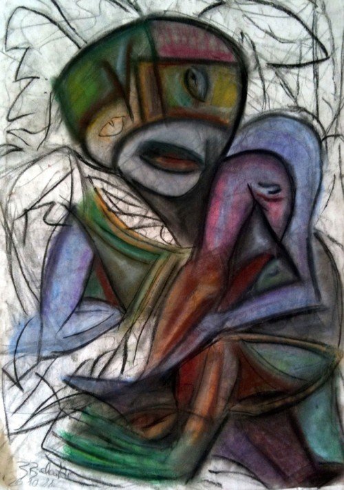
Artwork of the Day #43 - Phone Home
Todays artwork is called 'Phone Home' cause it somehow reminds me of E.T. the Extra-Terrestrial. I've done it using pastels and always thought of it being unfinished.

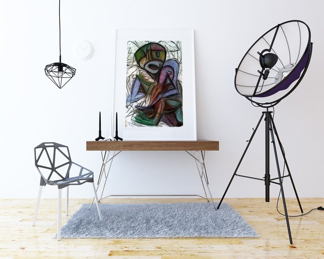
But when I searched for a suitable mockup template, I stumbled across this design interior and have to admit, that the structure of the chair and the lamp are perfectly fitting to the background of my artwork.

Do you agree? Let me know in the comments!
Thanks everybody for your great support! @shortcut
interesting lines and style. I like it!
Looks great!
Glad you like it.
Yes, I think it looks finished. The black and white background is a good contrast to the colours of the figure. Too much colour and it would get lost.
Thanks for your feedback. It's funny how I needed nearly 30 years and steemit to see that. But now it looks like if I carved something out of the paper and let the origin still be visible.
Yep, I agree, it would potentially get lost in a background. Plus the line work on the white is distinctly shortcut. Great work.