Painting a Mountain Landscape - Part 1 - Sketching and Blocking-In
I love painting mountains and one of the great things about living in New Zealand is there is plenty of them to paint! One of my favourite mountains to paint in New Zealand is Mt Talbot and Mt Crosscut which is located in the Fiordland region of the south island.
In this step by step painting demonstration I will show you how to paint this mountain landscape.
Planning the Composition
To begin with I gather my photo reference and decide on which photos I will use to plan my composition. It's quite difficult to get a perfect composition from a photo and so it is necessary to start making changes to the composition to create a pleasing art work that will engage the viewer.
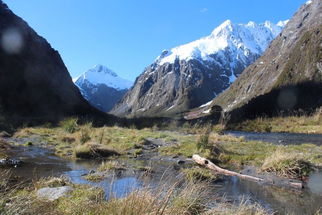
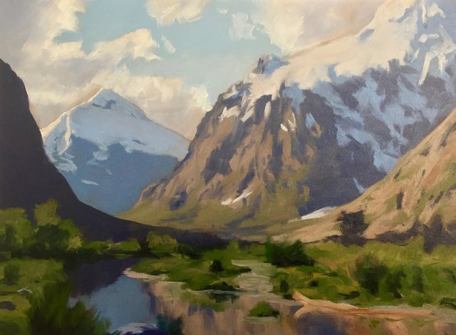
This is one of my photos of Mt Talbot in the distance and Mt Crosscut on the right. The great thing about this location is it already naturally forms a pretty good composition so when I came to sketching it and creating a composition I didn't need to move or alter too many things.
What I like about this photo is there are lots of shadows which is perfect for depicting a tonal dynamic in the painting and there are definite tiers of depth for creating atmospheric perspective. There is plenty of atmosphere and drama in this photo so this is great for creating a painting.
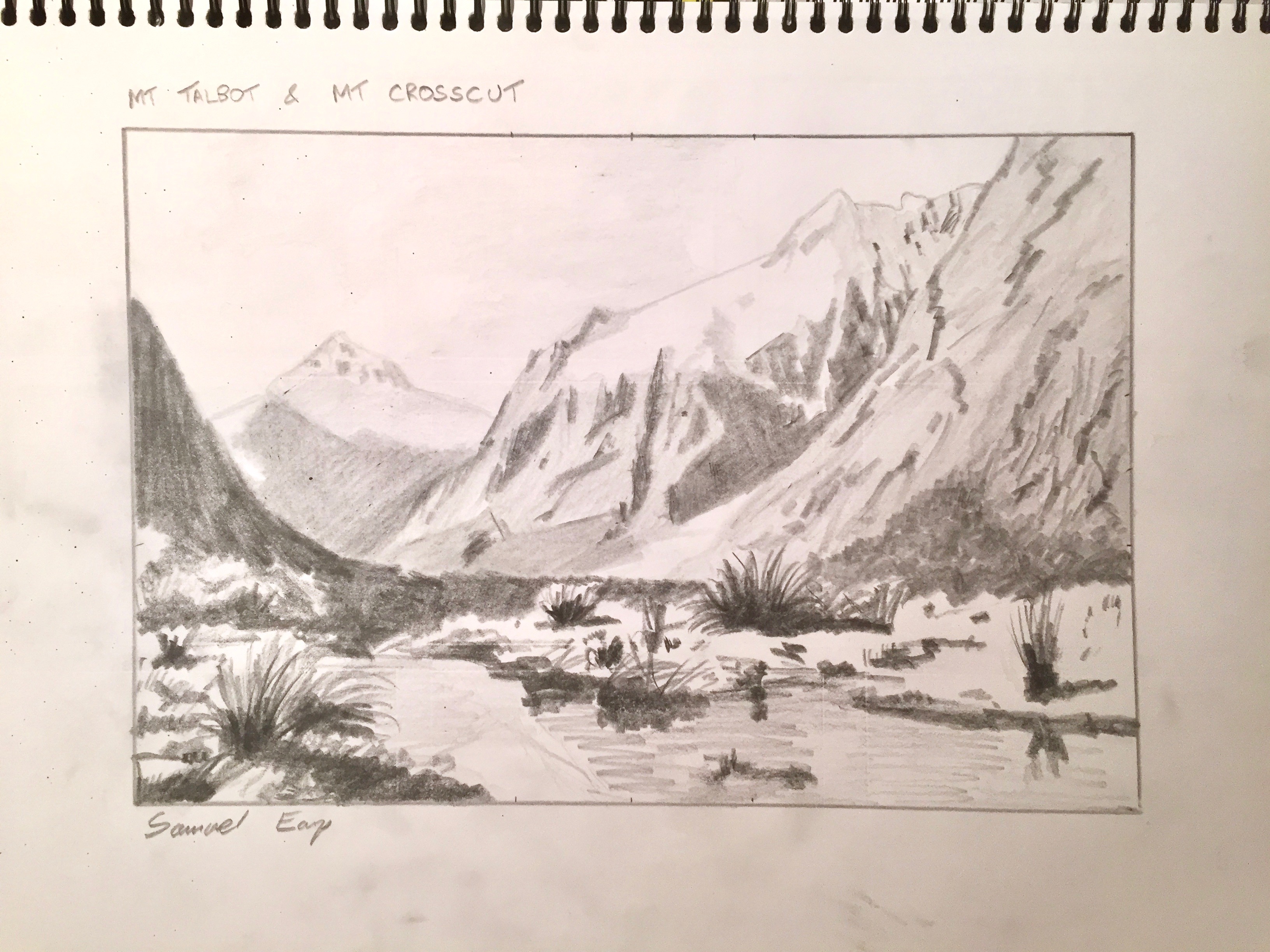
Pencil Sketch and Colour Study
After gathering my photo reference I sit down with my sketch book and draw a few quick thumbnail sketches to get an idea for a composition. This will culminate in a final pencil drawing which I then refer to when I start on the colour study.
Sketching is an important part of the painting process as it helps if you have an idea of where you are going and what the final product will look like. Sketching is not only good fun and good practice but it could also save you many hours of frustration in the studio as a result of a painting not working because your composition did not go to plan. Believe me, this happened to me a lot in the early days when I just went straight into painting with no prior planning, it was very frustrating and I have a mountain of failed art works as a result!
In my final sketch I have Mt Talbot as my focal point with the small stream leading the eye towards it. I use my pencil sketches to get an idea of the tonality of the scene and I achieve this by using a range of pencils including 4H, 2H, HB, 2B and 4B.
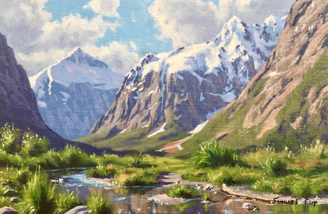
After completing my pencil sketches I work on a colour study which is really just a small painting, a miniature version of the final art work. Painting colour studies is really good fun, you can make your mistakes on these and easily correct them. They also make great little paintings which you can sell.
The most important thing about colour studies is that you can use it to determine the colour palette you will use and establish the over tonality and atmosphere of the painting. A colour study will help you to know the road ahead and they are great to refer to as you are painting you final canvas piece as you can match the colours.
My Colour Pallete
I am using Langridge Handmade Oil Paints, which include:
- Titanium white
- Cadmium yellow
- Cadmium yellow deep
- Yellow oxide
- Burnt sienna
- Burnt umber
- Cadmium red light
- Quinacridone magenta
- Ultramarine blue
- Cobalt blue
- Cobalt teal
- Pthalo green
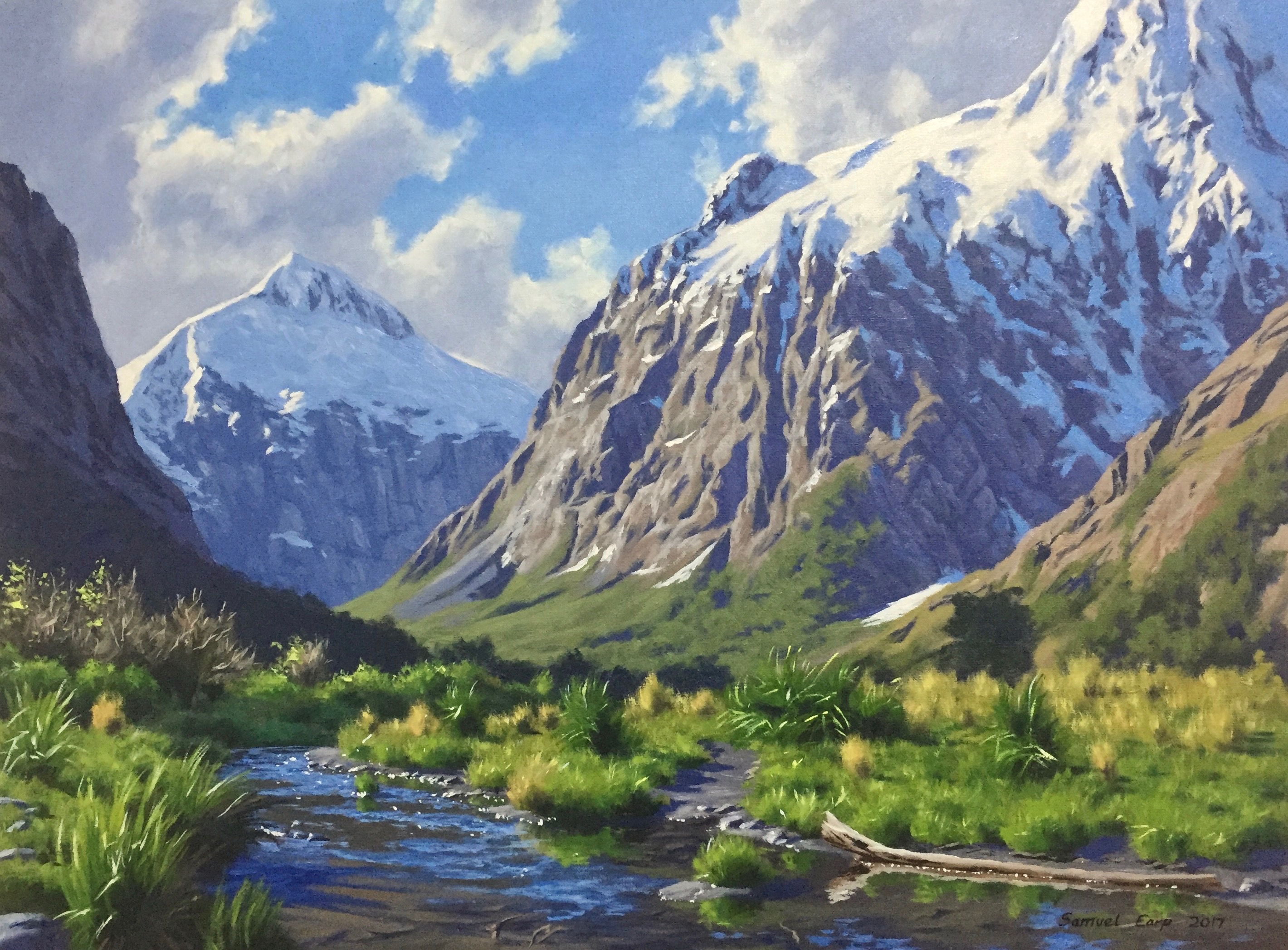
Beginning the Painting - Blocking In
I start my art work with an underpainting of burnt umber, this gives vibrancy and warmth to the painting as it comes through the paint layers. It also helps with establishing tone and colour as they are not distorted by the white canvas. An underpainting of burnt sienna or burnt umber also gives the painting a traditional look.
Once the underpainting is dry I sketch out the scene with burnt umber.
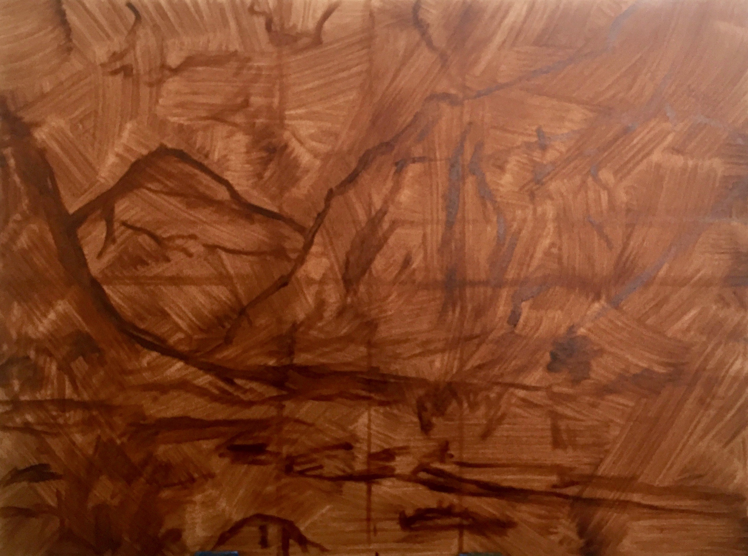
When blocking in the painting I start by painting the sky as this helps me to gage the overall tonality of the painting. I'm not worried about detail when blocking in the painting, for me it serves as a map that marks out the zones that I will work in once the painting is dry.
I mix the blue of the sky with cobalt blue, cobalt teal and titanium white. I mix the clouds with ultramarine blue, burnt umber which reduces the saturation of the blue and I add quinacridone magenta to give the clouds a violet tint. I increse the tone of the cloud by adding titanium white.
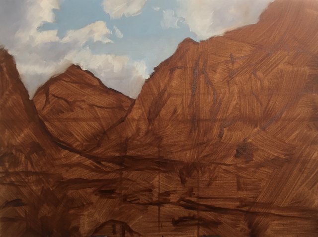
Next I start painting Mt Talbot, I am using large flat bristle brushes and I am using the same colour combination that I used in the clouds but with less titanium white. Using these same colours helps to create colour harmony in the painting.
I drop the tone of the shadows of Mt Crosscut which will bring it forward in the painting that will help to create tiers of depth.
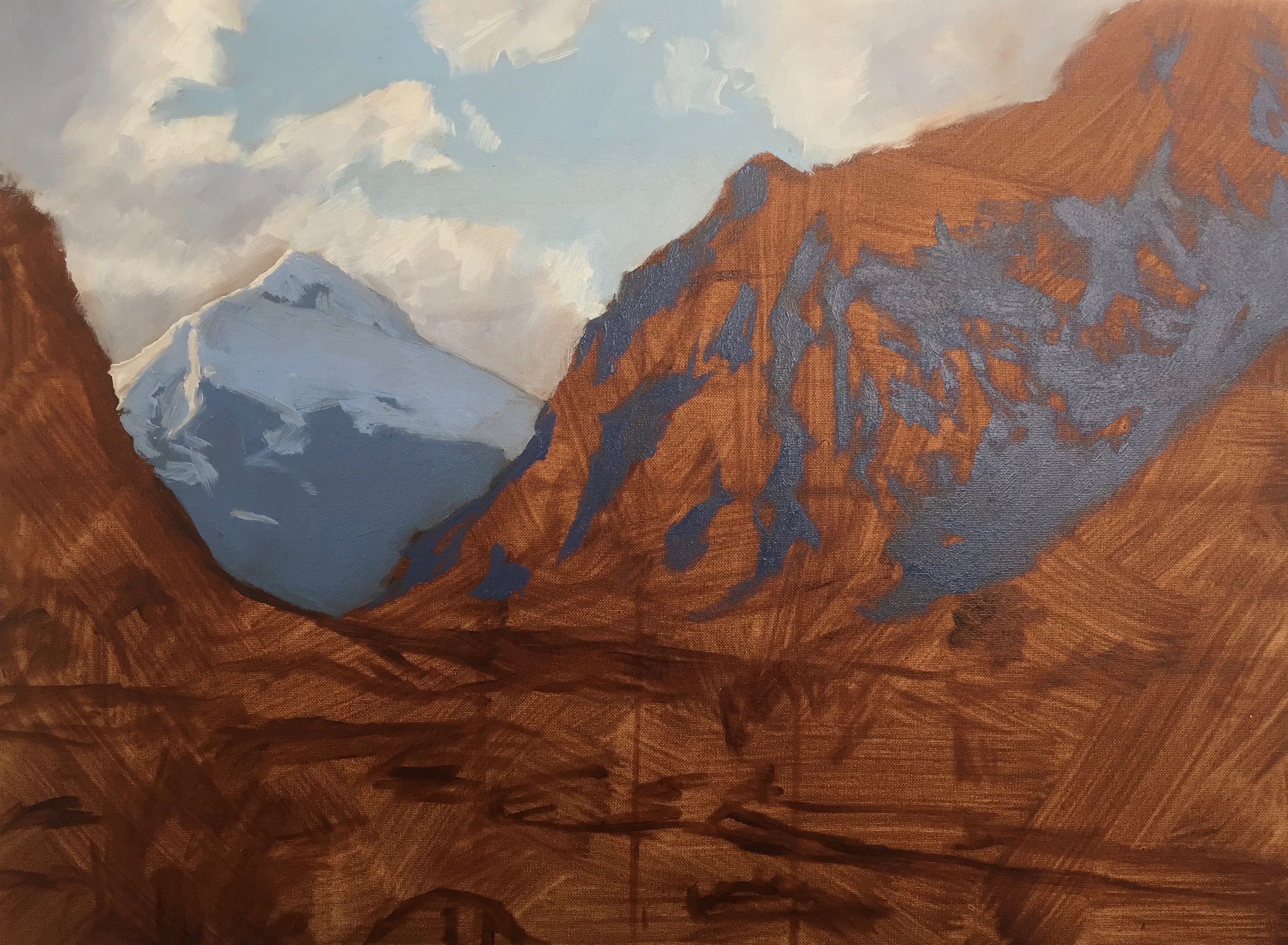
I start adding in the highlights of the mountain face of Mt Crosscut and again I am using the same colour combination I used in the clouds but with more burnt umber and titanium white.
I am not at this stage using pure titanium white for the sunlit areas of the snow on the mountains as this is my lightest tone. Whilst it appears white in the photo, most of the areas are not white and are actually darker. I was to preserve my lightest tones until the end of the painting so I mix the sunlit areas of the snow with the same colours I used in the clouds and plenty of titanium white to make an off white.
The snow that is in shadow was mixed using ultramarine blue, cobalt blue, a little burnt umber and titanium white.
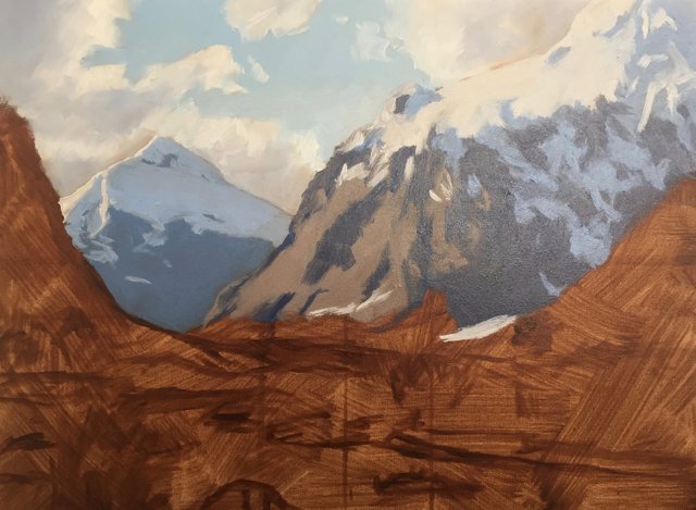
When mixing colour for the distant grass and foliage I need to bear in mind that green does not travel well over a long distance and so I will need to mix some desaturated hues. This is achieved by mixing yellow oxide, ultramarine blue, titanium white and a little burnt sienna to earth the colour.
It is important to make sure that the green is not too saturated otherwise it will come too far forward in the painting and the illusion of depth will be lost.
I paint the shadow of the mountainside of the land mass on the left side. As it is closer to the viewer I use darker tone as my tonal scale of lights and darks increases as you come towards the foreground. Again I use the same colour combination as I used in the clouds.
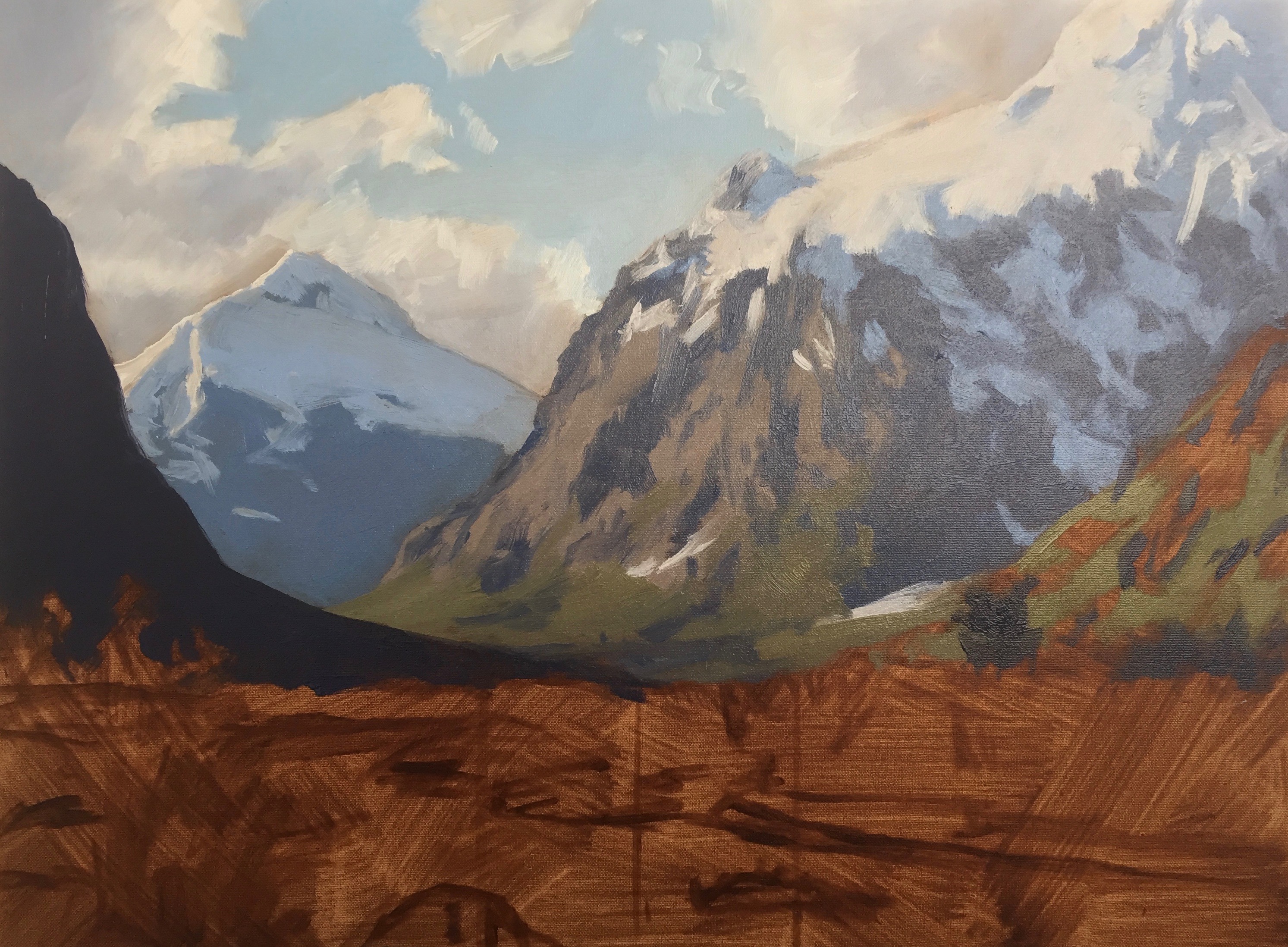
As I work on the lower half of the painting I paint the reflections in the water using the same colours and tones I used in the mountains which the water is reflecting.
I block in the grass, foliage and trees in the foreground this time using more saturated green. I mix these greens using a combination of cadmium yellow deep, ultramarine blue and I increase the saturation by adding a little pthalo green which really kicks up the mix. I earth these greens by adding either quinacridone magenta or burnt sienna.
I use similar colours for mixing the shadows in the foliage as the red in the quinacridone magenta and burnt sienna being the opposite to green on the colour wheel neutralises the mixture to create a very dark tone and even a near black.
With the blocking in stage complete I wait for the painting to dry before beginning the modelling phase that builds up the detail of the painting.
I hope you enjoyed this blog post, stay tuned for the next part where I explain how I build up the detail of the painting and refine the image.
If you found this blog post interesting and helpful and you like what I do, any tips to help support my art career would be greatly appreciated.
Bitcoin: 1Px9bSmVfw69F2uEUso8Zz46BV2DmGLZJg
Litecoin: LQYz47A7pZfMLRjqpR29YbxnY36aoLrFAT
Dash: XmHqFwzmyhax3zm2Q3hVhqAYfMZ2AqaZ3f
Check out my website for more painting demos and my art: samuelearp.com
Subscribe to my mailing list for news, new paintings and art tips and receive a FREE digital art print download of one of my seascape paintings suitable for printing an image of any size: https://www.samuelearp.com/subscribe/
Part 2 of Painting a Mountain Landscape to follow soon....
This is great art !! i like it :)
Thanks @aek081969 :)
I like your post @ samuel-earp-art
Thanks @sandra12 :)
I love looking at the process of creation. Great job.
Thanks @pratickr, I like your wildlife photography.
That's literally right next to Milford Sound where I worked and lived! :-)
Yeah, its about a 20 minute drive away. I always love stopping at this view when I am on my way to Milford.
Very well executed tutorial for a great piece of original art. Best original art post I've come across.
Thanks @corpsvalues :)
If I don't know it was a painting, I would have thought that I'm looking at a real photo of the mountain. Very nice art!
Thanks @tiffanyrej :)
Beautiful, nice work!
Thanks @gerben :)
Excellent work, infact more than excellent, couldn't find a word in the dictionary to express my feelings after seeing your work!
Thanks @ghulammujtaba :)
Crikey. Your artwork has just absolutely blown me away. What a talent.
Thanks @coffeehub :)