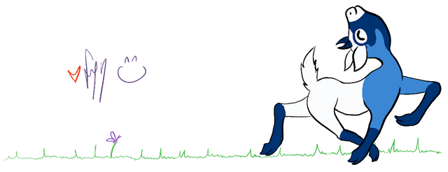
The sketchy lines look cool, think they need to be a lot lighter (like you've drawn over a construction sketch) or a bit lighter or different colour and a lot neater (like you've hit up a drafting table wit rulers and protractors and compasses and stuff). It doesn't look too bad at all.
I don't think it' a dumb idea, you're probably the only one that can decide if it's worrth finishing or not ;D

Thanks for the feedback! It for sure will be cleaner but you bring up some good points and some sort of how I was thinking about it. I am thinking perhaps keep the lines more black but thats based on wanting to print it on a mug or something for my morning coffee :)
I think the version you described would actually be super cool for like framed print on wall or something. Thanks again for input it actually really helps. After hearing others in this thread it makes me know I want to finish it. I sometimes get stuck in my own head and lose all objectivity lol so its nice to get feedback.