125 years of modern art, visualised [OC]
It's blasphemy, really.
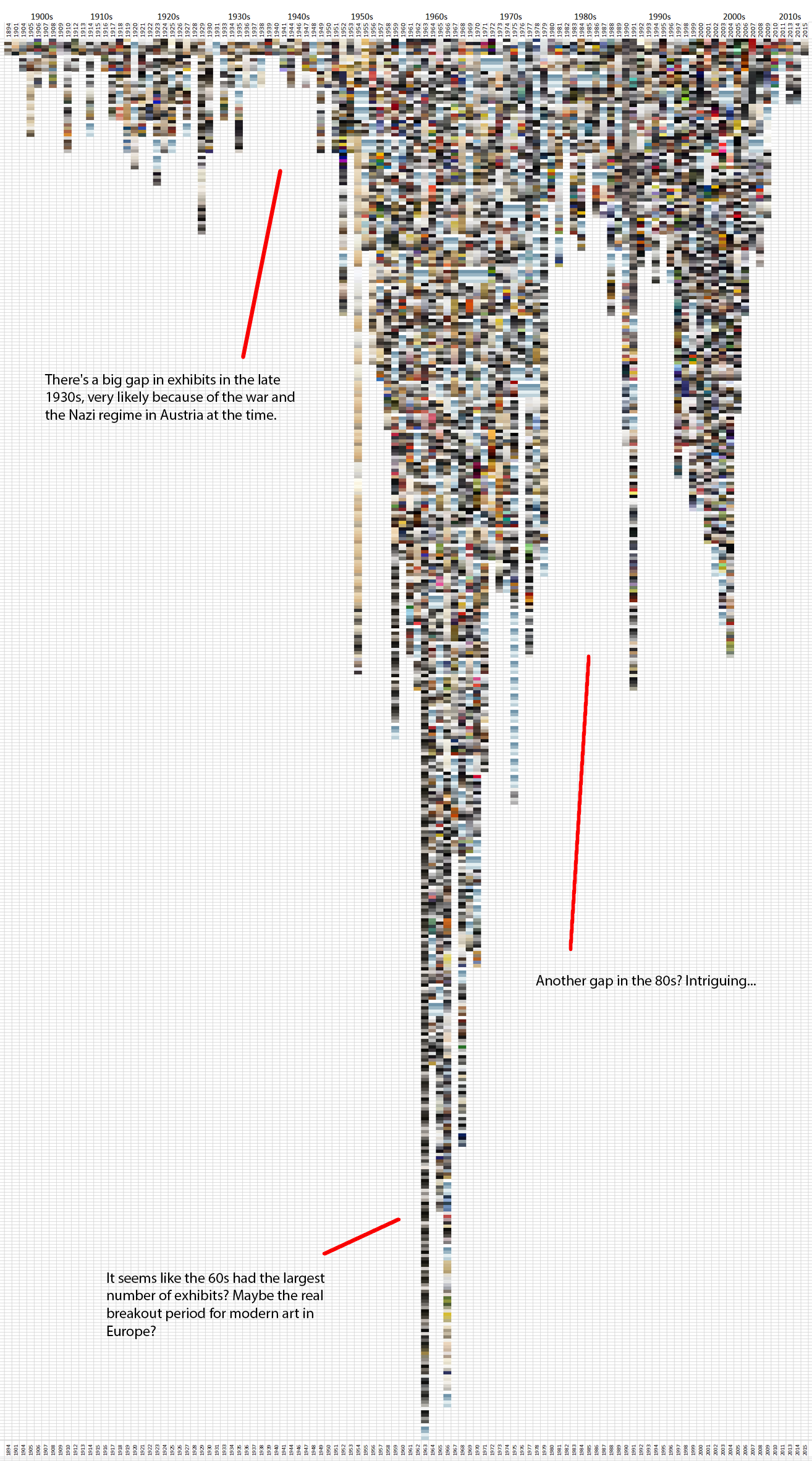
I've reduced around 5000 objects, exhibited at the Museum of Modern Art in Vienna, Austria since 1894. (MUMOK)
To be concise, I've reduced these 5000 exhibits (paintings, sculptures, etc.) to their 5 most commonly used colours and put them in a graph. So each box represents one of those 5 colours, and 5 together make up an exhibit.
Why one might do this? I don't know. It's a bit silly really. But it looks kind of cool and it does tell you a bit about history.
Let me know if you're interested in how I made this, I'd be happy to share my methodology!
All exhibits sorted by year (at the top) and by exhibit name alphabetically.
So pretty random sorting actually.

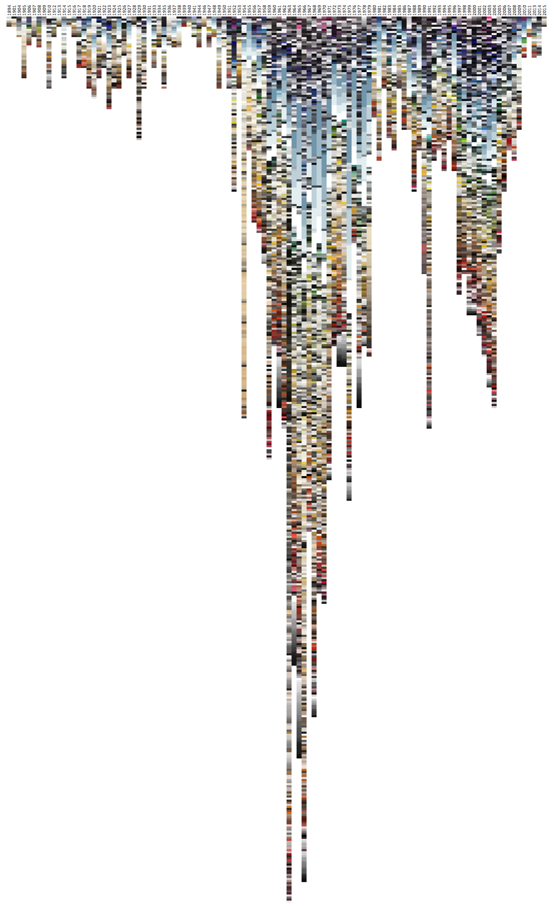
This time the exhibits are sorted by hue 
And finally, all exhibits sorted by brightness


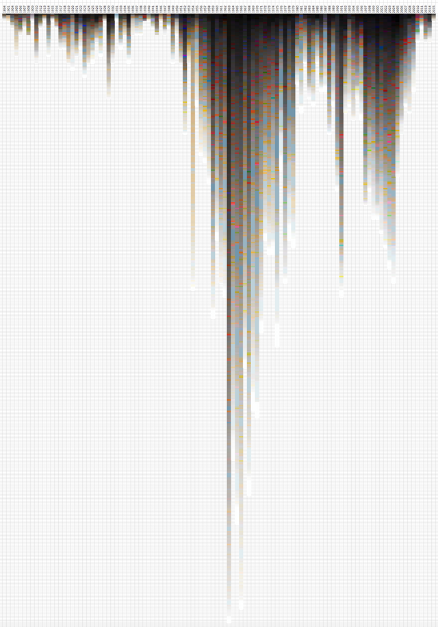
Can't really draw many conclusions from this little fun experiment with colours and data, but it does serve as an example of how colours and forms can feel completely different when arranged (or sorted) differently :)
I don't post much, because it's a lot of work to make something like this, but If you like these kind of posts, I would be super duper happy about a follow!! @remuslord
Thank you and happy steeming! :)
This is incredibly interesting and I'm sure it can even be a helpful tool for art students.
If you'd like to write a longer post explaining your methodology in making these, I for once, would be very interested in reading it!
Thank you for sharing <3
ok! i'm glad you liked it! maybe i'll make a longer "how-to" generally on how to extract colour data and put it together like this :)
Thank you ^_^
Looks awesome! And really interesting, too. Why do you think there was a dip in the 80's?
Probably cause people got distracted by TV, Music and Video Games :)
Also during the cold war years I think most people were too stressed out to produce much. I do like to think that in the 80's extremes like oversaturation (think all the cartoon series of that time) were pretty prevalent.
I wonder what would happen if you'd do something similar with music (maybe album covers?). Perhaps if you have a sound wave along with the visual data maybe we can "fill the hole" during the 80s.
Awesome post btw.
cool thats a neat idea with the album covers.
Dan! Great to see you on here mate :). I have absolutely no idea to be honest. Hoping some Austrian artist on Steemit might know the answer...
Thank you squire. I hope someone can shed some light on it :)
This is really impressive! I wouldn't be at all surprised to see some image revealed from this data, like some deity or something with a deeper meaning. Art is being created all the time by millions of people, with the right sequencing one might see the tapestry of life itself as it's minuscule threads come together. Mixing sound with art who knows what things it may reveal?
Much love and light,
X
Believe it or not this thing you did here could be art as well and it's quite interesting to see all this data in a graph making it much more digestible for the mind :)
keep doing it!!!
@originalworks
The @OriginalWorks bot has determined this post by @remuslord to be original material and upvoted it!
To call @OriginalWorks, simply reply to any post with @originalworks or !originalworks in your message!
@plushzilla you encouraged me to post this, so here it is :) thanks!
Ha! I love this! This is a really interesting concept. I'd love to see more stuff like this. The combination of a more scientific analysis of something as subjective as art is intriguing.
I got excited thinking about a 3 dimensional visualization of HSB values (and over time if you want to make it 4d)! Have you tried to show this information to the curator to get some perspective or commentary (context) on the visualization? That would be very interesting to follow up in my opinion!