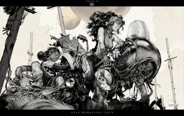
The art of detail and focus composition
When doing black and white drawings or very complex figures with many details, it's best sometimes not to put too much stuff in the background. This lets the design particles breathe and be noticed and understood at first sight by a quick eye. Many artists don't understand this and they overcharge their drawings with elements.
In part, this is one of the reasons why I admire painters who will do both the main characters with the main spaces, and also do secondary spaces with almost as much detail. I've made a post where I mentioned this before, but now I wanted to show an example of the opposite.
Many character designers will often also draw their characters with a white background or a simple gradient. However, making very simple backgrounds (in this case, the moon and electricity posts) will lead to a much more complete effect even if the actual painting done is very little and the main background is actually white. This tip also applies for normal graphic design, particularly with typography. The elements need to breathe!

Congratulations @reksnek! You have completed the following achievement on the Steem blockchain and have been rewarded with new badge(s) :
You can view your badges on your Steem Board and compare to others on the Steem Ranking
If you no longer want to receive notifications, reply to this comment with the word
STOPDo not miss the last post from @steemitboard:
Vote for @Steemitboard as a witness to get one more award and increased upvotes!