Insight into some pieces of art
This is designed to be less of a tutorial and more of an insight into the process of a particular piece.
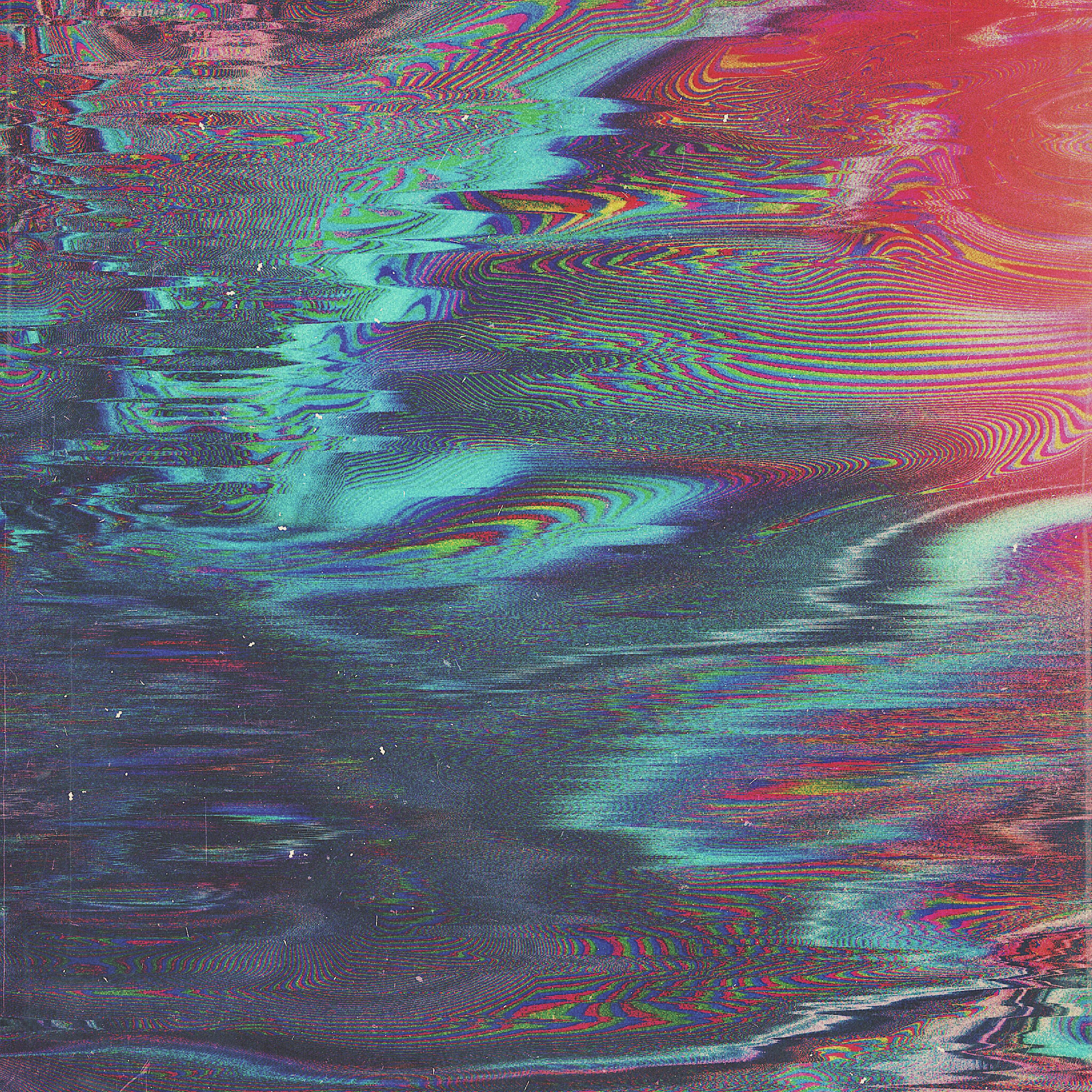
Description: This week's WW is gonna be a tough one. I thought I'd challenge myself this time (it's like that song "winning feels better when you take a little damage" :p), so I've chosen an abstract piece, which is tough to explain by itself, but on top of that it's a glitch art piece. With that in mind I hope you do excuse me for not having many design choices to elaborate on in great detail.
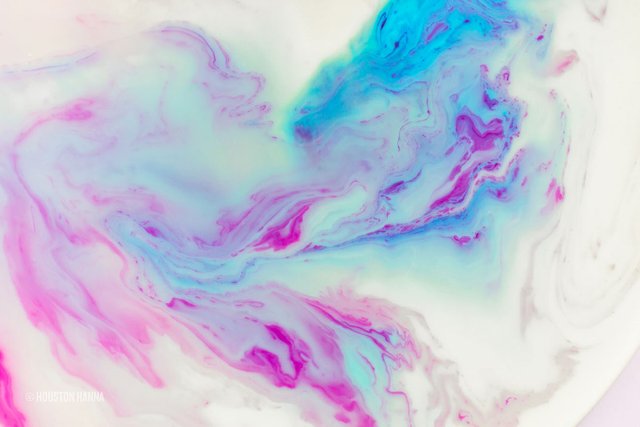
Right, now that the disclaimer is out of the way, let' get started. This piece is based on 3 core "looks"/visual effects. The first is ink marbling, which looks like this:
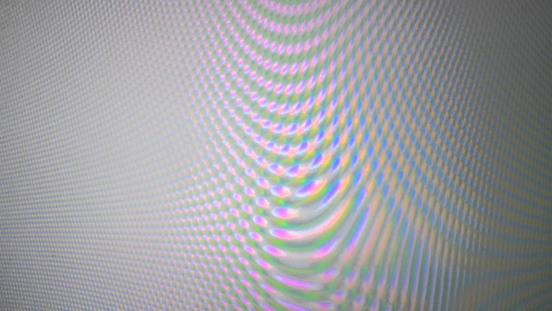
The second is an effect known as moire. It looks a bit like this, it's hard to find a good picture of it online, but it's the kind of effect you get when taking pictures of an LCD screen with your phone:
The third, is the glitch art aesthetic. I'm sure you're all familiar with this so I won't add a picture.
With pieces like this, it's more about experimentation and trial and error than it is about a specific design process or principles. What I would recommend is starting off with a blank canvas, messing around with different techniques, throwing stuff together and seeing what sticks. Essentially you go by eye. That being said, as with any piece of art, it's helpful to have a core concept or goal, even a vague one. For example, with this piece, after the first few minutes of messing around in photoshop, I decided I wanted to represent "liquid glitch" and that's what I kept in mind as I was playing with it.
Starting in photoshop with a blank 2k x 2k canvas, I began this piece by throwing bits of colour around using the brush and gradient tools, and filled the entire canvas with a mix-mash of various colours, sort of like an abstract soft gradient background. Next I smudged the colours together, adding visual interest, making the pattern less uniform and looking more like what you'd expect from ink marbling. Next came round 1 of colour correction. Adjusting HSB (hue, saturation and brightness) till the colours looked more aesthetically pleasing. Next some curves for contrast, and some subtle gradient maps to make the piece more cohesive.
Next, I started making it a bit glitchier by using a displacement map of some VHS static. Essentially this is almost a sort of "digital marbling" if you think about it. Next step was the moire effect, for which I will make a more in-depth tutorial in an upcoming Tutorial Tuesdays post. But essentially I used an RGB pattern and liquified and warped it. After this I kept on layering distortion effects until I was happy with how the piece looked, and was satisfied that it fit my concept of "liquid glitch". Then the next step was a final round of post processing, colour correction and finally, I decided this piece looked a bit too digital, so I justaposed some "analogue" glitches/effects, primarily some dirt/grit textures, light leak textures and finally some film grain.
My tutorials