Tutotial made by me: Semi-realistic Madonna portrait / Tutotial hecho por mi: Retrato semi realista Madonna
Hello friends, how are you? I'm going to tell you briefly what I think is fundamental to make a portrait, which although it's not entirely realistic, gives us that feeling.
Hola amigos, como estan? Paso a contarles brevemente lo que a mi entender me parece fundamental para hacer un retrato, que si bien no es del todo realista, nos da esa sensación.
.jpeg)
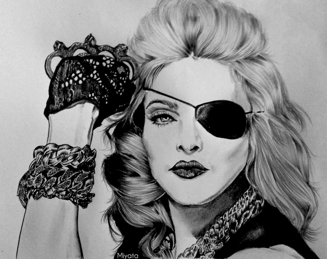
I think the eyes are the ones that will define if our drawing is on the right track or not. That's where we have to start. What I recommend is first to mark the separation of both, the distance and start to shape it. The contrast is fundamental, as well as the eyelashes and the light in the pupils. Remark with the pencil (2HB) as many times as necessary to give that life, leaving space for the light of the pupil and the darkest are the eyelashes.
Creo que los ojos son los que van a definir si nuestro dibujo esta bien encaminado o no. Para ello debemos empezar por ahí. Lo que recomiendo es antes marcar la separacion de ambos, la distancia y empezar a darle forma. El contraste es fundamental, asi como tambien las pestañas y la luz en las pupilas. Remarca con el lápiz (2HB) las veces que sean necesarias hasta darle esa vida, dejando espacio a la luz de la pupila y que lo mas oscuro sean las pestañas.
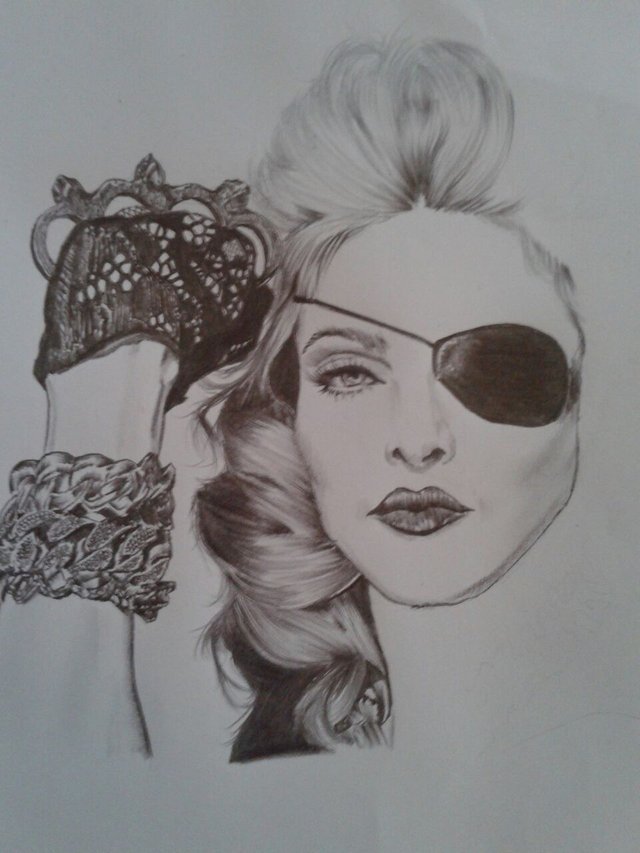
As for the nose and mouth, what I recommend is not to mark the pencil strongly. Mark only the contour very gently and from there begin to give shadows outward and then inside. It should not be marked as if it were a cartoon, the change should be natural.
En cuanto a la nariz y la boca, lo que recomiendo es no marcar fuerte el lápiz. Marcar solo el contorno muy suavemente y a partir de alli empezar a darle sombras hacia afuera y luego las de adentro. No debe quedar marcado como si fuera un dibujo animado, debe ser natural el cambio.
.jpeg)
The hair, not just random lines, should give the sensation of movement and shine. To do this, we use strong strokes until they fade, and on the opposite side we perform the same action. As if they were going to come together but in the middle they are lost. The longer the strokes are and the better they are lost, the more successful the sensation will be.
El pelo, no son solo lineas al azar, deben dar la sensación de movimiento y brillo. Para ello, empleamos trazos fuertes hasta desvanecerlos, y en la parte contraria realizamos la misma acción. Como si fueran a juntarse pero en el medio se pierden. Mientras mas largos sean los trazos y mejor se vayan perdiendo, mas lograda va a estar la sensación.
.jpeg)
We only need to pass our drawing to the PC and use Ps to achieve the color. The technique I use is very basic. We are forming layers and reducing the opacity of the color so that the lines are not lost.
In the same way we can overexpose the image so that the lines and shadows stand out, depending on what we want to achieve. With the opacity we get more pastel colors, like an old photograph. Without it we enhance the lines and we will have more defined colors.
I hope it served you, thank you!
Solo nos resta pasar nuestro dibujo a la PC y usar Ps para lograr el color. La tecnica que empleo es muy basica. Vamos formando capas y reduciendo la opacidad del color para que no se pierdan las líneas.
Del mismo modo podemos sobreexponer la imagen para que las lineas y sombras resalten, dependiendo de lo que querramos lograr. Con la opacidad logramos colores mas pastel, como una antigua fotografia. Sin ella realzamos las lineas y vamos a tener colores mas definidos.
Espero que les haya servido, gracias!