Op Art - Crypto Art Challenge [Round 4: Litecoin Edition]
Hello everyone! Today I'm sharing my participation on the Crypto Art Challenge in it's round 4, hosted by @sndbox, this edition is dedicated to Litecoin. The challenge is to pick an artist or style and transform the assigned logo into a piece of art and here is my take on it.
If you want more information about the challenge you can click here.
The Inspiration:
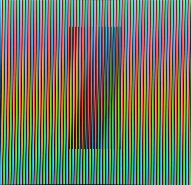
I was inspired by Op Art or Optical Art, the art that uses optical illusions. The piece I chose was Chromatic Induction Dual Frequency Permutation, by the artist Carlos Cruz-Diez. The piece shows the dynamic behavior of the color and how it plays with the viewer's perception.
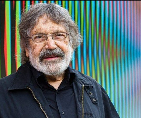
The Artist:
In my works, color appears and disappears during the course of a dialogue with real space and time. What also emerges is the undeniable fact that the information we have acquired and the knowledge we have memorized throughout our lifetime are, probably, not true… at least to some extent.
When we view color through an “elementary prism” that has been stripped of pre-existing meanings, it can awaken other sensory perception mechanisms that are more subtle and complex than those that have been ingrained in us by our cultural conditioning and the constant, ubiquitous barrage of information we face in our contemporary society.
Carlos Cruz-Diez. 1989.
The Process:
I begin by opening Adobe Illustrator with a work space of 1000x600px, I inserted the image of the piece of art to use it as a reference for the color palette. And then I added a rectangle to which I added a gradient effect with the colors of the palette.
.png)
I adjusted the width of the rectangle and the inclination of the gradient.
.png)
I located the model rectangle to the left of the work space.
.png)
And then I copied.
.png)
Until I had it all covered it.
.png)
After doing the logos vector on another window, I inserted into the main work space.
.png)
I picked some of the rectangles and sent them in front of the logo.
.png)
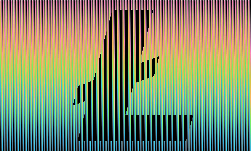
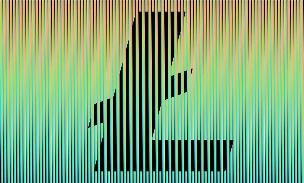
And this is the end result.
.png)
For the first image in this post I changed the colors to adjust the final product until I liked it, but here is another version of the image.
Thank you for passing by and reading my post.
Resteemed your article. This article was resteemed because you are part of the New Steemians project. You can learn more about it here: https://steemit.com/introduceyourself/@gaman/new-steemians-project-launch
cool looking neon sign kinda look, please feel free to join my current Steemit #contest here https://steemit.com/contest/@isteemithard/design-isteemithard-a-profile-picture-avatar-contest-12-winner-of-11