A little Peony painting, step by step - New work by @mayasky
Hello all!
How are you all doing this fine summers day?
Today I wanted to share with you a little painting I painted very recently of a single white peony.
This July I will be going to Norway to have a summer exhibit in my hometown and the theme for the show are Flowers!
I simply love flowers! To me they are just magical.. They can light up any room and always make my day better.
Its also been the most wonderful excuse for spoiling myself with tons of flowers these past few months, haha!
This little peony is one of several smaller works I'm making for this show, especially keeping in mind those who would like to purchase an artwork at a friendly nice price ;)
So let me show you how I went about creating this one;
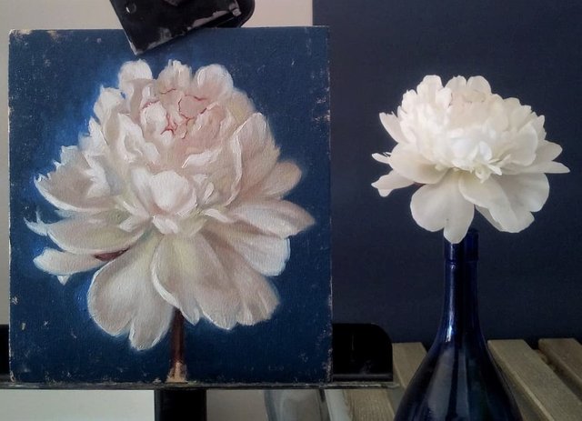
''White Peony'', Oil on panel, 15 x 14 cm.
For this painting I worked on an MDF panel which I covered with three layers of white acrylic gesso on both sides of the panel. Then I sanded the panel with a 600 grit sandpaper to make it extra smooth ( I like to paint on a smooth surface..), and put a thin layer of burnt umber hinned With Senneliers green thinner medium to give the panel a nice nuteral midtone value to start painting on.
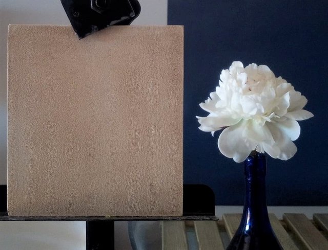
This is what the panel looked like before I started painting on it..
The next step was to make a drawing of the flower to get the big proportions in and place it well on the panel.
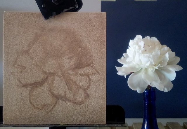
For this step I still only used burned umber to make a sort of underpainting.
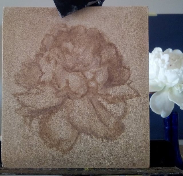
Above you can see the finished underpainting. This is a fairly rough placement of the more charactaristic petals and shadows of the flower.
Now its time to add some color!
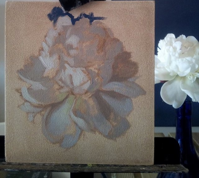
For this flower I first started with mixing a couple of general shadow values, a couple of midtone values and a couple of the values for the light. I would mix one cold value and one warmer value. To have colormixes withing the same value but with different temperatures I find is especially important when I am painting objects, or in this case, flowers, that are white. This is because the values are so close together that the only way to describe form is by temperature. Warmer temperatures will seem brighter and nearer and colder temperatures will seem further away and attract less attention.
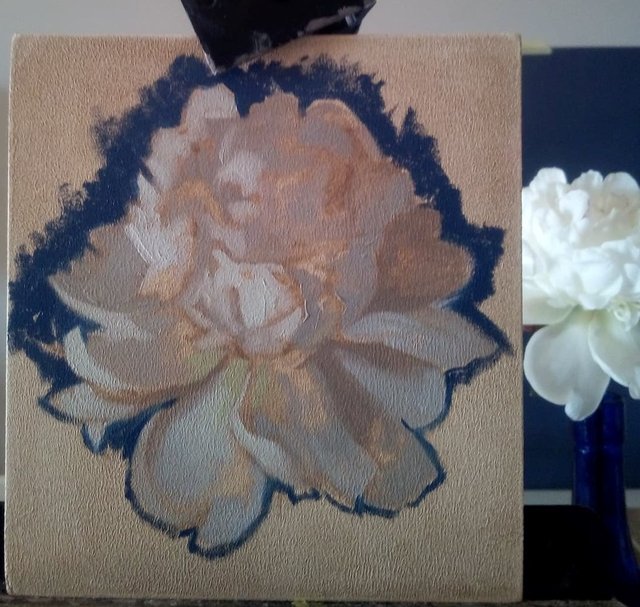
Getting the background in helps me to start carving out a more presice outline for the flower. It also helps in adding a sense of light and to determine more of the values.
The finished painting
Then I just have to spend (A long) time digging out all the little shapes from the larger shapes, hehe! A tip to make the lighter areas seem brighter and to give them a stronger impression of form is to add some extra thick paint. Also, try to keep your shadows more transparent and thiny painted. This way of thinking supports the theory that ''Light is form, shadow is atmospher''.
So there you have my little Peony painting and some of the process behind painting it! :)
I hope you are all having a wonderful and creative day!
Congratulations @mayasky! You received a personal award!
You can view your badges on your Steem Board and compare to others on the Steem Ranking
Vote for @Steemitboard as a witness to get one more award and increased upvotes!