3 Common But Little Known Portrait Painting Mistakes
Do you struggle sometimes with getting your acrylic portraits to look lifelike? Many artists do. It may be possible that you are making one or more of the three common mistakes I'll mention in this article.
I've been painting portraits for nearly 25 years, and teaching for the last two. While teaching and critiquing students' work, I've noticed similar mistakes crop up again and again.
The purpose of this article is not to put anyone down.
My goal is to simply show you a few of these mistakes--identify and take the mystery out of them--so that you can be intentional as an artist and avoid making them in your portrait painting.
So, to demonstrate, we'll use a photograph of an attractive young woman. I'll post it here in it's unedited form. Obviously, this is not a painting, but rather a photo. But since we strive for realism that would be on par with a photograph (or better if painting from life) this picture will be an example of a fantastic, realistic portrait.
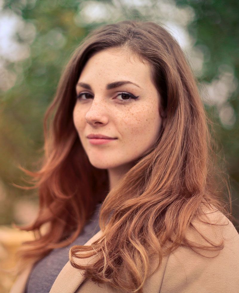
Notice the pose: the woman is smiling gently, the lighting is smooth and even over her face. If I painted a portrait like this, I would be very happy with the results, and I think you would too. The form of her face is accurate, the values, shading, tints and colors, are all in the right place.
That is why it looks realistic.
Now, using Photoshop, I edited this image, and I'll do a side-by-side comparison between the original photo (we'll call it the reference) and then the versions with the mistakes. I'll show you three of the most common. But not many artists are aware of them. Here they are...
1--Over-emphasizing certain details.
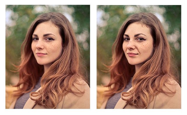
An artist may see a wrinkle under the eye for example, or running from the nose to the mouth, but the tendency is to make it way darker than it really is--in real life--or as shown by the reference photo. It's great to be able to see the detail, but too much detail can detract from realism, rather than create it.
You'll notice angle of the eyebrows are exaggerated. Even the freckles are too large and too dark. That happens often. We observe a feature, a characteristic on someone's face. But then we overdo it. Like a caricature, we unintentionally make it too prominent. And that detracts from realism.
2--Over-simplifying complex shapes or angles.
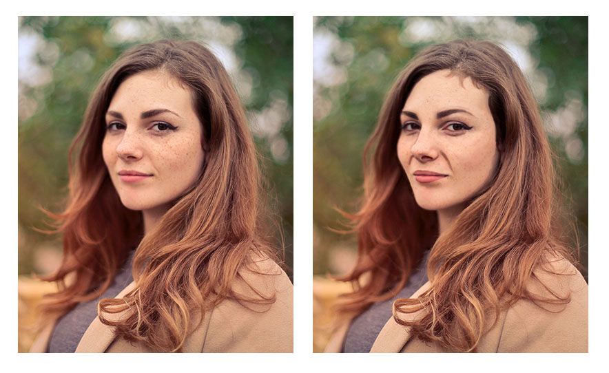
An artist may see the wrinkle stretching from the nose to mouth that shows when the subject is smiling. But they paint the shape as one straight line when, in reality, there are a couple different angles merging together to create what looks like one straight line.
In other words, they take a jagged kind of line and smooth it out.
The angle of the woman's cheek and jaw on the left side (her right) is another example of this. Notice how in the reference photo, it has three distinct curves (you could call them hills) running from the eye down to her chin. But when this over-simplification mistake is made, those curves would be merged together into one line--dull, lifeless, and inaccurate.
One final example would be the woman's eyebrows. Whereas in the original reference photo they have slight peak to them, here they would be painted completely smooth and curved.
The result looks as if they are painted on.
In realism though, even though everything is painted on, we are always trying to defeat that fact, and create the illusion of three dimensional reality on a two-dimensional surface. Nevertheless, the mistake of over-simplifying details often persists.
Why do we do this as artists?
Because, as human beings we want to order our world. But in nature, there is randomness; that's the way God created it.
There is beauty in that irregularity. So we need to learn to see what's really there, and paint that, rather than what we think is there. That is always the challenge. Every artist, no matter how experienced, has to fight that tendency, myself included!
3--Painting (and drawing) symbolically rather than representationally.
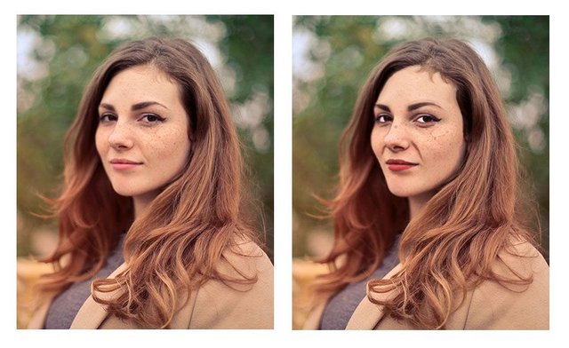
We are taught from childhood that eyes are white, blond hair is colored yellow, lips are red, and so on.
That's just how we learned to color our coloring books. And so we take that into creating realistic paintings. And we end up with eyes that are way too white, and all the other things.
In reality, eyes actually appear grey, and they can be darker than the skin around them.
Why?
Because the eyebrow ridge, eyelids, and eyelashes cast their shadows over the eye, but once you get below the eye into the cheek, the shadow dissipates. And the skin is actually lighter in value that the eye. That is just one example. But we do it all the time.
You can see from the image how odd it looks to have eyes that are that white. Especially when you compare it side-by-side with the reference photo.
A great tool to overcome this is the Value Checker tool. I made one that you can print out, and what you do is hold up the square that has the closest color and value next to the area in question on your painting. Then set that same square above the corresponding area on your reference photo--and see what the difference is.
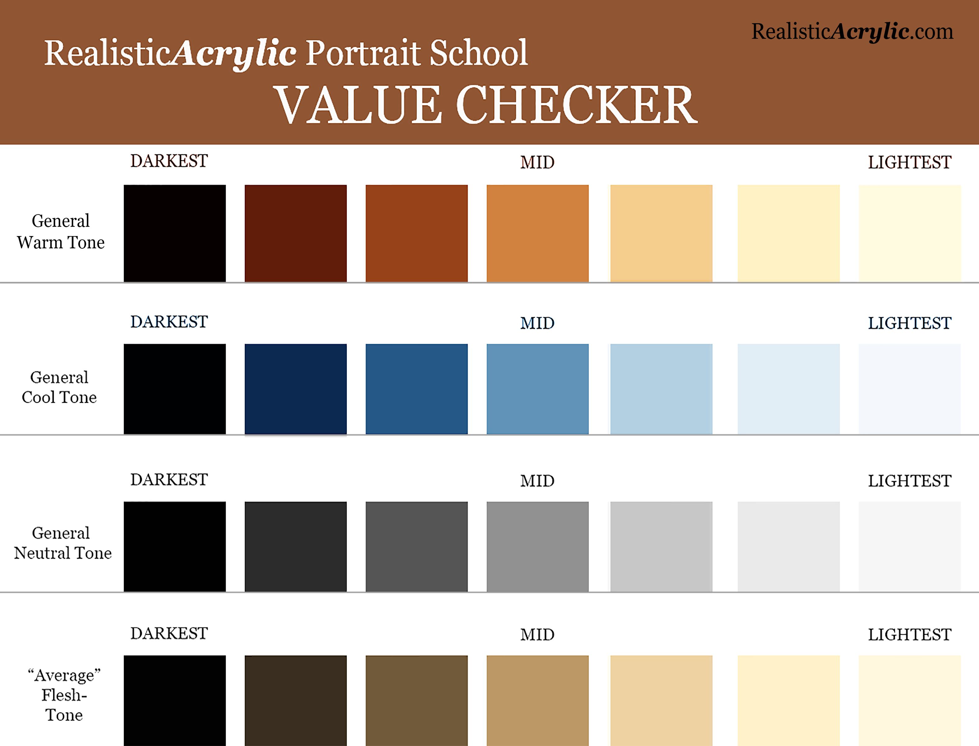
Do you need to go darker or lighter?
Or, do they match? That's obviously what we're shooting for. If they don't, now you know exactly how far off you are, and you can adjust as needed.
It's not cheating.
It's a tool to double-check yourself and help you do your best work possible.
You can download a full resolution version, below, for free and then print it out and keep it as a handy tool in your studio. Let me know how it helps.
http://mattphilleo.com/get-value-checker-tool/
I'll sum up with this: it's a never ending struggle to paint realism, because we have to fight inherent human tendencies. But it's a worthy struggle. If you continue in the battle, you'll amaze yourself at the beauty you can add to the world with your well-crafted fine art portraits.
Here's my advice on how to improve.
Be aware of these three mistakes. That's the first step. Then you can catch yourself making them.
When you do, make the necessary adjustments by carefully observing your reference photo. Print it out smaller and tape it with low-tack tape onto your canvas so it's right next to what you're painting. Study it and compare the difference.
If you can't see what to do next, ask an artist friend to critique your work--or ask me. I'd love to help.
However, just the fact that you read this article to the end shows that you have what it takes to improve and create a realistic portrait that you can be proud to show. May God bless you in your portrait painting adventures!
All the best,

If you like this post, please comment, upvote, follow me ( @mattphilleo ) and resteem. I post regularly on art, tips on painting and drawing, and encouraging thoughts. You are helping me to do art full-time and support a family. Thank you so much!--Matt
See more of my artwork at: MattPhilleo.com
Source image for reference photo courtesy of Pexels. Edited by me.
This is actually pretty interesting for a non-artist such as myself. Sometimes I look at a painting or drawing or whatever, and I'm like 'it looks good...but there's something off; something wrong, but I can't say what.'
An experienced artist can probably tell in a moment what things are off, since most of them are probably pretty common and familiar after a while.
Indeed. I'm glad you found this interesting. I've just noticed these same mistakes so many times, I thought I could help people out by showing them. Of course, I've made them too. And I catch myself making them. But knowing about in advance helps you to stop yourself as you paint inaccurately. I suppose it's like that for many lines of work.
It's exactly the same struggles I have with fiction writing. There are easy traps one falls into, and at the time you think you're 'being dramatic' or 'being clever' or 'being creative', but it turns out its steering your work down a road where you're not telling the story you want, or it gets in the way of the reader's enjoyment, and your final piece isn't what you intended.
wow nice info ! thank for share
Some great advice Matt, I will definitely think about these in my portrait paintings!
Thank you, Ian...glad this helps.
Nice post...I really enjoyed that one 😉
This is a great resource for the Steemit Art Community. Thank you for taking the time out to make these examples. Resteeming.
Thank you, Art-Mess. I appreciate the resteem!
Congratulations! Your post has been selected as a daily Steemit truffle! It is listed on rank 19 of all contributions awarded today. You can find the TOP DAILY TRUFFLE PICKS HERE.
I upvoted your contribution because to my mind your post is at least 6 SBD worth and should receive 88 votes. It's now up to the lovely Steemit community to make this come true.
I am
TrufflePig, an Artificial Intelligence Bot that helps minnows and content curators using Machine Learning. If you are curious how I select content, you can find an explanation here!Have a nice day and sincerely yours,

TrufflePigThis is very helpful! Thanks for posting this. :)
You are welcome!