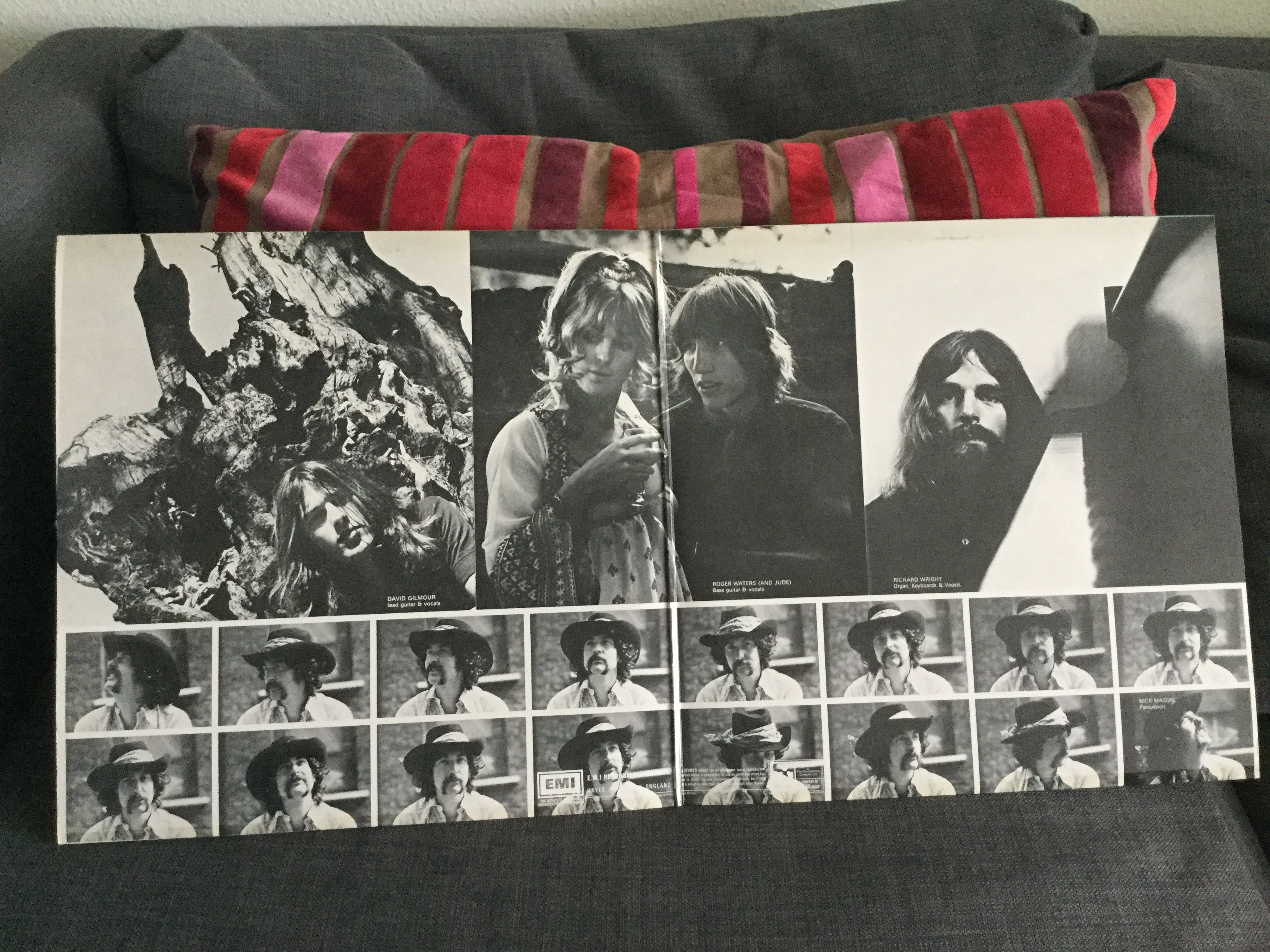
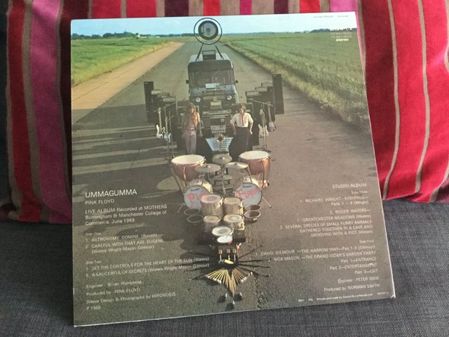
Hipgnosis album art : UMMAGUMMA by Pink Floyd, 1969
Storm Thorgerson and his artgroup Hipgnosis, was a close confidant of the guys in Pink Floyd from way back in the earliest days of the bands existence. Storm went to school with Roger Waters for instance. No wonder, that Storm and Hipgnosis went on to become so closely linked to the image of Pink Floyd, through Storm´s surrealistic sense of art. "Ummagumma" was the third time that Hipgnosis did a cover-design for Floyd (After A Saucerful Of Secrets & More) and they had already become more daring in their designs, if not yet as coherent and iconic as a few years later. But it seems to me that whenever Floyd called upon Storm, he would kick himself into an even higher gear than with other artists. The designs of the studio albums are all very iconic and legendary and this one is no exception.
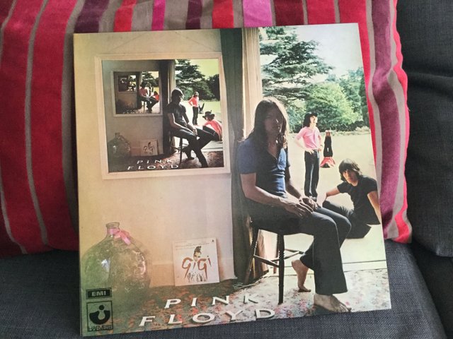
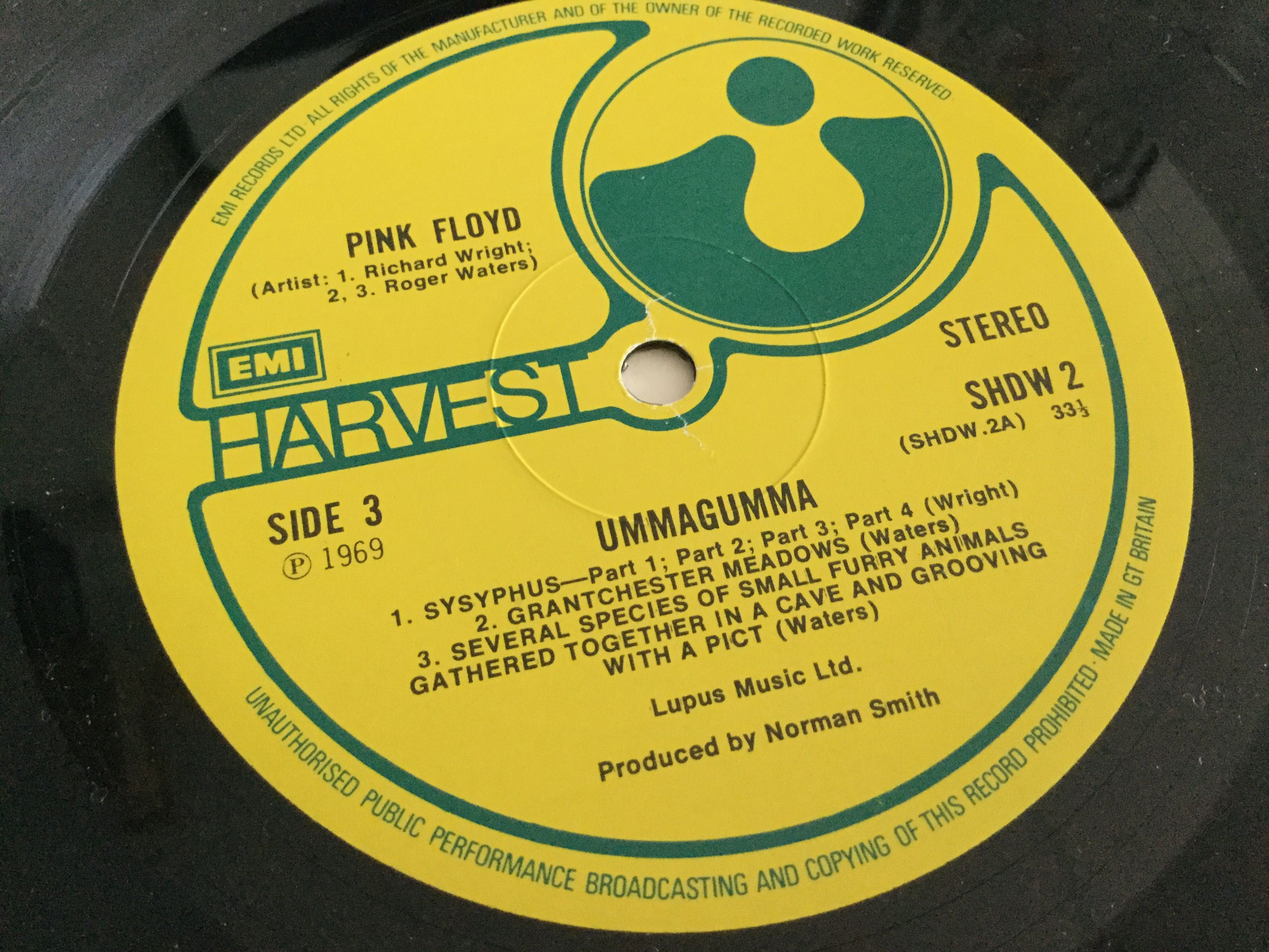
When I am looking for Hipgnosis covers for my collection, I tend to go for the original pressing of the cover art (not as much the earliest pressing of the record itself, unless I really dig the music itself). The design may change a bit over time or text aaded, removed etc. So in the case of Ummagumma, an original UK Harvest is preferable. My copy shown in pictures here, is an early pressing, the third I believe and in completely mint and unplayed condition. Just needs a cleaning.
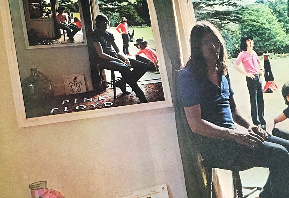
Hipgnosis usually received early previews of the music on the records they were to cover design and the title. Then they would brainstorm ideas for images that emerged from listening to the music and the titles of the songs and the album. In this case, Floyd had become more layered in their expression and this psychological aspect spawned the idea, inspired by his then girlfriend Libby, of using what is called the "Droste effect", named after a dutch cocoa box which shows this same effect on its front. This is a well known effect that can be obtained by using cameras and mirrors (?) in photography (Bohemian Rhapsody video).

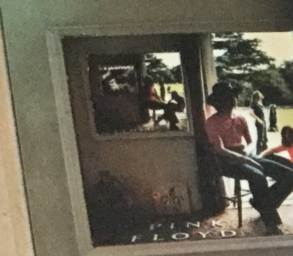
But Storm wanted more than that. He wanted to use the bandmembers in the frames, but rearrange them in each frame going into infinitessimality. This meant that there were five pictures in this visual optical effect, with each a different placement of the band-members, in what looks like a rotation, but not quite. If you look closely at the last sixth picture on the wall, it actually is the cover-design for "A Saucerful Of Secrets"
"Physically it is like a window, metaphorically it´s an endless set of pictures, an endless set of layers, going back and back, regressing endlessly. The artwork was rather amateurishly executed, with Stanley knife and ruler, and suffered from my lack of control. The rotation of the group mebers is the icing on the cake, though I am not always sure how much it is detected. I am asked more about the GiGi cover, which is a fasle trail, or a red herring. With the benefit of hindsight I can now say the I think this image, along with Elegy (The Nice), was a turning point for me" - Storm Thorgerson
"We were also interested in the comparison of mental perspective (The picture on the wall) with the physical perspective (the people in the garden). One source for this picture was a line drawing in a psychological text book (anyone who have any idea which one that might be?) which showed a similar infinite regression - we just wanted to try it photographically since it would then be more real and more incongruous" - Storm Thorgerson
The photographs were taken in Shelford, Cambridge, in the house of his girlfriend. One problem that the photographer clearly battled with, was the range of light intensity, where the outside is overly lit, while the inside is under-lit. A classic dilemma in photography. The lower left corner has somehow been compensated with artificial light or manipulated during exposure, while the outsides are slightly overexposed. nevertheless a stunning result all considered.
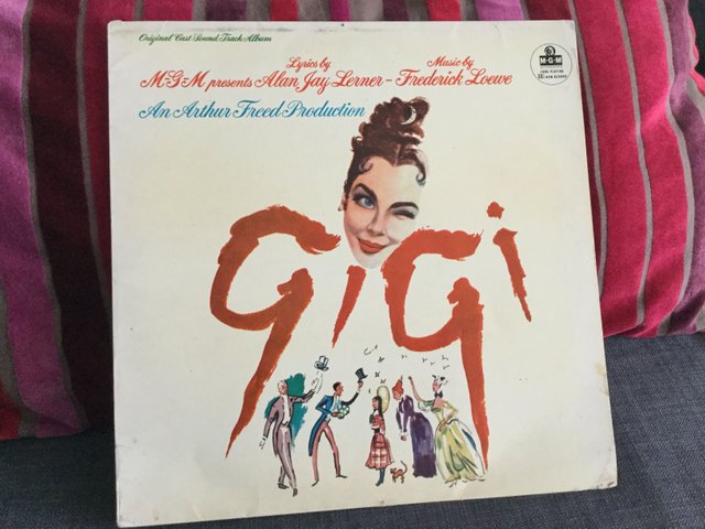
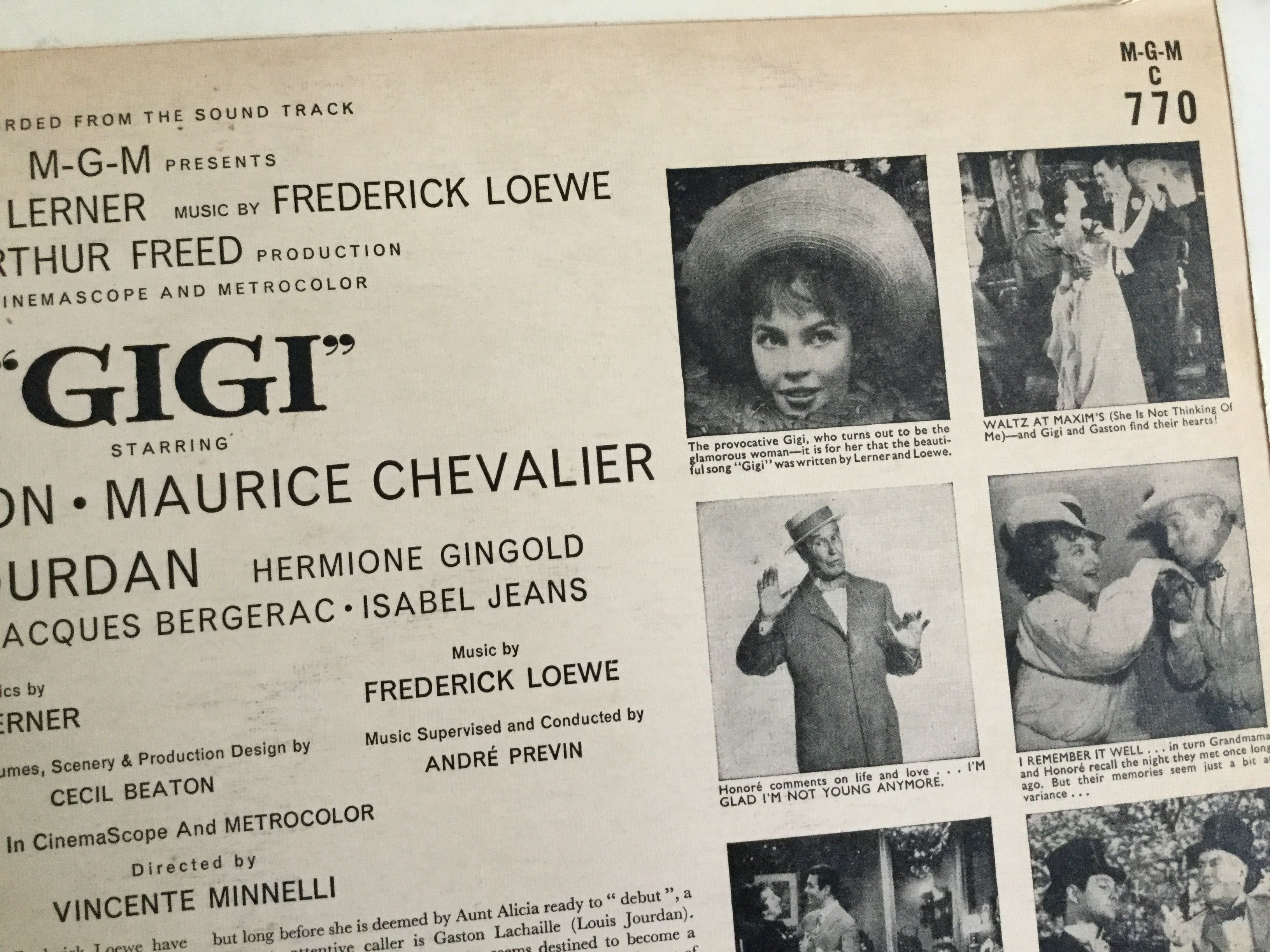
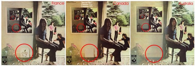
The "Gigi-cover" controversy, refers to the LP standing up against the wall below the hanging picture. This was a copyrighted design and was actually censored in some parts of the world. In Canada the front of the LP was paintbrushed to white, while in Australia it was removed completely by retouch. As Storm stated, there is no reason for this specific LP to be there. Is is a misleading clue, even if someone have suggested that Waters brought it along. I find it more likely it was a random pick from Storms girlfriends collection, since they did the shoot there. It is just one of Storms usual surrealist touches.
I actually have found an original copy of that exact british pressing of Gigi.
(ref: hipgnosiscovers.com)
"In order to preserve reality we wanted the lettering as part of the image, not added later as a graphic. It would be a real fixture which would reappear in the inset pictures on the wall and help the feeling of infinite regression" - Storm Thorgerson & Aubrey powell.
The album was released in October 1969. The album's title supposedly comes from a Cambridge slang word for sexual intercourse, commonly used by one of Pink Floyd's friends and occasional roadies. It's supposed to be pronounced "oomah goomah" but is usually pronounced "um-uh-gum-uh".
One of my first records. Love to see this here and will Listen to it at home.
Great :-) ... one of those Pink Floyds that are a bit difficult for me to get into ... but I seem to find interesting new bits everytime I listen ... which may be to rarely :-)
Wonderful write-up on a timeless classic! How can you go wrong with a name like Storm Thorgerson btw?
No .. that is one hell of a name ... I have previously reviewed the docu .. "Taken By Storm" .. title says all :-)
The best band without doubts, thanks for the information.