Hipgnosis album art : DECEPTIVE BENDS by 10cc, 1977
10cc is one of the bands with a whole string of Hipgnosis covers during the height of their career. This album marks the first output following the split between Godley & Creme and Stewart & Gouldman. This four piece powerhouse of writing and singing ability could not hold together as their differences became too great to carry on. But this album would prove a huge success musically, including a personal favorite of mine "The Things We Do For Love". After this one they never really regained their strength, though two more Hipgnosis covers were to come for Stewart & Gouldman's 10cc.
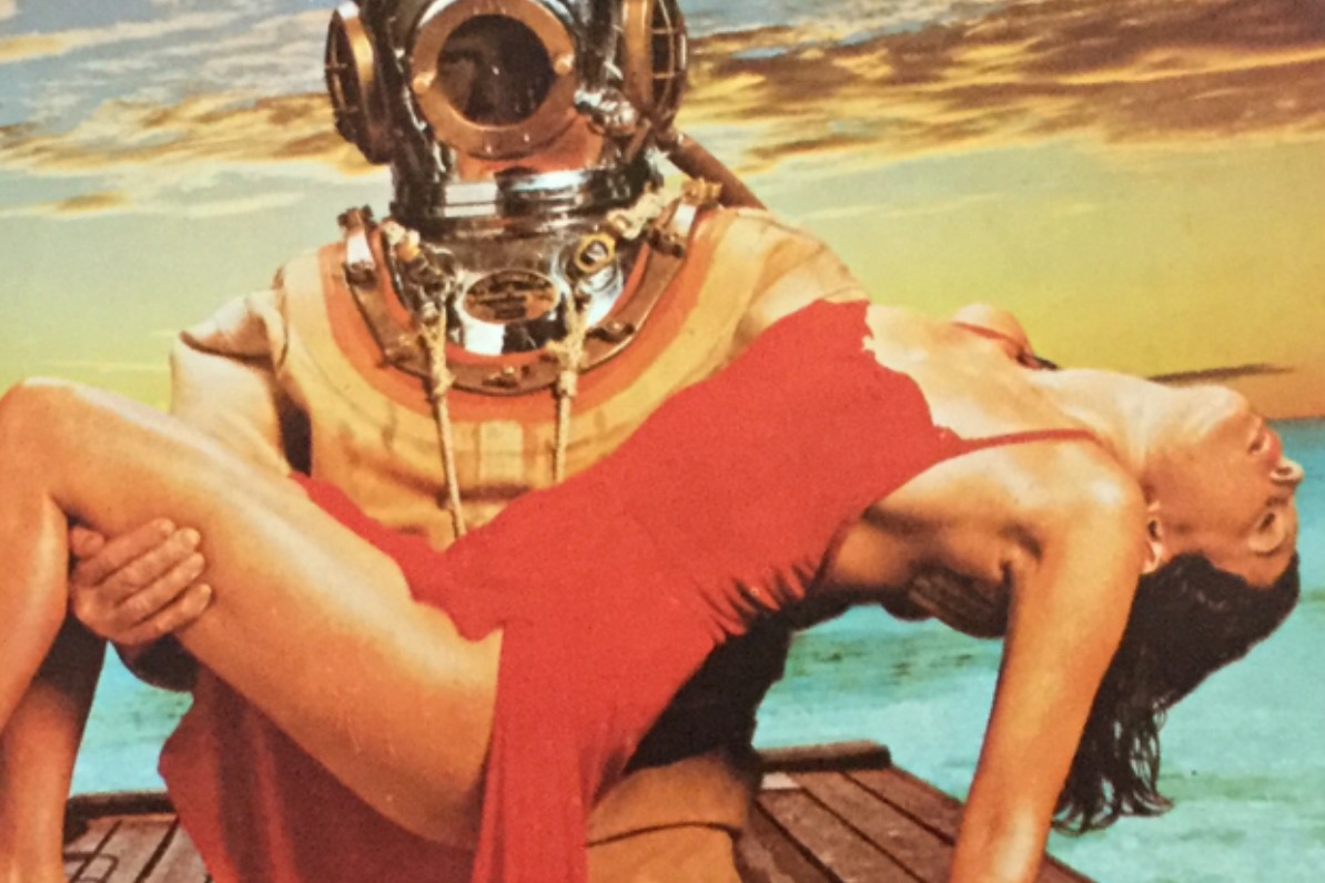
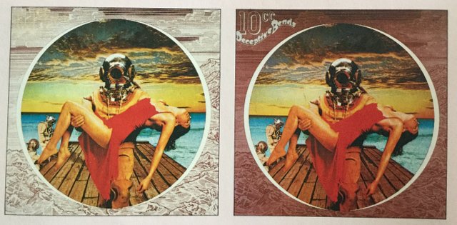
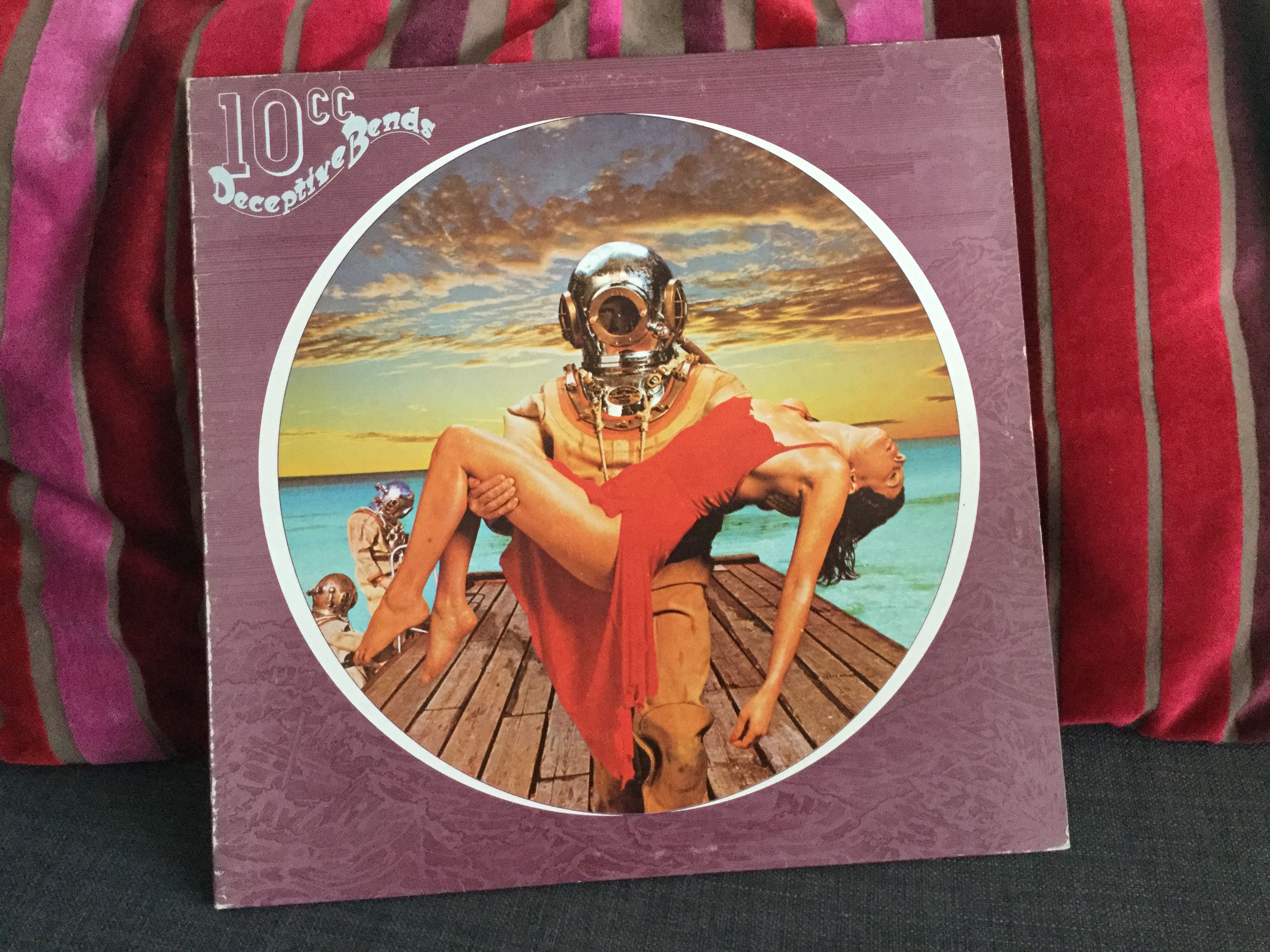
The design this time is quite intriguing and elaborate. The band called upon Storm before the album tracks were finished and they had the idea of using an album title inspired from a road sign they used to drive by to and from the recording studio ... "Deceptive Bends". As far as I know, Storm weren't inspired by the music but only the intriguing title. The obvious references to a road that bends or straight lines versus bended lines, he felt was too obvious and those designs were scrapped. Then he thought of another meaning of the word bend, which refers to divers sickness.
(Ref: "Walk away René")
"I thought immediately of those diver's suits of the 20's or 30's and how amazing they look, not only for their bizarre metallic helmets but also for the whole monster feeling that they evoke. Since you can't either see the face or the body you've no idea what the occupant really looks like. And the it wasn't long before I felt that the deception of Deceptive Bends, referred to the person in the picture not, not the person looking at it" - Storm Thorgerson
"When I 'saw' it I visualized it in a circular frame (like the diver's mask). The border around it on the sleeve might well be illustrated but the central image had to be photographic, otherwise it would look too clichéd and too like a hundred comic book covers we've all seen before" - Storm Thorgerson
(Ref: "Walk away René")
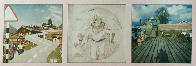
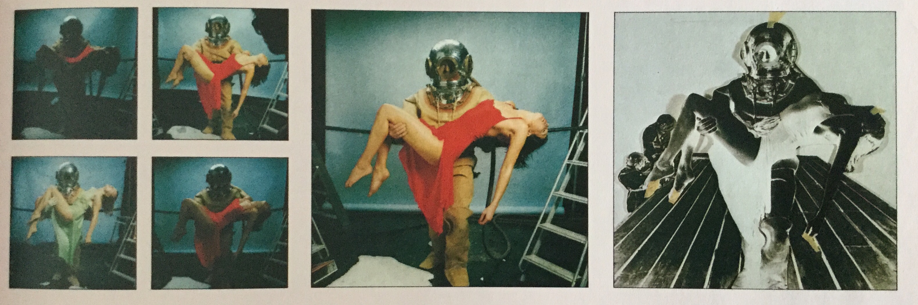
The shooting of the diver pictures were quite elaborate. They rented a specific large room for the that session... and the divers suit, although inhabited by a strong fellow, turned out to be nearly too heavy for him to also lift and hold the girl. Divers suits are meant for the 1/6 of surface gravity under water. The jetty walk was shot on location at Hammersmith at the Thames. The sea and the sky pictures were taken from external stockphoto, but carefully chosen only after decision on the right photographs.
(Ref: "Walk away René")
"We looked for a clearly stepping forward pose for the diver and a good curved (deceptive bend) shape of the girl, so that she looked really limp. Of secondary importance was the way the girl's dress fell, how her legs, shoulders and breasts looked and how her head hung. Lastly we examined the head of the diver, searching for one which was very definately looking toward the viewer. In addition the lighting and focus had to be spot on. When you consider all these points you can appreciate the necessity for shooting a lot of film" - Storm Thorgerson
"The complete picture was given the thumbs up by 10Cc. But the border remained a problem, mostly because it was virtually impossible to see to see it with the finished picture in the middle of it. We tried all sorts of colors and tyoes of illustration. A plain border did not work nor would a phitographic one. It didn't want to be too dull or too colorful. In the end Colin suggested a pen and ink line drawing" - Storm Thorgerson
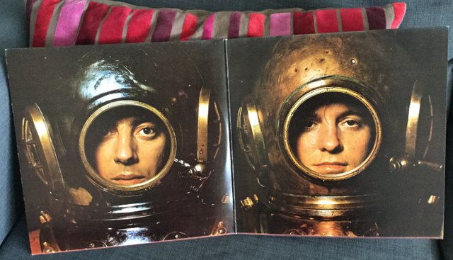
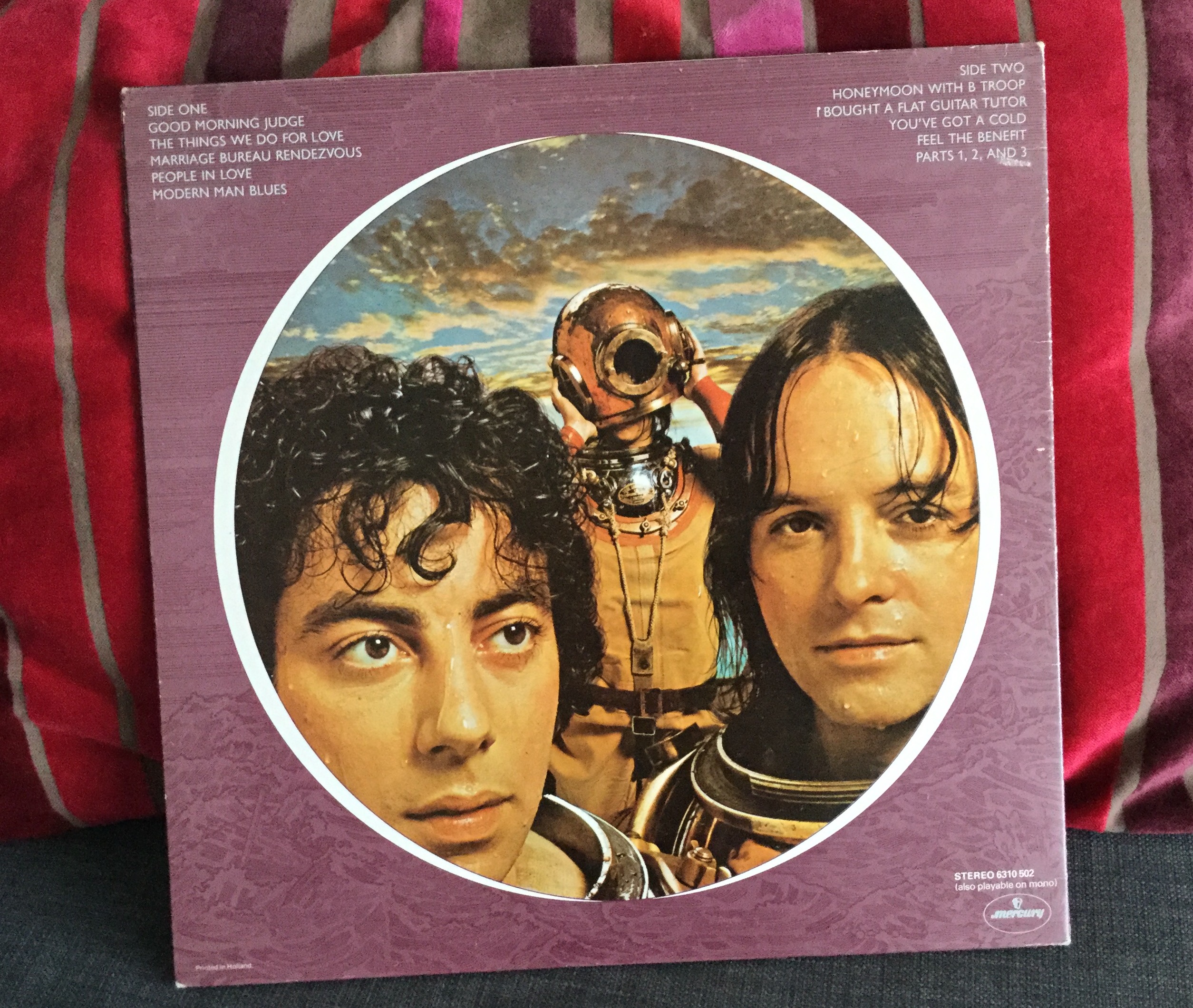
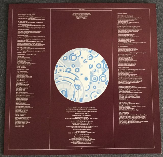
The pictures inside the gatefold and backside shot plays on the idea that the two guys entering from the sea unto the jetty, is actually the guys from 10cc while the inhabitor of the suit suddenly appears to be the girl. Very deceptive... "am I feeling the bends?". The artwork for the inner bag with lyrics are slightly different on my dutch pressing. The design has become a double side extra print and the record itself just housed in a plain skeeve. There are slight color differences from the original and my pressing, to the circular design in the middle.

Certain shots from the diver session was used for a poster. This is the same basic idea, but a slightly differen shot. When the photography magazine ZOOM braught an article about Hipgnosis, they featured this poster on the front cover. A nice gesture towards the masters of coverdesigns.

They did ask Jessica Lange to pose as the rescued girl ... but she denied as she "did not do that sort of thing"
nice post :)