The Beauty of Simplicity
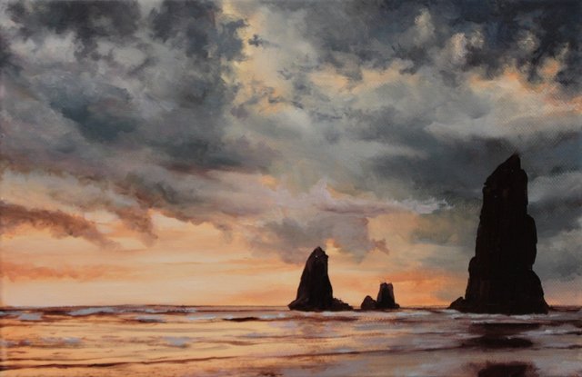
This is the latest of my simplified landscape paintings. Admittedly, I have painted others that were simpler still, but the aim remains the same, to keep loose brush strokes and not to be lost in details.
The other simplification put into practice is working with a limited palette. This means choosing the right colours at the start, sticking with them and resisting the urge (old habits) of reaching something else. However, introducing other colours often disturbs the colour harmony. That is the whole aim of a reduced palette, colour harmony.
In studying figurative painting, that is painting the human form, it became apparent that the masters of this, used a surprisingly sparse selection of colours. Then upon further investigation, it was a trend that followed through all of the Old Masters.
It was inspiring to see and understand the range of colours that they could express, or trick us into see, with just so few. Herein lies part of the mystery and magic of classical painting.
In the future I will write at greater length about colour theory and practice.
The original painting is currently listed on Ebay.
More artwork and writing can be found on my website: LeoPlaw.com
It's fabulous. Bravo!
Thank you!
This is awesome @leoplaw
@immarojas thanks!
You're welcome..more of those :)
I think there will be. ;-)
Great! Steem on.
I love the choice of colors and the atmosphere of this painting.
@ubik cheers, I used three colours excluding white.