Latest Illustration | More Spooky Stuff
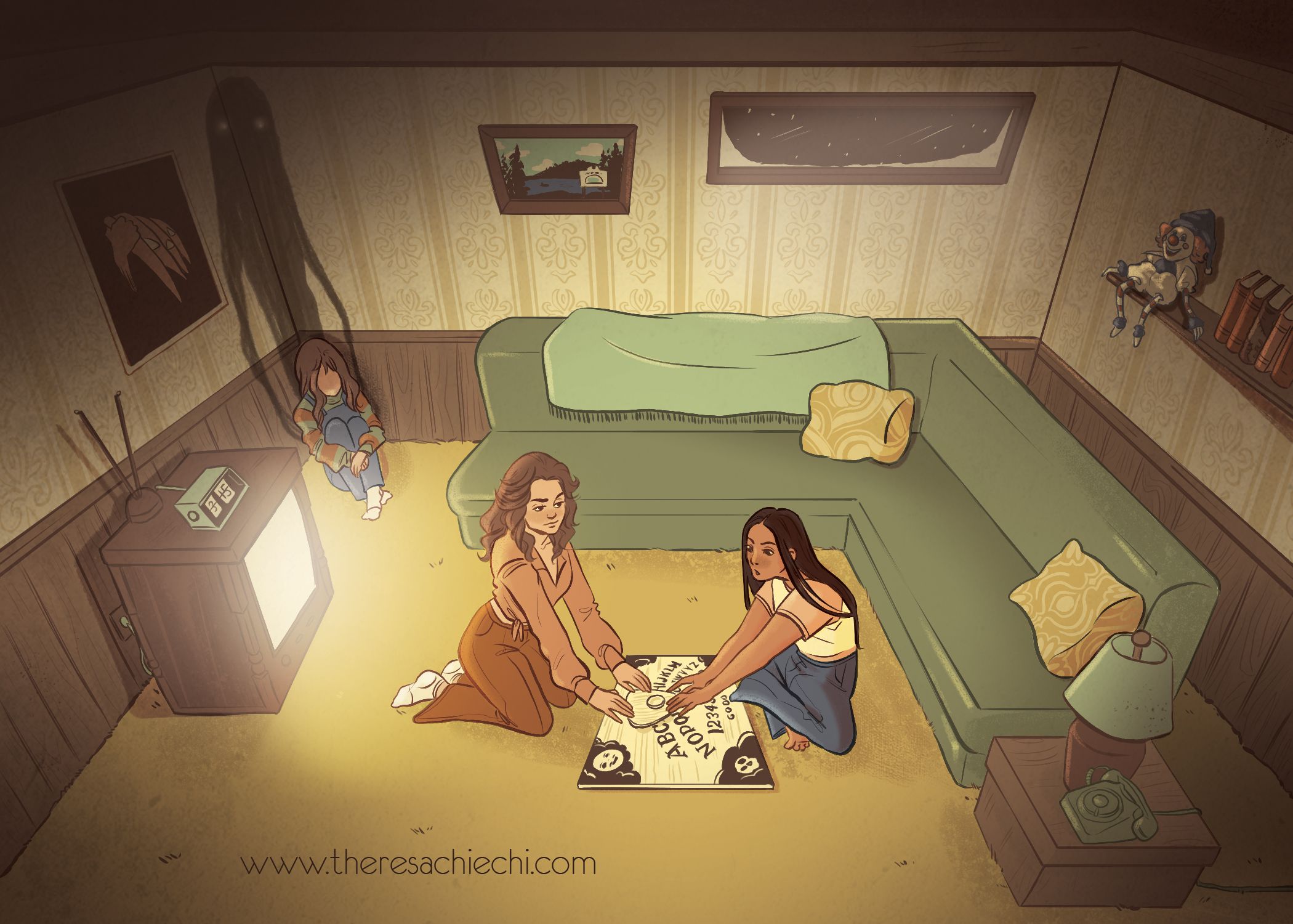
Latest Art Project
Taking a quick break from my work today to share my latest illustration. This was done for promotional postcards that I'm sending out real soon.
Rough Sketch
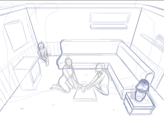
Perspective...always a fun time. This sketch took me a couple of goes mostly due to the fact that I really wanted to make sure I had a convincing enough high-angle perspective going on.
Tight Sketch
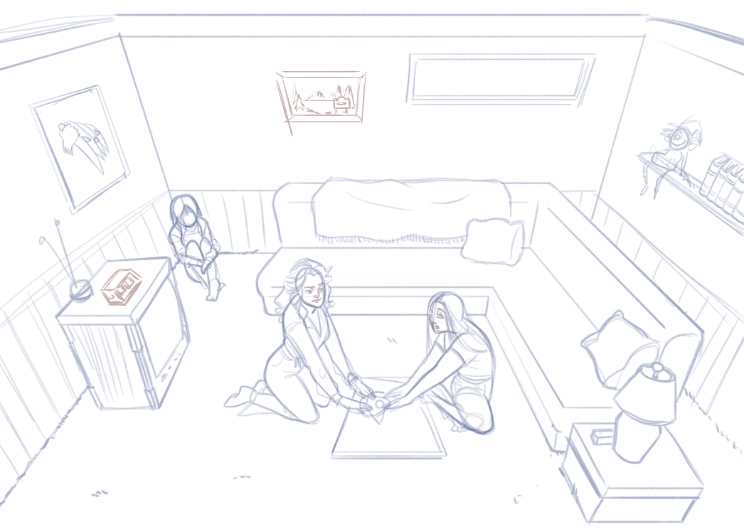
In this step, I added more details to the room and tightened up the lineart. I had a poll on Instagram/Snapchat to decide whether the teens in the room should be 70s teens or 80s teens. It was a tie; my partial feelings towards the aesthetic of the 70s was the final vote. Maybe my recent interest in the show Mindhunter also played a part...
Lineart
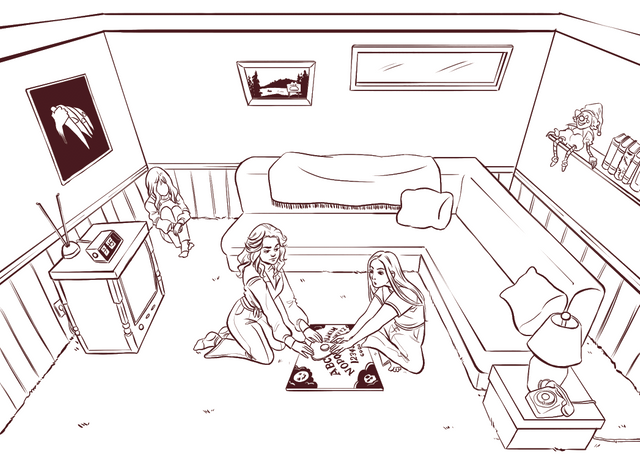
Flat Colors
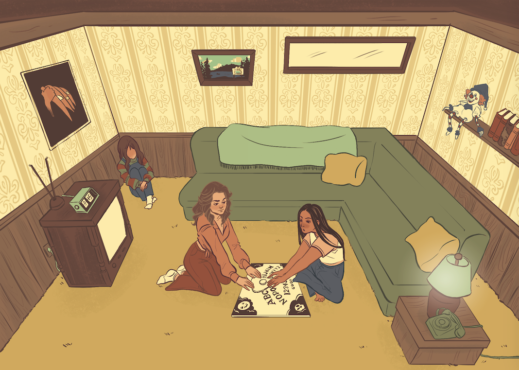
I always start my digital illustrations by putting in the flat colors first. In photoshop, I put each color on a different layer to make things easier for me in the next steps. I worked with a limited palette and stuck with earth tones that were very popular in the seventies.
You'll also notice I started coloring the lineart too so that the colors corresponded with the color of the object it was outlining.
Lighting
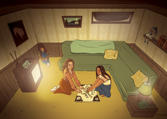
Cue the mood! This step I focused on adding highlights and shadows. At first, I started out with three light sources (the TV, the window, and the lamp) but you'll see in the next steps I decided to take the lamp out. I was working with gouache-style and textured brushes. I was going for a Sara Kipin kind of look. I also was inspired a little by Gravity Falls with the lighting/mood.
Demon!
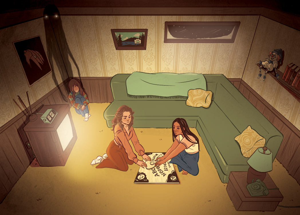
As you saw in the initial sketch, I originally intended to have shadow monsters emanating from all three of the girls but then I realized I didn't want the monster coming from the girl in the red to interfere with the lighting of the TV. So, I just kept it to the girl in the corner.
Final Touches
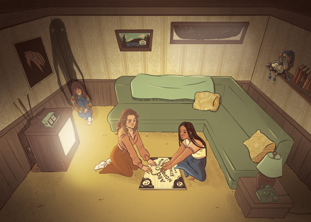
The Final Look
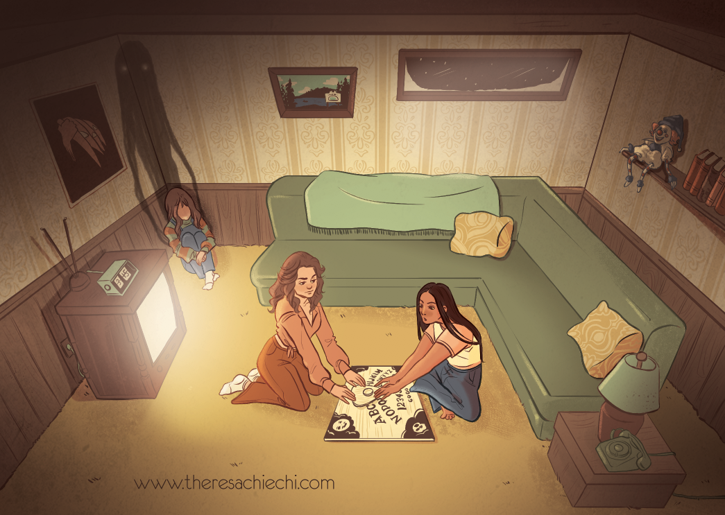
What originally started out as just a creepy illustration turned into an almost homage to horror movies. I put in several references from various horror movies from the 70s and 80s; let's see if you can find them all!
Thank you for taking the time to read this till the end.
If you'd like to keep up with more of my work you can check me out at the following:
Instagram: @la.fumettista
Tumblr: http://la-fumettista.tumblr.com/tagged/art
Twitter: @TheresaChiechi
Website: https://www.theresachiechi.com/
Until next time 👋
Ha! That's great! Has a nice tone quality and darkness. The message is enlightening too. Color choice seems to bring the message forward and enhances the whole scene. Me likey! Well done.
Thank you for the feedback :)
This is amazing, any way I could get my hands on one of these post cards?
Yeah, sure! Just text/email me whatever address you want it sent to. I'd give it to you in person, but I don't think they'll be printed before the radio show.
Love this! And especially the step by step review of how you created this art - My daughter is very interested in being an artist, or art teacher - I’ll have to share this with her
I also love horror films! I picked up clues to Halloween, Poltergeist, and The Shining. Did that little girl in the corner dress like Chucky!? Ha ha So creepy!
Thank you! I wish your daughter the best of luck; being an artist is hard but it's very rewarding. The girl in the corner is actually referencing Freddy Krueger's sweater from Nightmare on Elmstreet but now that you mention it, it could pass for Chucky too.
Aahh yes yes of course!
This is really cool. Hmm well, the IT clown on shelf, is the glowing TV from Poltergeist? Jackolantern painting from Halloween the movie? And is the painting on the rear wall the Hotel in Maine from the Shining?
You got some of it! The clown is actually the one from the Poltergeist and the painting is of Camp Crystal Lake from Friday the 13th. What you were missing: the girl in the corner wearing Freddy Kruger's sweater, the book from the Evil Dead on the shelf, and the clock has the time that clock always stopped at in Amityville Horror. If we reallly want to stretch one, you could say the ouija board references the one Regan used in the Exorcist.
This is so sick! Must have taken you hours!
Thank you! I know it took me three days to work on, but I didn't really keep track of the hours. Need to do a better job pf that lol
Owh you certainly do a great job that drawing that!
Great job! I like it
Love the atmosphere really mysteriously creepy ;)
Amazing illustration! Good post! Visit our blog and see the latest news :D Greetings
Congratulations @la-fumettista! You have completed some achievement on Steemit and have been rewarded with new badge(s) :
Click on any badge to view your own Board of Honor on SteemitBoard.
For more information about SteemitBoard, click here
If you no longer want to receive notifications, reply to this comment with the word
STOP