Colour studies
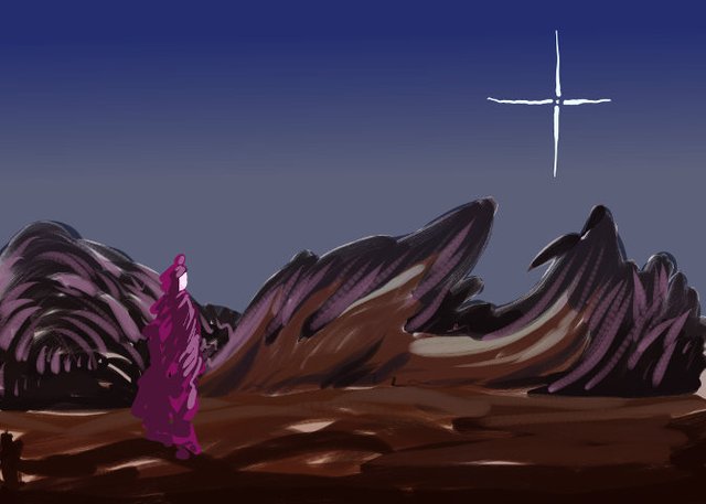
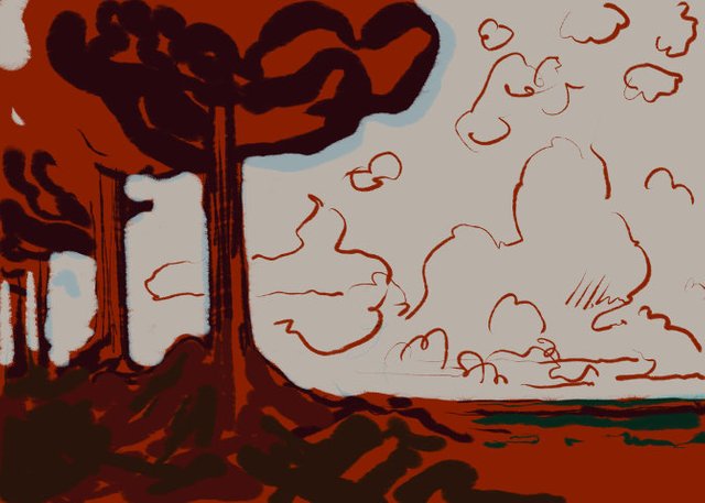
Once again I try to drag myself up a hole - I wish that the Danish health system can drag itself up from the whole that the new proprietary computer system has left it in. But that is a digression - my way out of holes is mostly to work. So here is four colour studies, all made with what in painting is called an imprimatura to see if this technique can be used in digital painting. I also found a new brush that is used in all of them.
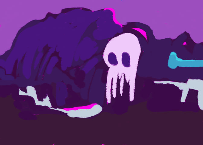
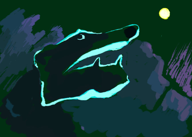

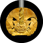
I felt instantly attracted by the drawing of Fenrir and had fun reading the story behind him. There were also quite some interesting drawings in the wiki-article like this:
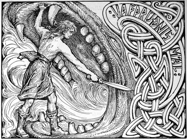
I don't know if this is appropriate, but I can even imagine wearing your Fenrir and Pac-Man drawing on a T-Shirt. Also thanks for bringing this interesting imprimatura technique up. Always so much to learn following your posts :-)
Somehow I imagined that Fenris would be your favourite. I could publish them in high res. as CC-by. the it would be easy to make t-shirts. I'll do it on Diaspora - it is my Creative Commons library.
Awesome, I'm going to print a shirt and maybe even make a post about it. For the CC-BY it would be best, when a signature/link of your choice is added directly to the image.
I really like the 4th image,
it reminds me of a specific avenue,
that I came across several years ago,
where one could see the whole landscape around oneself.
So, are you convinced of using more imprimaturas in the future?
Or did you came across some problems,
that you wouldn't have encountered with it?
Thank you! I was thinking of Tivoli outside of Rome.
As for the imprimatura it can be used with some success in digital painting. it gives a tone to the layers involved and that "collects" the different parts of the image. It is on the other hand very different and also a bit more primitive than when applied on a real painting - there is first of all a very big difference between additive and subtractive colours (the way they blend), more important is that there is no physicality in digital painting so the sense of real layers is only simulated, and can easily disappear when things get complicated. There is after all only one pixel.
That second one looks pretty awesome!
Thanks. I think my favourite is the last red one.
The second one is great i like the distant look it gives
Thanks :) it is the only one with a split imprimatura - that is maybe the reason.
i loved last one.it's so peaceful .. thanks for sharing
Thanks.
That red one is extra cool,.
Thx.
Useful info
Oh yea?
Great and nice post - hats off @katharsisdrill..Keep posting good stuff.
To say frankly, I am replying here literally for your upvote. As I am a newbie, what else is important than upvotes and steempower. Please let me also be part of Steemit family.
I used at least a month creating quality posts almost every day before I began earning anything. That is the way to earn money here. Work instead of spamming and begging.