The Warm and Cool Palette: The Bridge Between Grisaille and Color
The Warm and Cool Palette: The Bridge Between Grisaille and Color
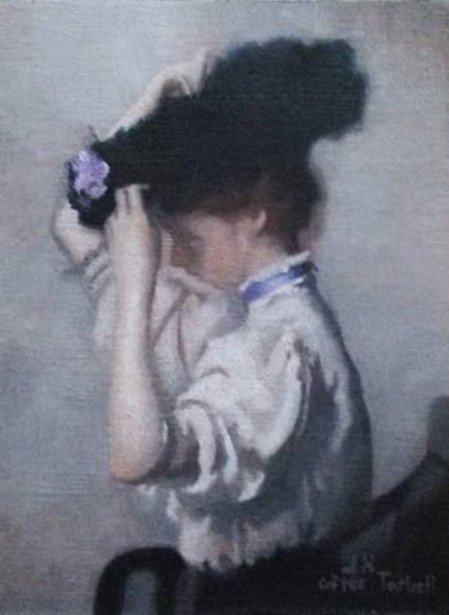
(Here is a small master copy painting I finished during the end of my 2nd year in the atelier. This was done by only using burnt sienna and ultramarine blue, with the exception of white of course. Originally painted by Edmund Tarbell.)
Greetings and salutations Everyone!
In today’s post I’ll be discussing the beneficial intermediary step in classical oil painting that is between the initial grisaille stage (ivory black/titanium white or raw umber/titanium white) and typically a limited color palette such as the Zorn palette. This additional step I learned while attending The Aristides Atelier I found to be highly valuable in strengthening my paint handling skills as well as increasing my perceptual accuracy in distinguishing the subtle nuances of value and temperature.
Unlike the grisaille palette where one is attempting to control the comparatively narrow range of value, the warm/cool palette has the challenge of controlling the added dimension of what is known as “temperature”. What I have found to be a wonderful bonus of the warm/cool palette is that once mastered, the painter can give the illusion in that there appears to be more color than there really is!

As you can see here, this warm/cool chart made from this palette shows a nearly unlimited potential range of depiction in value and temperature. Of course here the value strings (up and down) have been condensed into nine value steps as to facilitate a thorough understanding of these pigments and core principles. All that is needed to make your own chart like this is burnt sienna, ultramarine blue, and titanium white. As was recommended to me by Juliette Aristides, I too would personally recommend using Winsor & Newton’s burnt sienna as it appears to be the “hottest” version of it on the market. If not, that’s okay as most brands out there these days would suffice for the purposes of this palette. Afterall, it’s just basically earthen rust right?!
Of course on the top left the chart begins with pure ultramarine blue and as you progressively move to the right, the squares slowly increase with burnt sienna until it reaches the last square with pure burnt sienna. This top row (NO WHITE) would be made from what would be considered your “mother” piles. I suppose there could be two different ways you could make these transition piles. One way would be to start with a large pile of burnt sienna and making progressively smaller and evenly amounted colder piles by slowly adding more ultramarine blue to each pile.
Or what you could do is to begin with a large pile of equal parts as this will act as your “middle” pile. Then you split this pile in half taking on half and slowly mix piles in the “warmer” direction (burnt sienna) and take the other half and do the same in the “colder” direction. It is important to make these transitions as evenly as possible. You don’t want any huge gaps or jumps in the temperature or value transitions. Don’t worry though, not everybody gets it right the first time. With time, patience, and practice you’ll begin to quickly spot the subtle shifts.
After you mix your mother piles, from each individual mother pile you’ll begin to do the same with titanium white in creating your value strings. Keep in mind that it is imperative to keep your palette knife clean when mixing as titanium white and ultramarine blue have a high tinting strength.

Shown here is a master copy created with a similar warm/cool palette done by alumni artist and teaching assistant with The Aristides Atelier, John Zadrozny. The Original artist was of course William Bouguereau. The only difference in this alternate warm/cool palette is that the ultramarine blue is swapped out for Viridian. What I personally find pleasurably challenging with this alternate warm/cool palette is the difficulty in handling viridian in that it has a very high tinting strength. But once properly handled, it can produce some wonderful neutrals, especially in rendering flesh. To create a color chart with these two pigments, you would of course proceed in a similar fashion.

(Here is another example of a still life study I finished while in the atelier using the warm/cool palette.)
Please feel free to let me know what you think?
Thanks for reading Everyone!
-James Hansen
https://jameszenartist.weebly.com/
@OriginalWorks
The @OriginalWorks bot has determined this post by @jameszenartist to be original material and upvoted(1.5%) it!
To call @OriginalWorks, simply reply to any post with @originalworks or !originalworks in your message!
Thanks for informative content.
Thank you so much :)
welcome
@OriginalWorks