Zero Suit Samus
As an artist, I always try to experiment and push myself to create higher quality work. Sometimes browsing the gallery of an artist you admire can be just the thing to spark creativity and inspiration. That's exactly what happened to me in 2012. One of the artists that I follow online goes by the name Artgerm and he's a phenomenal portrait painter. I wanted to try my hand at illustrating something that matched the style of this work. Imitation is the highest form of flattery, am I right?
Learning from others is a sure way to improve your own skill. The best method of putting this into action is by analyzing the illustration carefully and figuring out how to mimic something without straight up tracing it. As renowned comic book guru Scott McCloud once said:
"As an artist you should learn from everyone, copy no one, and work like hell."
The Final Illustration
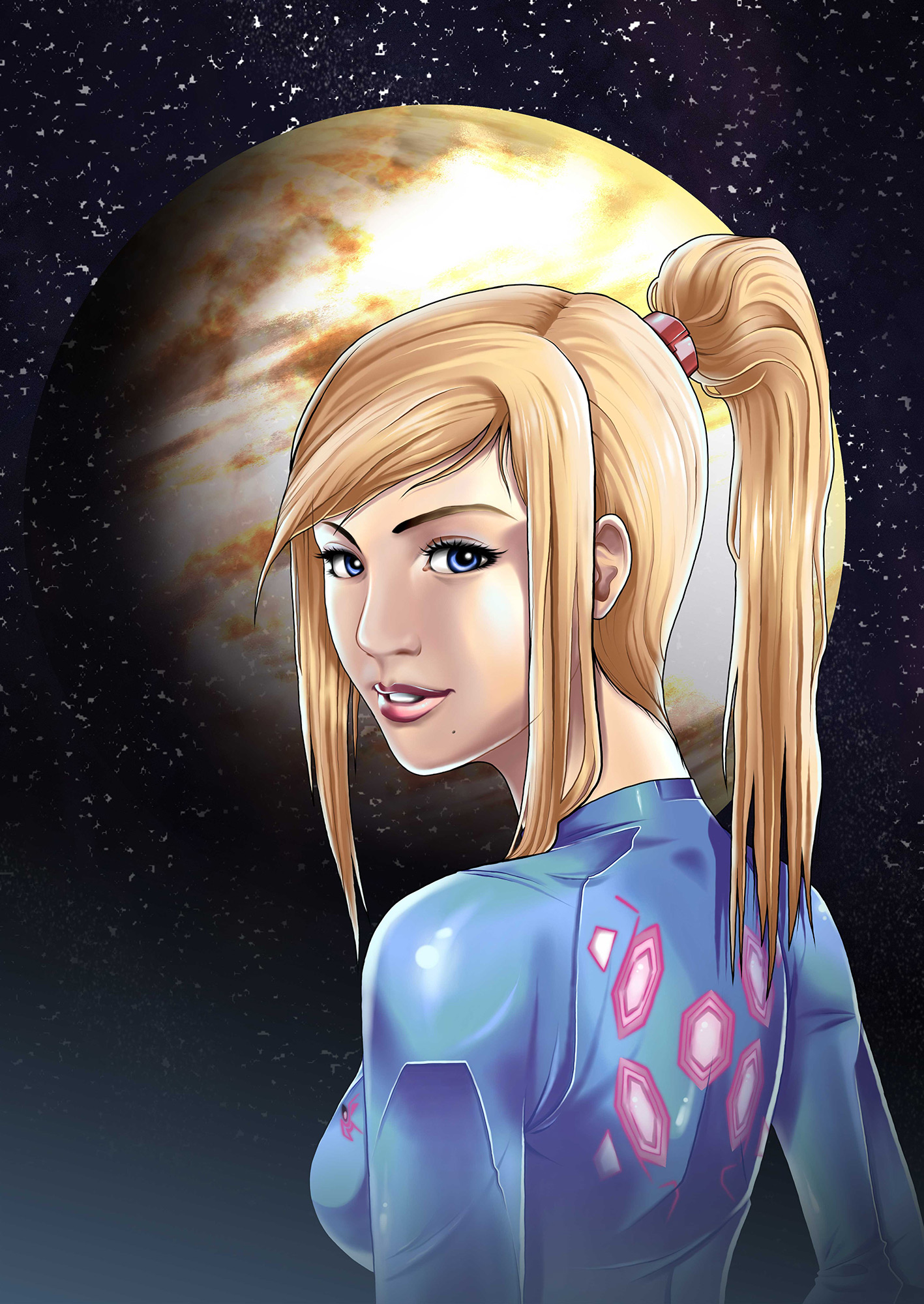
I chose to paint Zero Suit Samus from the video game series, Metroid, published by Nintendo. I have drawn her before, but never with such attempted realism. My goal was to draw the viewer to her face and not her... other features. As a fan artist, I am aware that there is a line between being true to the character's design, and straight up fan service. Samus is a respectable bounty hunter and I believe the allure of her character lies with her strength, not her feminine features. After all, most of the time she is inside her power suit battling space pirates and saving the galaxy.
The planet in the background is generic and not suppose to represent anywhere in particular. There are a few it can be if I had label it: Talon IV, Zebes, or SR-388. I looked up a very helpful "create a planet in Adobe Photoshop" tutorial for that one. Sorry, I don't have a reference link. It was a long time ago. I admit I rushed it with the stars. I have the bad habit of being 95% done and skipping the last 5% because I want to stop and post the work.
What I should of done was tap/click each star into position. What I ended up doing was using various filters to create noise and adjusting the levels to make a random sprinkle effect. It looks good at a distance, but I failed to see that up close the "stars" were not round but rather squiggly lines and blobs. I have since never rendered stars like this again. I've learned my lesson.
The Line Art
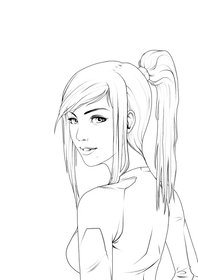
My usual setting for drawing my lines is to use a hard brush with anti-aliasing turned off to create a crisp, hard edged, line art. However, I wanted to give it a try using a soft brush, especially after watching a few tutorials and demonstrations from another artist, this one goes by the name REIQ. It was helpful for me to use the keyboard shortcuts to adjust the size of my brush on the fly. I believe the standard shortcuts are the left and right square bracket keys just to the right of the "p" key.
Another technique I practiced for the first time was applying shading to the line art itself, in a few select areas. For example, her eyes, eye lids, and lips contain shading. In addition to the shading, some of the lines are also erased ever so slightly so that they blend out when the flat colors are set against it. Lastly, when adding the color holds over the line art, it will visually remove most of the lines, which is necessary for the realistic look. Otherwise, keeping bold black lines will make it look like common comic book art.
The Flat Colors
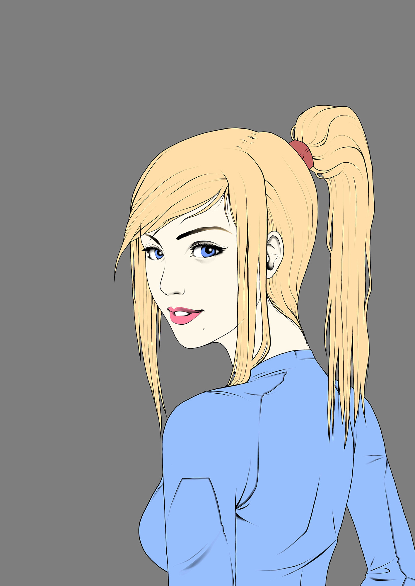
Because my line art wasn't anti-aliased, I couldn't use the paint bucket tool to click my flat colors into place. Therefore, I used my old technique of using the polygon lasso tool and manually selecting every area and filling it in on a new layer. This is definitely required for the areas where the line art remains open (meaning there are places where the lines don't touch and close off an area).
When adding the shadows for this piece, I worked on each color before moving on to the next. I selected a color palette ahead of time and used those for the shadows and highlights, keeping it consistent. The coloring is really where Artgerm's portraits really shine, sometimes literally. His use of highlights and soft edges makes each piece such a masterfully crafted work of art. I still have a lot to learn when it comes to shape and shading, knowing where and how to place a shadow realistically.
Most of my work now doesn't look like this. Zero Suit Samus was a fun experiment and a learning process. However, it's not my style and I am okay with that. It's healthy for artists to admire others for their art and awe at how amazing it is. But it can be dangerous to allow comparison to create feelings of inadequacy and doubt. The only thing I should be concerned with is to keep drawing, keep learning, and keep perfecting my own style. It is better to be a work-in-progress me than an Artgerm copycat.
That's pretty much all I have to say about this piece. Did you like it? Please upvote if you found this post entertaining, educational, or encouraging. I want to inspire all amateur artists to keep drawing and never give up. If you have any requests for future posts, please let me know with a comment below!


👏🏻👏🏻
Amazing and beautiful, thank you for the educational post, it really helps newbie artists like me! Well done ;)
This post contains original material @originalworks
The @OriginalWorks bot has determined this post by @jamesartville to be original material and upvoted(1.5%) it!
To call @OriginalWorks, simply reply to any post with @originalworks or !originalworks in your message!