2nd LOGO PROPOSAL for PASAR COMPANY for its 35th Anniversary Celebration
Hi everyone!!
So again I have to say that it has been days since I last posted here. I have been very busy with stuff and I also had a vacation. Anyway, I really haven't been totally gone off the grid in my days of absence. I have also worked in my free time and this is one of them.
A copper company in Leyte is looking for a logo to commemorate their 35th Anniversary and it so happened that one of my closest friends works there. So, he asked me to make a logo for him so that we can pass an entry in the competition. I have previously posted my first entry, and now I will show you my second entry.
Our Entry

Background
A company's success reflects on the precision and accuracy it gives to maintain its product's quality and thus, its customer's satisfaction. It also reflects on the attention it gives to its responsibilities and constraints while still running the operation smoothly. Most importantly, a successful company is goal oriented and grows holistically with its people. PASAR, being on of the most successful companies of the modern metals industry, is celebrating its thirty fifth year of what is a prime example of a successful company. As part of that celebration, this logo is designed to summarize the 35 years of PASAR's success into one symbol.
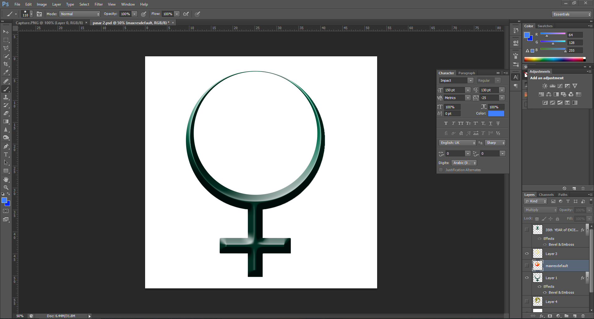
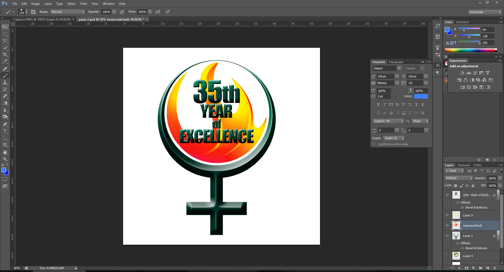
The main symbol that is being shown in the logo is the ancient symbol for copper which is a ring with a cross on the bottom. It is widely used by the alchemists before the modern era of metallurgy to represent the copper element. It is also colored with Jade to emphasize the 35th year anniversary of PASAR. The words inside the logo is also in the shade of Jade making it as the primary color of the logo. The color, jade, is the traditional celebratory color for a 35 year event. Inside the circle is a fire emblem. It is there to show three things; first is the representation of the metallurgical processes that is the main operation done in the company. Secondly, it represents the solidarity of the company and the people through the years of PASAR's success. And lastly, it represents the fruitful success that was brought about by 35 years of the company's operation. The entirety of the logo gives us an overall celebratory vibe that is fitting for 35 years of PASAR's operations.
Work in Progress

DONE


Please support @surpassinggoogle as a witness by voting him at https://steemit.com/~witnesses and type in "steemgigs" at the first search box.
If you want to give him witness voting decisions on your behalf, visit https://steemit.com/~witnesses again and type in "surpassinggoogle" in the second box as a proxy.
Please like @teardrops on Facebook and Twitter:
• https://www.facebook.com/teardropstokens/ •
• https://twitter.com/teardropstokens •