Making Material Design Icons in Gimp!
So in case you've looked at my app that i talked about in a post a few days ago , you'll see that the store listing contains a fancy icon with shadows that follow google's material design philosophy. While you may think that we need Adobe Illustrator or photoshop to make such icons, they can actually be made in Gimp, the FOSS image editor. So this is a tutorial for that:
1. Import your image into Gimp, and separate the background and foreground into their own layers.
You have to have a clear background and foreground, each in their own layers. Basically, just cut the foreground and paste it again, and create a new layer out of that pasted layer.Then, in the background layer, fill out the area that was taken by foreground(which should now be just empty) with the background colour.
This is how it should look(look at the layer window):
2. Duplicate the foreground layer, and colour it black
Duplicate the layer by right clicking on the layer, and selecting Duplicate Layer

This is how your layers window should look like(i have renamed the topmost layer to "main layer" to avoid confusion):
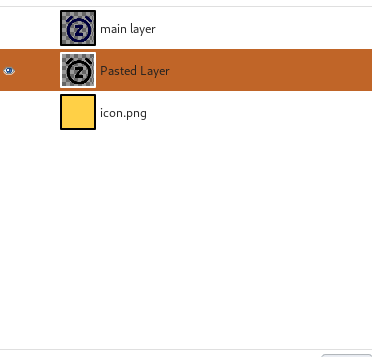
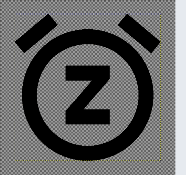
Then, take the middle layer(ie. the lower foreground layer, in this case, named "Pasted Layer"), and colour it black. This is how your middle layer should look like(other layers aren't visible):
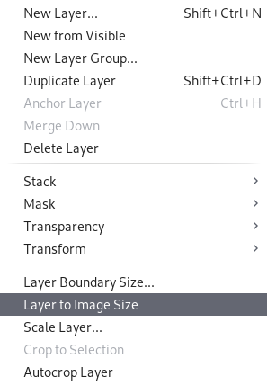
Next, expand this layer to the whole image by going to the Layer section in the main menu bar of Gimp, and clicking Layer to Image Size:
3. Apply the Motion Blur effect to the middle layer
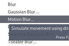
Go to the Effects section in the main menu bar, select Blur:
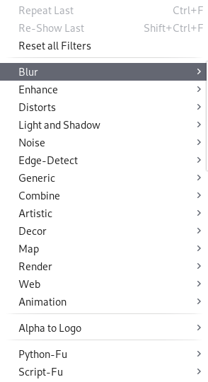
In Blur, select Motion Blur:
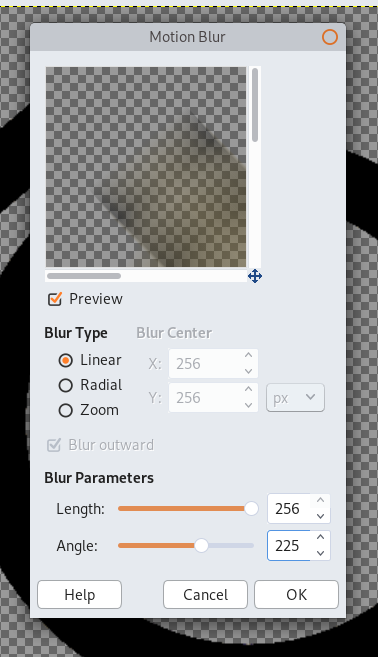
In the Motion Blur settings, set Blur Type to Linear, Blur Length to maximum, and Blur Angle to 225:
Press OK. This is what you should get:
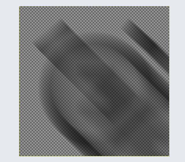
Next, right click this layer in the layers toolbar, and select Alpha to Selection:

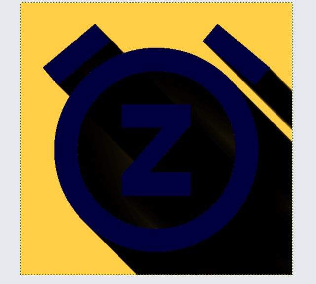
Then, go to the Paint Brush Tool, select Black as the foreground colour, and fill the whole layer with black, until it's completely dark black. This is how your image should look like, with all the layers visible:
4. Make the Shadow Layer more transparent
Go to the Layers toolbar, select the middle layer(in my case, named "Pasted Layer"), and adjust transparency to between 50 and 25%(whatever feels good for your image), like so:
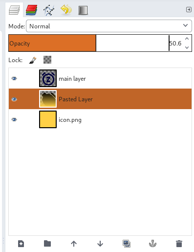
This is how your image should look like:

5. Blend the Shadow layer with the background
First, select the background colour as foreground. Then, Go to the Blend Tool (press L), and in the settings, select FG to Transparent as the Gradient type:
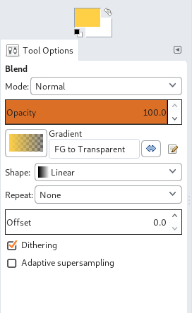
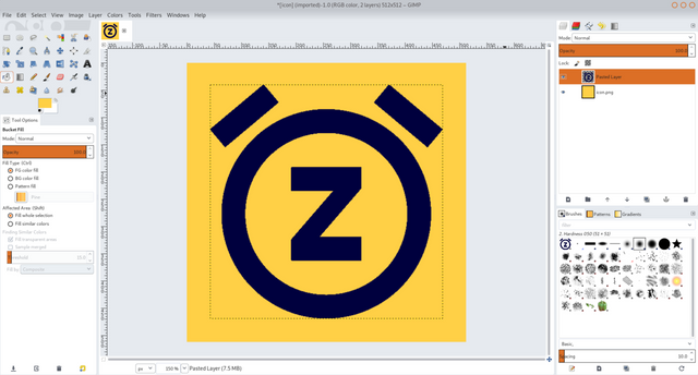
Now, place your mouse at the bottom of the image, press the left mouse button, and drag the pointer all the way to the top of the image. This will make the shadow much more natural. Finally, adjust the Blend Opacity or Layer Opacity to get exactly the shadow that you like. This is how my final result looks like:

That's it. Just Export the image and you're done!
Thanks for reading this post. If you liked it, please resteem it.
If you were intrigued by the app, check it out here:
Congratulations! This post has been upvoted from the communal account, @minnowsupport, by harshal from the Minnow Support Project. It's a witness project run by aggroed, ausbitbank, teamsteem, theprophet0, someguy123, neoxian, followbtcnews, and netuoso. The goal is to help Steemit grow by supporting Minnows. Please find us at the Peace, Abundance, and Liberty Network (PALnet) Discord Channel. It's a completely public and open space to all members of the Steemit community who voluntarily choose to be there.
If you would like to delegate to the Minnow Support Project you can do so by clicking on the following links: 50SP, 100SP, 250SP, 500SP, 1000SP, 5000SP.
Be sure to leave at least 50SP undelegated on your account.