Putting Your Best Foot Forward - a.k.a. Nitpicking Your Way to Perfection
Note: All of these pieces were created last year either as a daily warm-up sketch or part of the Drawlloween and/or Inktober art challenges.
Almost every artist posting their work on the internet(s)/social media wants to put their best work forward. Most of us desire to showcase what we can do, and putting your best work out front helps attract potential clients. Cause and effect. Most Art Directors only look at a few pieces from each portfolio, so if you don't grab them with each and every piece, in a world market, they move on to the next artist without a thought and you just lost an opportunity. Bummer.
The drawback to this phenomenon, however, is that a) we rarely post the pieces we dislike, and b) we tend to dislike a piece as soon as it's finished or as soon as we create something better.
Here are just a few pieces I have created that could have been better.
Disclaimer: I've been an artist since I was four years old (forty years this year), and have been working primarily in sketchbooks and/or Photoshop that entire time. What you see below are images I felt worked "well enough" at the time, but were not perfect (as I would like). All images are analogue/traditional media though (I.e. no Photoshop magic).
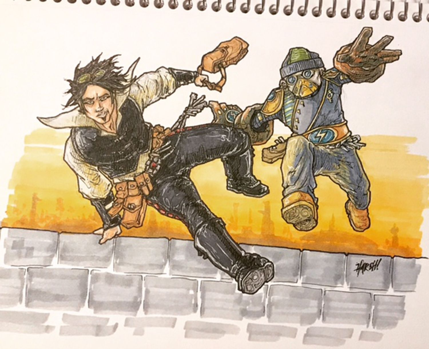
These two rogues are part of the Mytharia setting I've been putting together for Harsh Realities. I plan to do a lot in this world and have many stories to tell there. So my focus is generally more on story than hyper-accurate or detailed images. I like this image. Especially the background and the general adventurous feel of it. But look at Never's (the human guy) legs. What is going on there? I even inked and colored it like that! Sheesh. I may need to do some adjusting there before I publish this piece, but this is a great example of how even a seasoned artist/illustrator can botch anatomy when rushed.
Now. Ask yourself this: would you have seen it if I hadn't pointed it out?
Lesson: Never ever make excuses for your work. Especially during a portfolio review! Just let the work speak for itself.
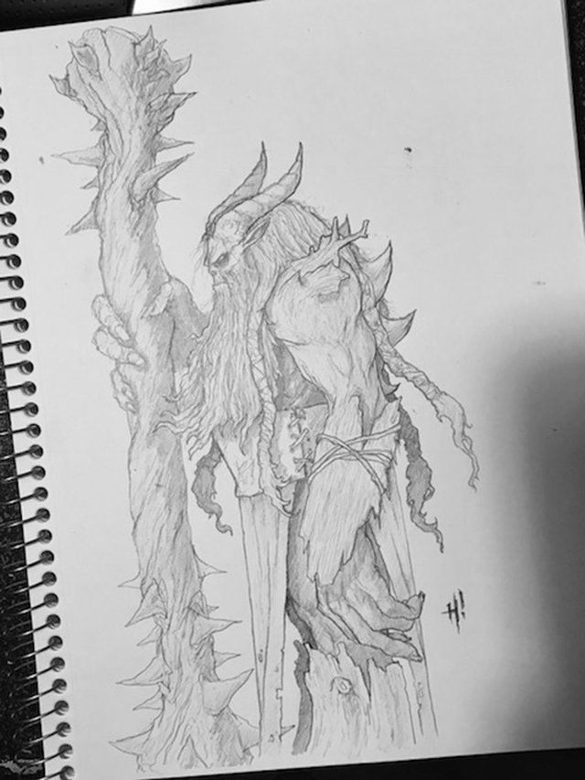
I love this concept and creature design! It's a ThorneOgre from ElfWood, also from Harsh Realities. Even though I have literally been drawing in the exact same size sketchbooks for four decades, I still somehow manage to run an image off the page. Big no-no! Well, again, I can fix it in Photoshop by drawing the feet and merging two images, or bypassing that all together and make a digital version using the pencil sketch as the basis of the image. No big deal, but IMHO the pencil sketch is reduced to concept art at best because of the error.
Lesson: As best you can, plan ahead and know what you are going to draw. That way, you can assure it fits on the page.
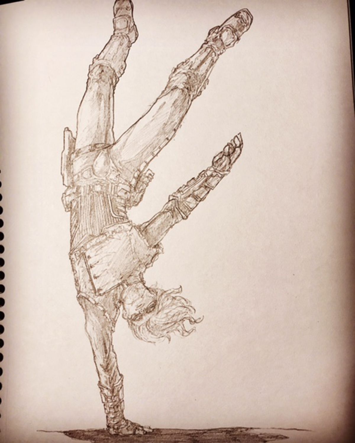
This is another image I'll use for Mytharia. I honestly love this piece because it breaks so many expectations, and (spoiler) is directly inspired by Luke Skywalker from Empire Strikes Back. Much of Mytharia is heavily inspired by Star Wars. Ok, much of my work in general is heavily inspired by Star Wars. I'm sure I'm not alone there.
This image is (surprisingly) near perfect (IMHO). It sits well on the page even though I cropped the image too tightly, and the anatomy and design are great. I love it. Too bad I would really, really struggle to recreate it. Consistency is important in a portfolio if an artist wants to work. I'm learning that (finally), but it's been a real struggle for me over the years. My problem is that I'm very much a natural artist and largely self taught. Sometimes I don't realize I know what I know even though I've had some formal training and should be consciously aware of these things while working.
Lesson: Be careful not to lean to hard on your instincts when working so that you can train your skill set to be able to reproduce works at will. Also, acknowledge your weaknesses, and compensate. For instance, I'm working up a checklist of things each image should have or accomplish to be successful. This will force me to consciously consider these things instead of just zoning out and letting my subconscious drive while drawing.
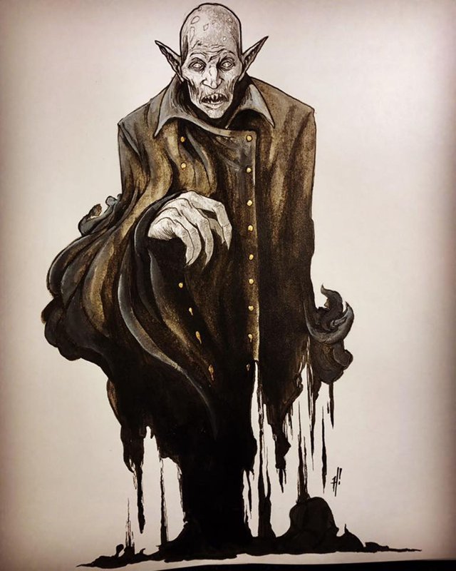
I distinctly remember working on this piece. I wanted to do a Nosferatu type vampire, but I wanted to play with unusual media so I used old coffee and tea in addition to ink. I got so caught up in the notion of doing something artsy that I failed to pay attention to proportions or placement on the page. That led to me punting and making his bottom half melt into some sort of ichor dripping from shadowy smoke. It works, but I know my failures in this piece, and that's all that matters to an artist sometimes. I still like the piece for what it is, but I'll never put it forward as my best work. It's just "ok" in my eyes.
Lesson: Clever can carry a piece through to completion, but it can also blind you to the basics you should be consciously and consistently implementing. Planning and intention are paramount to consistently turning out successful pieces of art.
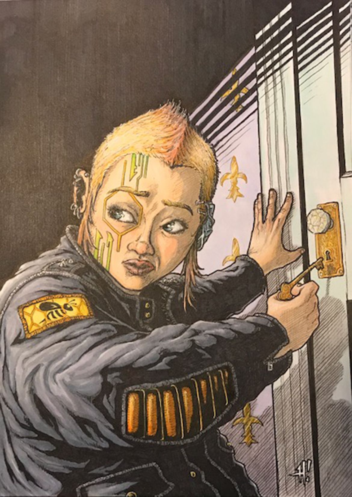
This is another piece that will always be dear to my heart, but falls somewhat shy of perfection. The girl in the image is supposed to be my niece. It doesn't really look much like her, but I was thinking of her when I drew the piece, so it's her. lol. Lame? Maybe, but art is perpetually tied up in emotional entanglements. The piece is part of the EvoPunk world, also for Harsh Realities. I wanted a slight Noir feel to the image, but chose to use some forced perspective as well, and wanted to show a young teen girl in an oversized leather jacket. She's either really short, or she's stooped to unlock the door. Poor planning, actually, but it is what it is when you are working in ink.
What I love the most in this piece, however, is not the execution, but rather the very cyberpunk feel I was able to capture along with fitting some very important symbols from EvoPunk into the image. I've managed to crop the image for the book so that it works well.
Lesson: Almost any image can be salvaged if you look at it right, and some less-than artistically successful images still work if they communicate the intended _____________. You can be critical. You can take critiques/criticism. But remember, there is only one you, and you are the only artist who can do what you do. Keep working. Keep improving. But do not discard your stepping stones. There are gems in the rough in there that people want to see!
These are really good, harsh!!! Love the idea for the post as well :D Great motivator and very true!!!
upvotes
Thanks so much, @veryspider! I'm glad you like it. I wanted to do something other than just talk about my pieces created for clients, and I've been wanting to start a teaching/tutorial series of sorts for a while now. I hope it helps someone. :)