Logo Design

Who:
A college buddy of mine called me up to inquire about a logo design, and of course I gladly said yes!
What:
Logo design can be tricky. People mean different things when they say logo, and typically they are not what artists/designers think of either. To various people, a logo can be a stylized word/lettering, an icon, or something in between. A true logo leans heavily into the icon category, but modern parlance and application has largely overwritten this to include the word logos as well. It's best to ask enough questions up front to be sure you can deliver what the client is wanting.
In my case, the client was pretty sure of what they wanted, and was able to describe it fairly well. I was able to hit the general concept on the first sketch, and we went from there!

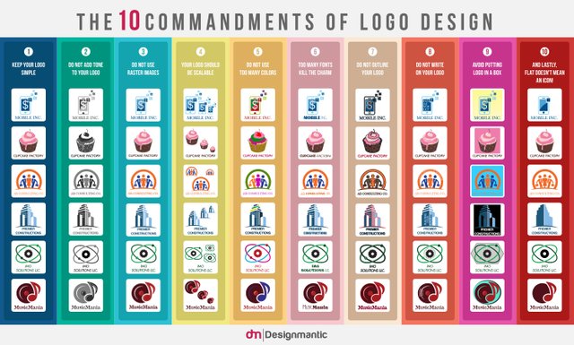
If you search online, you will find many helpful graphics like this one. I mostly agree with everything this graphic reports, but I would add that it should be viewed as subjective - your client's satisfaction is your highest priority. That's not to say you cannot attempt to guide them toward good design though.
When:
This was a quick turn around over the weekend.
Where:
My home studio, as usual.
Why:
Helping out a friend and paying the bills!
How:
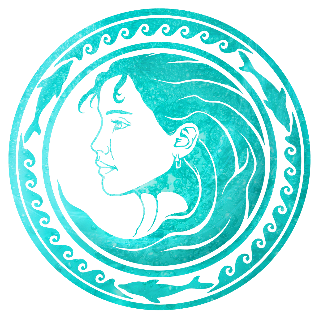
I started with a pencil sketch based off the description. Took a picture and sent it for approval. Once the sketch was approved (with minor adjustments in mind), I moved into Photoshop and worked up the first pass as a black and white image on a transparent background. I sent that for approval. With the approval, and a few minor adjustments per the client's suggestion, I worked up the final image you see below.
Since the client had a clear vision, I was able to go straight to it and knock this design out quickly. Another important aspect of the quick turn around is my depth of experience. I don't think I could have done this so quickly or as well ten years ago, for instance. It had everything to do with bringing my whole skill set, including experience and knowledge, to the job.
Quibbles and Lessons:
I work almost exclusively in Photoshop. Some graphic designers frown upon this as my work is not created as a vector image. I've never had any complaints because I carefully compensate for dpi and deliver images suited for print and web delivery. I've never seen cause to change how I do this. Especially given how technology is gradually closing the vector/raster gap.
This image scales well enough, but the design required some give on that factor. My rule of thumb is the logo should be equally legible at 1" (2.54 cm) square or 100' (30.48 m) square. This logo is near that, but not perfect, and sometimes that's the best you can get.
The client specifically requested the logo have a sea-aqua coloring, but I wanted to assure it worked in any color or value, so I started with a black logo against a white (and transparent) background. This is another rule I work with on logo design. Logos should not be color dependent because not all reproductions or viewers will get the colors chosen. It should read for everyone as best you can without manipulation.

If you like what you see of my work, or just want to know more, please email me to inquire. I am currently taking commissions, and I'm always open to helping fellow artists/designers if I am able.
