You are viewing a single comment's thread from:
RE: My Logo Design Entry No. 1 - ICON DIGITAL NETWORK
I made the top a little less intricate because I knew that would be the case. Do you like the letters smaller?--may to fit inside the purple circle like this?
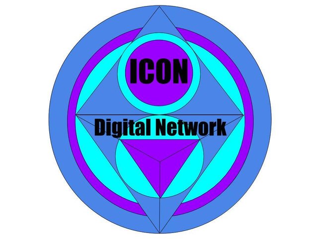
I like the icon in the purple but now the digital network looks off.....We may just consider using ICON only and leave digital network out except for business documents and official purposes...
That option changes a lot in the design. Hmmmmm....more possibilities! <3 Thanks for the comment.