Design - Logo Development - Steemify App
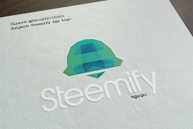
Now that our Steemify app has been announced, I can properly tell you about the logo development for our dedicated Steem Notification App.
The client

Again, just as with the Blockbrothers logo, the client was me and my friends (aka @blockbrothers). So, because of the way the development of the Blockbrothers logo went, I knew my brothers-in-arms weren't the hardest toughtest clients there are. Therefor, this was all fun. And when I say fun, I mean it. We had some good laughs over my first design. 🙈
The Brief

Every App needs an Icon, a logo, something to recognize and distinguish it by. So did our app. And since the function is notification, preferably, the logo conveyed that.
So that's what I set out to do, design a logo that's immediately recognised as 'notification'. And, seeing as it was going to be used on phones and tablets alike, it also needed to be scalable in terms of recognisability.
The Concept

Since bell's are pretty much the defacto symbol nowadays for Notifications and Alarms that part of the concept was easy. The way the bell looked though (the shape) proved slightly harder. My first design got shot to pieces (or laughed out of our groupchat) because it resembled a certain shape to much. I guess bells do tend to resemble something.
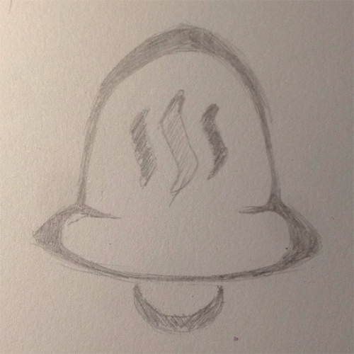
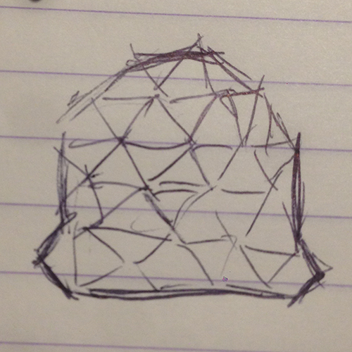
So, during a visit at @bennierex I took up some pen & paper while he was in early stages of coding the app, querying the Steem blockchain for needed data. This resulted in a more geometric pattern forming a bell. That's the best part of doing design concepts. All you need is pen & paper and you can concept anything anywhere.
The Final Design

When I further developed the concept sketch into a more digital design, I quickly noticed that while the concept worked, moving over to the actual design was not going to work. The sloppiness works for the sketch, but I needed real triangles and it just didn't work. But the main idea behind the concept was geometric anyways, so, being a 3d artist by profession, I used my 3d knowledge / skills to model a lowpoly bell in 3ds Max, which I could trace in order to construct the 2d lowpoly geometric look of the bell.
Render

Final Actual Logo
Obviously, the render itself isn't useful as a logo. For one it's not vector (infinitely scalable) and the colors were just placeholder. I needed it mostly for the 'shading' of the bright and dark faces conveying geometry.
So, after remaking this reference in my vector design package of choice, making decisions on colors and some other small tweaks, this is the final logo. I wanted it to have a fresh modern look without being to flat. That's why I used a sort of inverse colors on the bell.

Thanks for reading. Watch my blog & @blockbrothers for furtner news on the pending beta release of Steemify !
Full STEEM ahead my fellow Steemians - @eqko

Great job man 👊
you know it bro 👊🏻
The logo is great! Mark showed me the app. It's also great and very useful.
Ah very cool that he showed it to you. Hope you have an iOs device so you might be able to use it in the very near future ;)
Hey awesome I can't wait to check this one out. Good job working on this guys @eqko
Thanks. Soon I hope.
Very happy with the final design Brother! Can't wait for more projects that need a fresh logo from your hand!
Already working on one as we speak :)
Beautiful logo, looking forward to checking the app out.
Thanks man. Hopefully soon 😉
Looks great! Cant wait for this to drop 🔥