Battle of the Brush: Super-Hero
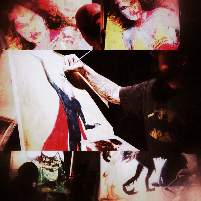
Battle of the Brush: Super-hero edition was pretty exciting. I wasn’t at the edge of my seat at all, it seemed obvious that team 4 comprised of Dimitri Sirenko and Tony Chiang would win. It was a great performance as we got to witness the layering of primary colours with lively brush strokes in Chiang’s signature style. He was the only artist who’s work was showcased against the walls of the spacious room as far as I can remember and this may have given him an advantage.
Our artists had under two hours to complete their masterpiece.
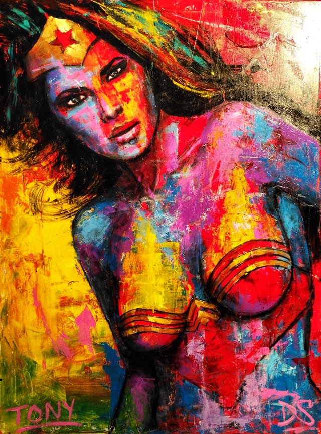
I find the anatomy to be on point and Wonder Woman’s piercing gaze goes right to your soul. It is making me feel caught in her truth lasso which although intimidating doesn’t compare to the Hellfire depths in Ghost Rider’s eyes. If you can’t tell, I have a huge bias towards Marvel which I find more liberal and creative. That is only one of the lesser reasons why my vote did not go to this apparently more deserving team. I have no qualms with the fact that they were working from photo reference but the fact that it was a promo pic for the movie seemed like the easy route. It would have been much more interesting for them to transform a cousin or a friend into the revered heroine. Going the way of fan art would also not have been my first choice.
Just by looking at the duo’s incredible palette knife technique, I could tell that this team was ahead of the competition so I wish they challenged themselves more. However, they were by far the most fun to watch so I am glad they won. I also appreciate the metallic effect on the crown and décolleté.
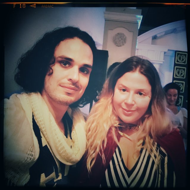
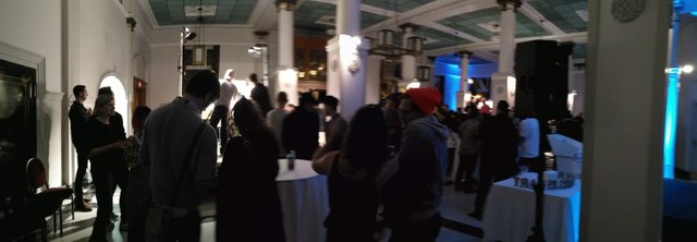
Here I am with my co-critic who arrived halfway through the competition and I have to say I was getting a little restless. When she walked in the room with a beautiful red velvet cape she made herself, the party was officially on! I love this girl so much. She can light up a room already full of people and she kept us on the move as we danced the night away eating delicious vegan pizza. It was gluten-free thanks to a cauliflower crust.
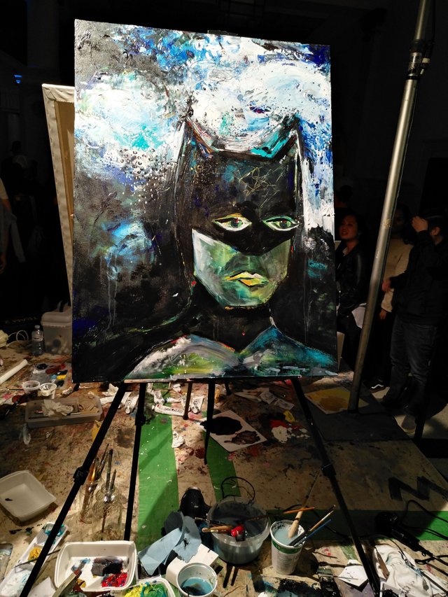
I convinced Jen and her friend to vote for Chrissy Chang and Claudine Gervry, the underdog, as per their blank silent auction sheet. In all fairness bids started at one hundred dollars. I learned it after asking Jen to buy the piece in order to paint over the canvas, to her great dismay. I really did not like the face, thought the nose was too high and the jaw too angular for a Catwoman but then isn’t that what art is supposed to do? Make you feel something? The abstract background is decent and offers a show of depth. I feel like there was an honest effort and the team appeared to push themselves the hardest which is why we voted for them.
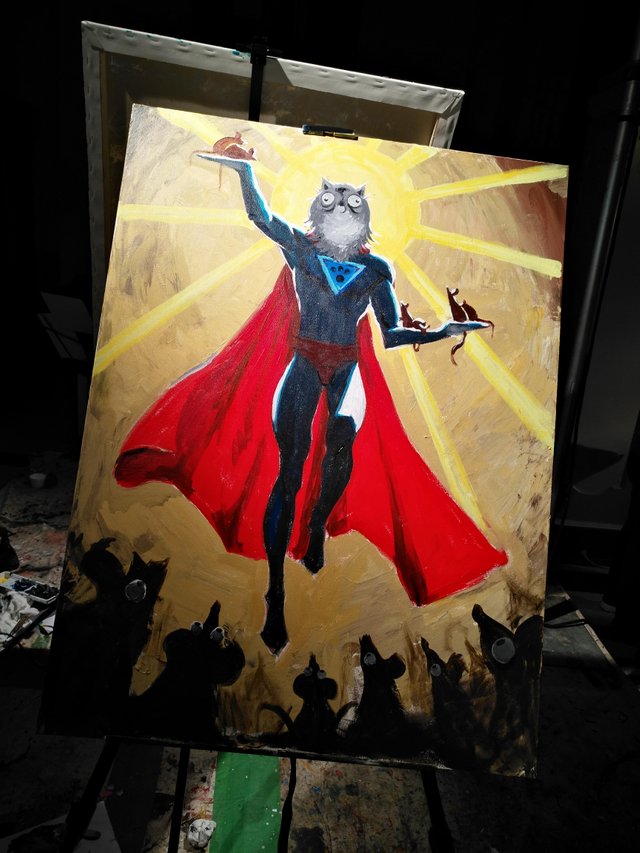
Team 2 almost got my vote. I was quite impressed at the early stage of this painting. From the silhouette, I saw volume so it was a disappointment for that volume not to be properly rendered. The yellow ambiant light clashes against the stark white highlights of the hero and makes him feel disconnected with his environment. The darker parts of the body lack structure which could have been created with a variety of tones but also with the triangular color blocking we associate with comic book art. For example, I don’t see the shape of the subjet’s left quadriceps and that was a costly mistake.
There was a lull in the middle of the performance where the picture evolved too slowly yet at the end, when the surrounding rats were defined, a wonderfully creative idea emerged out of no-where. I love the sense of humour here. The cat-person has such a round face and could be confused for an owl-person.
For all my criticism, I have a lot of respect for Aaron White and Doug Nhug’s achievement.
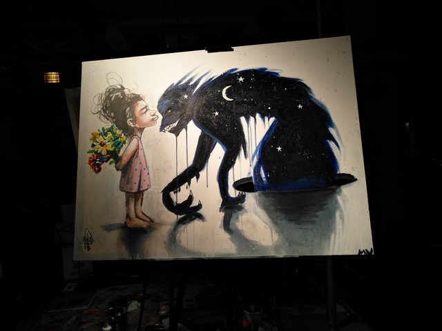
This piece is definitely up to par. In my mind, the little girl is a manifestation of an adult telepath inside a psychic bubble universe. Telepaths, although powerless against AI can certainly hack the brain of an astral being such as this one.
The black outline works beautifully against the white background and the shadows cast by the two adversaries give a sense of their weight. However, the right arm of the creature feels too long.
Where Mike Vigeux and Terry Wonder lacked is in showmanship. They finished some 30 minutes early whereas in my book, keeping the crowd entertained is most important.
That being said, a few more positives are: the texture on the flowers, the nifty dripping and the fact that the shadows are darker close to the bodies.
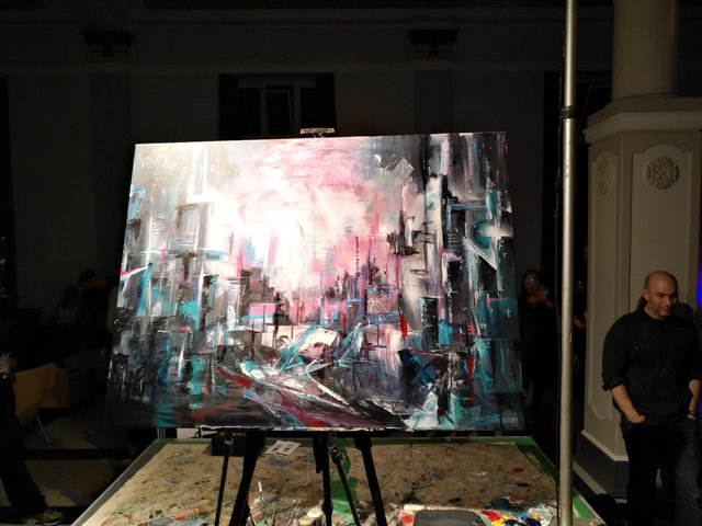
This one is my favourite painting. It’s a good thing not to want to be literal but a theme like super-hero calls for pop art and nothing else. The cheesiness of the theme is absent from this painting. Perhaps the buildings could have been fighting each other. Where is the danger?
If say, planes were bombarding the city, it would have made for an amazing origin story. We know that the city is something a good super-hero prides herself on defending, but that theme alone isn’t enough to score the non-literal points.
It’s too bad because like I said, Soda Leavey and Chris Watson made my favourite painting of them all.
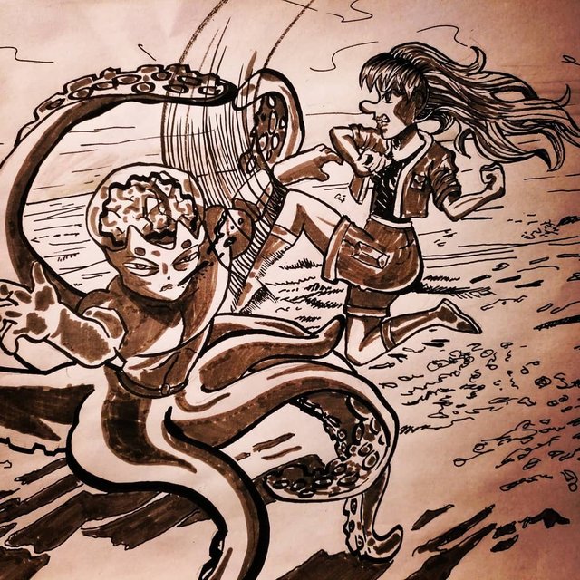
Provided she agreed, this Inktober drawing is a composition which me and Jen could have used for such a challenge. She has done Battle of the Brush in the past and would love to team up with me in the future!
Join Steemit Dreamit on Discord!
This sounds like such a cool event to see in person! I love the concept! Great analysis of the various entries. Love this!
Awe thanks Carl, it means a lot! And I recently connected with your Instagram. So cool to have snapshot of your daily life with the kids!!!
Hi edouard,
Visit curiesteem.com or join the Curie Discord community to learn more.
What an amazing event! I have never been interested in art but then I have found the art and artzone tag on Steemit. Oh man! I can't stop going through all the artwork now!
Your review of each piece is fascinating. As I don't have any experience with that, I only see a painting and then I think 'nice or not' :D You gave a different perspective to me. I will pay more attention to the detail now. My favorite would be the one with the girl. BUT if you wouldn't say that the right arm of the creature is too long I wouldn't notice. Now it does bother me :)
Thank you for sharing. I really enjoyed your post!
When I go to art events, I have my blog in the back of my mind. I make sure to remember certain highlights from conversations or any other observation that could enrich the narrative of those photos.
I love how this has made you eager to be more observant and to put words on how art makes you feel. That is one big takeaway that I got from art school so it is a pleasure to share it.
When it comes to art, trust your gut and you can be just as good a critic as I am!
You are very kind but it would take me A LONG TIME to get even a little bit close to your level! :)
@curie loves you!
That being said, cool read there's no way i could produce anything remotely like that with such time constraints.
I just posted my (thus far) inktober drawings and they are cringeworthy. I have given up on drawing and painting so many timez because i'm a perfectionist and if it's not good enough quick enough i get too annoyed and impatient... character flaw
Your blog is amazing and I hope you get more recognition because you absolutely deserve it. I’m also very pleased that you are back to drawing for Inktober and so proud of you!
Hey @edouard Completing this amazing thing under 2 hours sound crazy. Look at the Batman one :)
--

I have joined my favorite communities on the 1Ramp App
Awesome!
Just thought I’d share a response to this article by one of the organizers of the event:
“Great writeup, Edouard. I really enjoyed reading your critique; it really gave me some insight into how to explain the critiques. You definitely have a gift in explaining your feelings through words; I wish I had that, too. It would make writing descriptions of the artwork much easier.
The work that you and Jennifer made would have been perfect for the show. Too bad we had all the spots filled already.
Anyways, good read. Looking forward to reading more of your articles.
Kevan”
Houuu that looks so amazing when you think they only had 2 hours to paint!!!my favorite is the deathnote inspired painting i really like it it is incredibly well done.
I didn’t realize it was Deathnote inspired. I noticed one of them checked a reference on their phone and thought the original had a nice movement which wasn’t completely translated here. But yeah I totally dig it too!.
I may be wrong but it looks like a lot like the deathnote demon:)i love the contrast between the demon and the little girl.
Thank you for sharing such entertaining event, even been a reader of your post, it is easy to feel that exciting competition feeling in the air, the topic is also very interesting as nowadays with Marvel series, there are so many possibilities. Was interesting to hear you own opinion and thoughts about every art work, especially you know those guys very well so it is easy for you to assess them. Enjoyed you review and the works are all awesome.
Thanks a bunch from dropping by, your support is much appreciated. I actually did not know these artist before the competition. What is it you like the most about the Marvel universe?
There are few of them but I like Hawkeye most, may be he is more close to normal human being and I like Archery, since I was little all the stories about Robin Hood, who was master in that then later Hawkeye with his skills and a great positive personality.
That event looks like an incredible one, it will be so great to be surrounded by so much art pieces and also seeing the whole process.
I do like wonder woman's painting, the "clash" of colors gave the painting a more fun feel...
I think I like catwoman too, it's definitely a different kinda cat woman😀. Is that "cat fish " she is holding in her other hand?
I do like the creature with the "cat-owl" face, with the little girl there. I think that one is cute...
I like what you wore to the event (that's you, right?), it looks interesting, fun and carefree. I don't know if I will be able to pull of that look but it's definitely fun watching you...
Your post is so nice and fun. You even spotted things that could have been easily overlooked... The makes you a good critic 😊