Sovereign
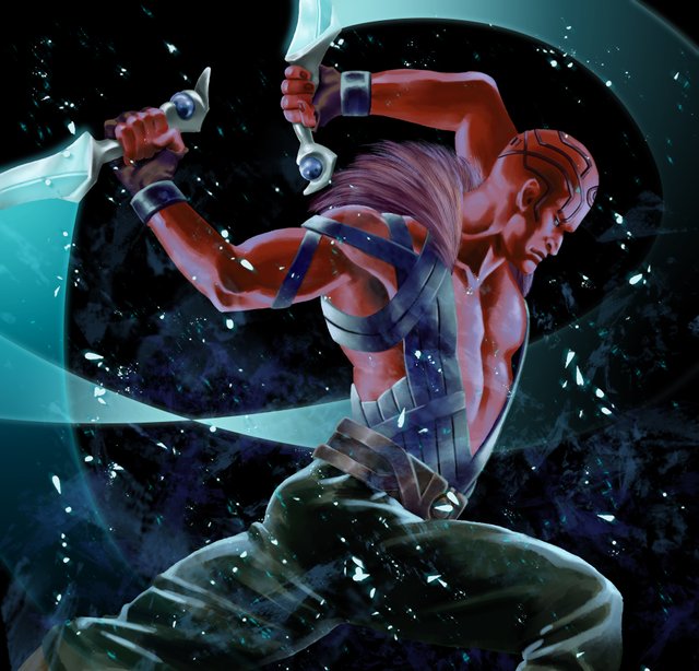
okay! so I've previously talked about my process when it comes to illustrative or comic style pieces but not my painting process, so here's a post about it. This piece is for an expansion of game called Ophidian 2360. This hasn't been released yet to my knowledge so this is the first look at it. If you have any questions about the process, let me know in the comments!
First Ill look for some reference. I found a good one from tumblr. I think this one is something like "Real Men do Ballet" or something to that effect.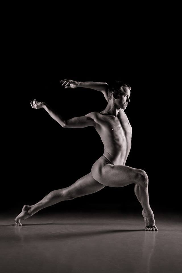
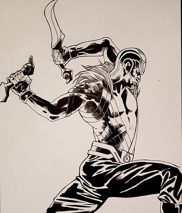
Then comes this ink sketch. I really wanted to get the lighting to where I wanted it in the sketch
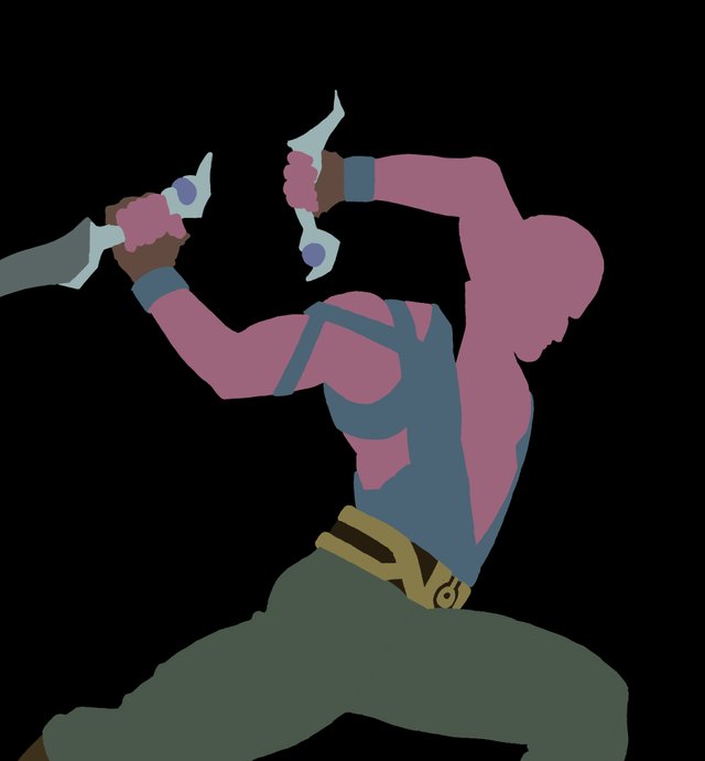
These are the quick flats. As you can see, I missed the left arm blade and had to adjust later. I did the mane with a specific brush that wouldnt need flats so I left that out on purpose.
ok, it seems like I jumped a lot of steps here but I promise this just a multiply layer with some kind of grey. I select the flats from the previous layer to keep my shadows neat while I work.
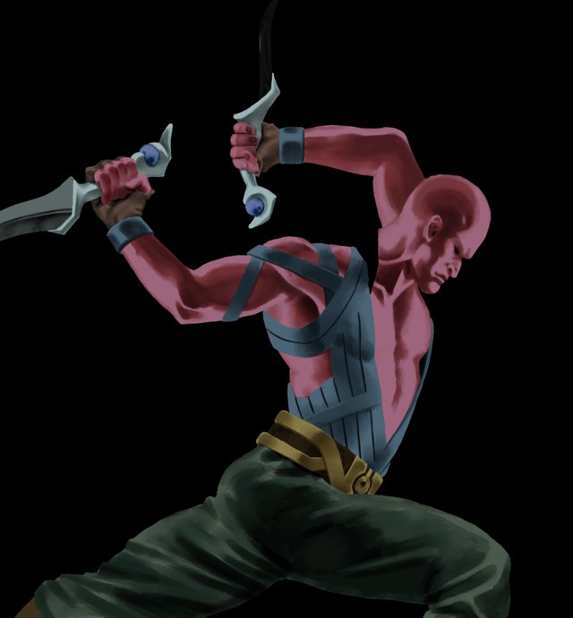
Once I've got the base shadows, I go in and adjust based on what I think will look good. Lightening, darkening, adding color. All with adjustment layers.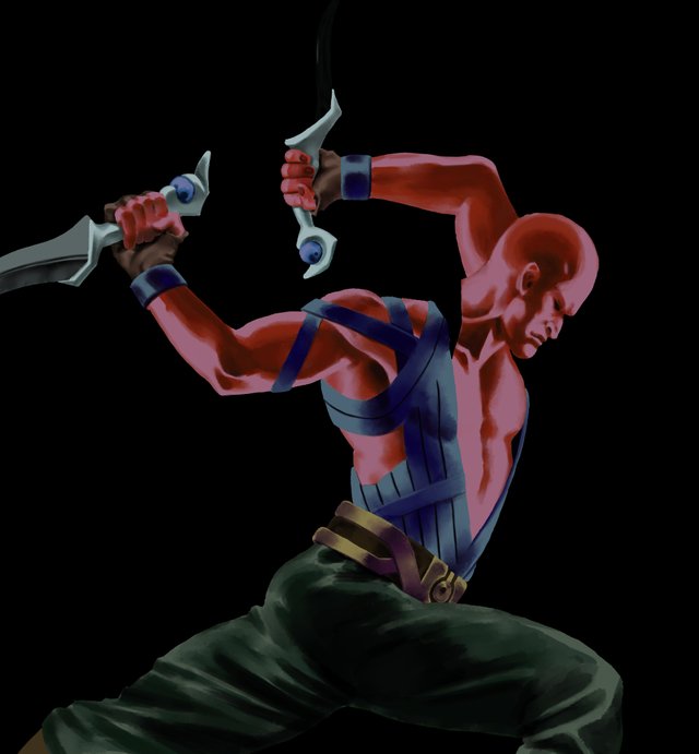
Next, I do the same thing with the highlights, although less color adjustment will happen here since the lighting is almost universally pale blue
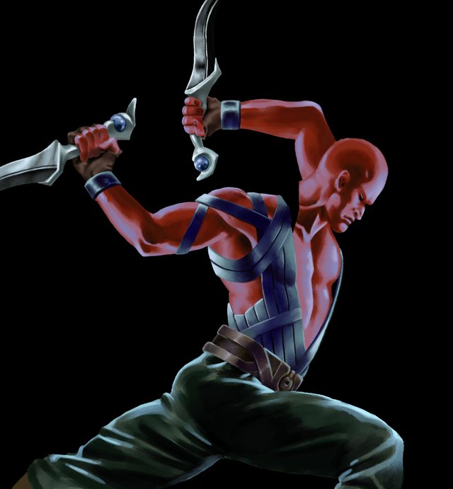
I add the mane now on its own layer. I use one of Kyle Webster's bristle brushes. I add the heavier colors first then layer lighter colors until there's a nice depth to it. I also add stray dark hairs.
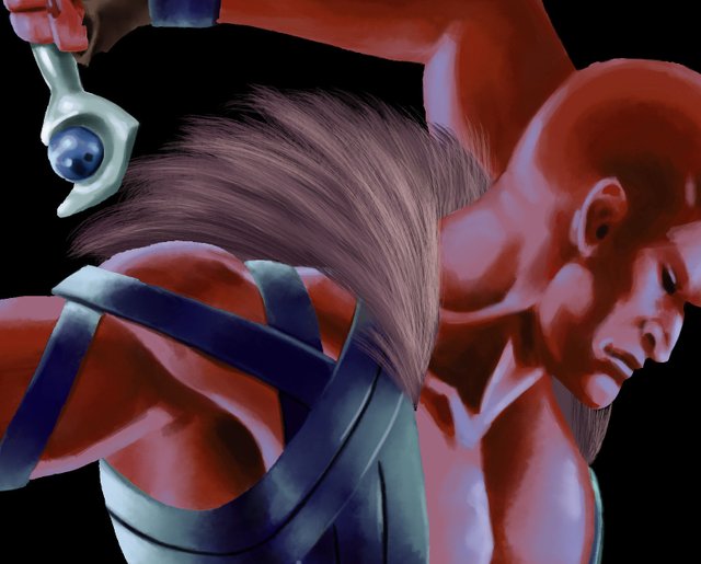
In this one, I added a couple adjustment layers in the mane just to give it some color differentiation. I also added some stray hairs that catch light to give it a bit more depth.
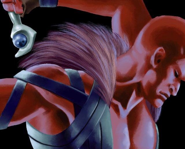
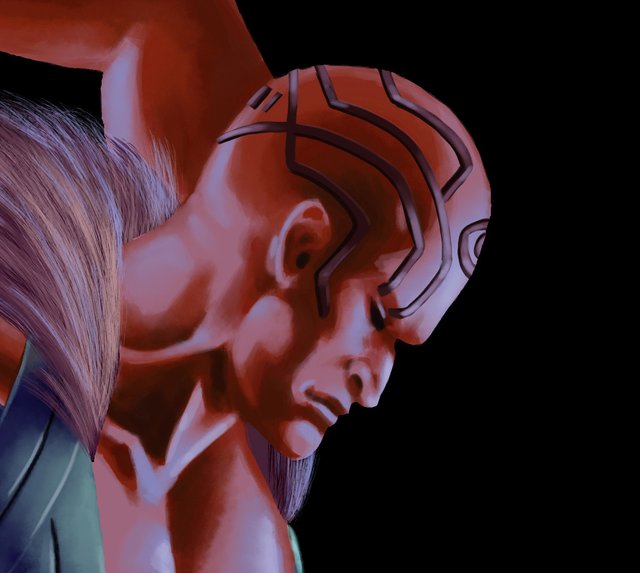
On this step, I added his facial markings which I've thought of as being a bit reflective and just laid over the skin so not like tattoos but maybe something removable
The blade tracks were a bit tricky. Due to where they are in relation to the character I had to use two separate layers. One on top and one below the character. I used paths to create them. Basically, once I created the paths I used them to select the interior, used a few gradients with color fading out to clear. I then deselected and using the paths again, I stroked the paths with brighter color. Then I used a layer mask with a large soft brush to make the slash tracks "fade" where I wanted them to. Almost there!
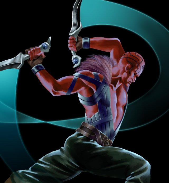
Then I added the glow to the blades. This is pretty simple. I made a selection in the shape of the blades, filled them with the same bright color of the edge of the blade slashes, and then reduced the opacity. I duplicated that layer and then used the gaussian blur effect and reduced the opacity.
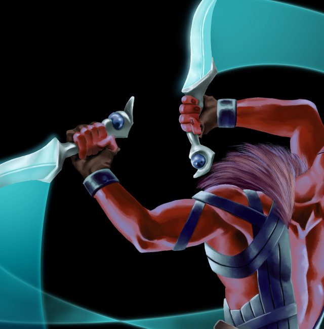
At this point, I thought I was pretty close to done, but my art director on the project thought the black backdrop was a bit too simple. It could use some texture and movement so I used a couple tools. The first was a spatter brush. This is still the same pale blue I've used elsewhere. I added a couple layers for this. The opacity was lowered on some layers to make it look like some of these were off in the distance. In addition to that, I duplicated these layers, added a motion blur and lowered the opacity. I thought this gave them a nice sense of movement.
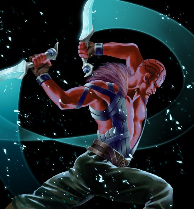
However, I still need to use something more for better texture and to break up spacing just a bit more. I grabbed one of my favorite Kyle Webster concept brushes, changed the color to a kind of blue purple, added two layers and set them to screen. I mashed around wildly until I found a spatter of texture that I liked on both layers and adjusted the opacity until I liked what I saw. And for the last step, I added a bit of a cold twinkle in his eye ;)

It the same process I use when practicing digital art when basing from stock images. But your skills are much more advanced. At first I thought this was an awkward pose for carrying daggers to strike. It seems like an impractical way to deliver a slash to an opponent but then it's just for the sake of practice so it's not bad at all.
What made this post a lot more interesting is the process shots and thought process behind. I like the textures that overlay the main character, the snowy or smoke effect thing suits the image well.
Thank you for your kind words! I do think theres some commonality among most artists when it comes to process, particularly with photo reference, but there's always a few small differences that end up makign big changes.
Congratulation on the curie vote! So well deserved!
The process of creating the illustration was spectacular .. And the final result undoubtedly charmed me. I know the work that this entails, my sister is a designer and does works very similar to yours, and it is not easy ... I could see your past posts and you do it really Excellent post @edgaruvm
Thank you! I do graphic design jobs here and there. I think people really estimate how much work is done. People tend to see end product and think that the path to it was very direct.
Amazeballs, Ed :D Love it ! The step by step explanation is really wonderfully done, and I love the finished picture very much <3 Love your style so much * ___ *
This post was shared in the Curation Collective Discord community for curators, and upvoted and resteemed by the @c-squared community account after manual review.
I love how this art piece turned out to be, its just too beautiful. I also think the textures you added made the piece extra beautiful, its just a perfect compliment to the glow from the blades.
The mane you added seems like the perfect finishing touch to the whole look, I love the colors that you chose for it. I love the vibe this painting gives off!!
You did a great job explaining the whole process, it so detailed and concise!..
Congratulations @edgaruvm! You have completed the following achievement on the Steem blockchain and have been rewarded with new badge(s) :
Click on the badge to view your Board of Honor.
If you no longer want to receive notifications, reply to this comment with the word
STOPTo support your work, I also upvoted your post!
Do not miss the last post from @steemitboard:
hello @edgaruvm I congratulate you for the great art you have shared as I enjoy every step of the art you have done, step by step as I enjoy every detail of the art very beautiful a lot of love and faith @ neymarth10
The art process is not an easy one, creating something beautiful out of nothing amazes me. I like that you took time to explain the entire process as well as why you chose one style instead of another. The result is amazing. I can just imagine him as a superhero, fighting against evil.
Your creativity is outstanding. Great job @edgaruvm. I just love this.
This is awesome! I love the inspiration and that you posted the steps and the process. Great Job!