We Draw The Letter H
Hi Steemians,
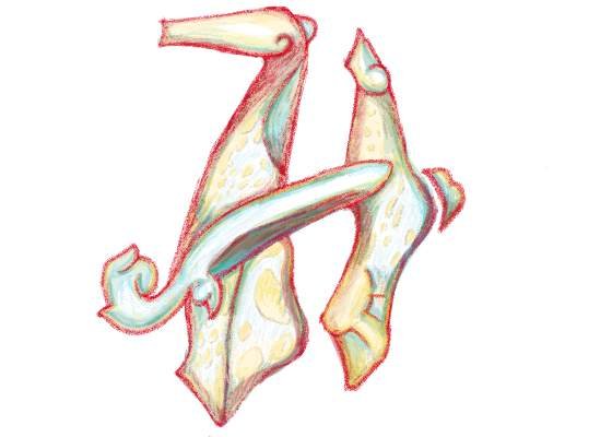
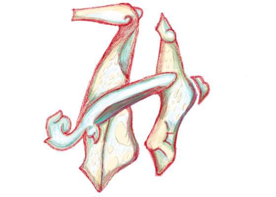
This is a drawing of the letter H I made today as my entry for the contest of @ran.koree. The details you may find on this link: https://partiko.app/ran.koree/we-draw-the-letter-h-contest?referrer=dinglehopper
Here you will see the stages of my digital drawing which by the way I want to make it look like a pencil drawing
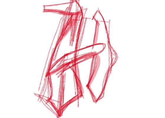
Rough sketch of the design. No specific direction yet except for the mix of rounded and sharp edges.
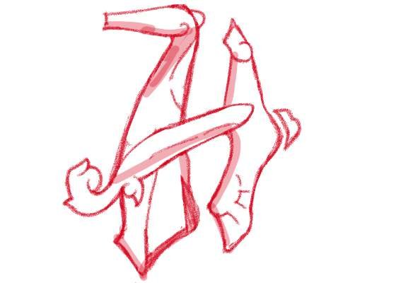
Refining the shape and edges and defined that bar in the middle to make it a bit elaborate. I think this is the defining detail that would add character to the drawing. To balance it, I added that little bump to the right then another small ear like structure to the top. Those small details that could enhance the design. Somehow I am seeing a good direction now in terms of the form. The lines are a bit linear so I added some curvy ones.
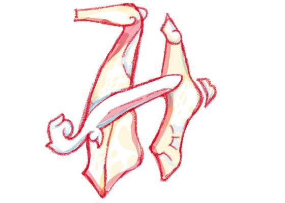
Starting to add base colors with the blue undertone while maintaining the red line drawing similar to the previous entry I made for letter G
The details are highlighted like the mellow yellow spots and the greenish patina on the edges and crevices
Thanks for reading my blog post
@dinglehopper
Posted using Partiko Android
Creative and artistic well design letter H, and a perfect combinations of colors to make it looks unique and nice
Thanks for dropping by 👍
Posted using Partiko Android
I like the colors you used and the border of the red letter .... nice work :)
Thanks ran
Posted using Partiko Android
@dnglehopper This is an awesome entry!