Furthermore on Pigments
Lakes
A lake pigment is made by precipitating a dye upon an inert pigment or lake base. Similar to the process of dying cloth a great deal of skill is required to produce usable product. Lakes are made in a large range of hues and strengths. A toner is an organic pigment in its most concentrated form, containing no inert pigment; for satisfactory performance in artists colors it often requires added inert pigment to contribute bulk to the paint and to decrease excessive tinctorial power. Clear will typically will have a base of alumina hydrate, transparent lakes that are used as glazes or ink; while blanc fixe is the best base most cheaper options are made on clay or barytes. Green earth makes an exceptional base for green lakes as its a species of clay that absorption powers are strong for dyes. A lake can also be made using a colored pigment as a base. An example of this is Tuscan Red, made for industrial use its a combination of alizarin on an Indian red base.
Most of the modern dyestuff are synthetic, although a few examples of extracts of vegetable and animal origin still survive for special purposes usually because of their low cost, for lakes made from modern organic colors are superior to those of natural coloring extracts. Prior to the eighteenth century lake referred to red lake only. The term comes from the Indian lac, scum or sediment from the dyers vats, called lacca and consisting of dyed particles of shreds, fibers, dust, and other impurities, was collected and used as a pigment in Italy.

Reduced or Let-down Colors
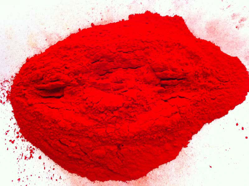
On the market are pigments known as reduced or let-down colors. These pigments are ment for commercial use and should not be considered for an artistic purpose only exceptions being some of the highest grades in purity. The difference in the production of a reduced pigment is that the inert fillers are added during the wet stage of a batch rather than adding them while the pigment is still in powder form. This process results in a final product with a brighter or less muddy tone than if the mix was made in the dry stage. A reduced pigment will typically be labeled with the color used along with its purity. An example of this is the use of Prussian blue in this process that will typically have a C.P. in the label. In this case C.P. doesn't simple mean chemically pure rather it denotes that the hue is at full strength. This is a huge improvement to the former use of fancy but confusing names for the various grades.

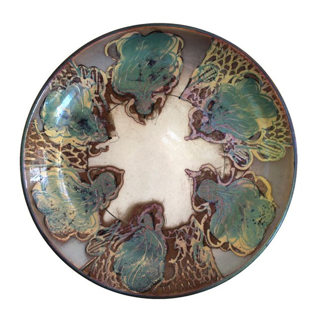
Spanish Garden, R Reid, reduced pigment lustre, vitreous earthenware, dia,34
Mass Tone and Undertone
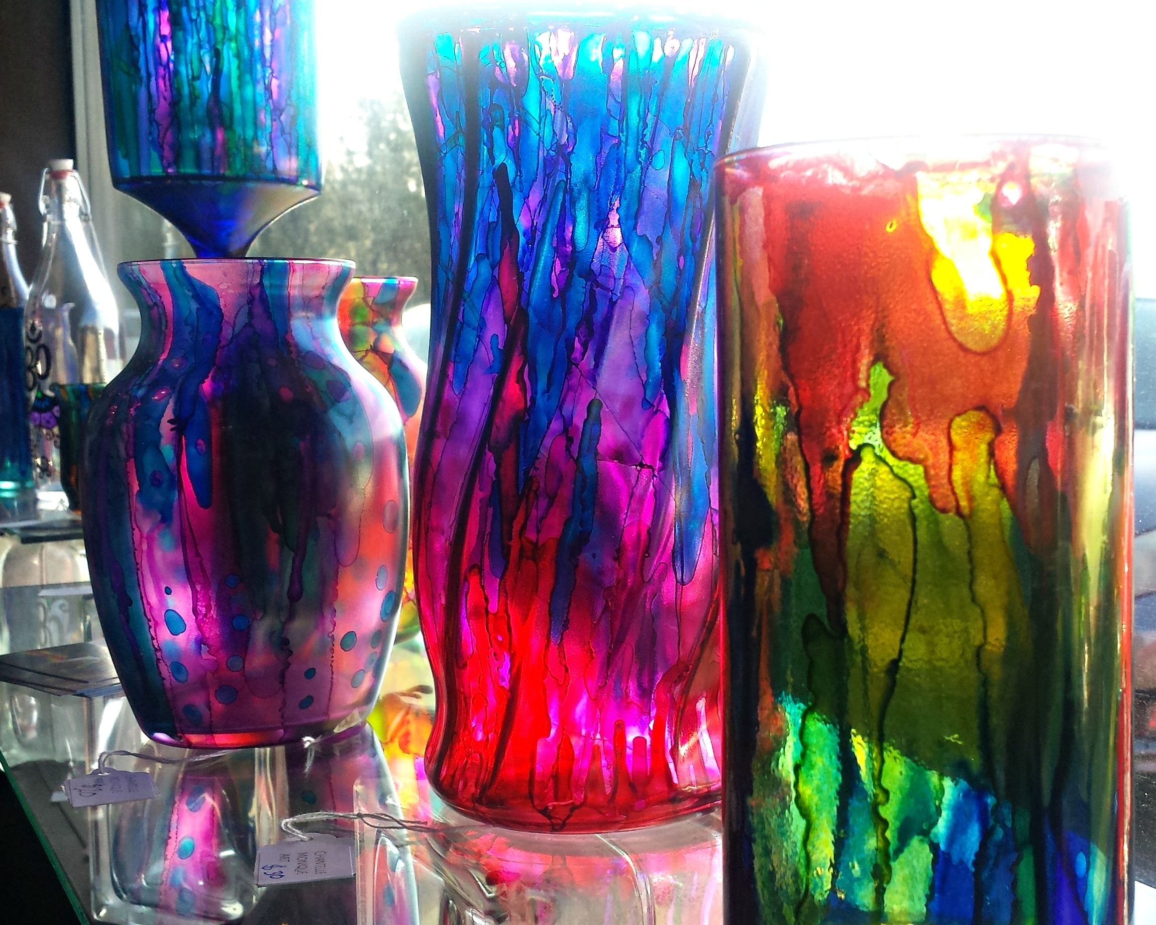
A mass or top tone is the full strength surface color of a pigment viewed be reflected light. The color affect when the pigment is spread out thinly over glass then viewed by transmitting light through the color is called an under tone. Some pigments have a distinct difference between there under and top tones. This is apparent in the average alizarin when a thin layer is placed on glass then viewed through light. Some of the synthetic organic reds used in the manufacturing of printing inks can also produce a two-tone affect. While other pigments so little to no difference between their top and under tones.

Nomenclature
It should be noted that the chemical purity of pigments varies greatly. Some are almost pure compounds while others of the same high qualities contain minor components whether natural or added during manufacturing. Pigments are named for their resemblance to objects in nature, their inventors, places of origin, their purpose of which they are used, and their chemical composition. For centuries the nomenclature of available pigments was confusing and unsystematic. The main reason for this confusion was the use of fancy names on the label by manufacturers and others, often for an ulterior motive. This causes a single color to have a vast number of names, and multiple colors all going by the same name. This organization of creating a universal nomenclature has made the job of the American Society for Testing and Materials (ASTM) much easier to create the standards in artists supplies we see today. When an artist is buying supplies its wise they choose products that are labeled with relevant information based on the components and origins of the product. Brands without such information are under much speculation as to their qualities and life expectancy. If you want your work to last its best to follow the standards of the ASTM.
Thanks for reading, at this point in our journey of education we come to the decision of whether I should type up this nomenclature or not. I would like to leave it up to you guys if you want me to do this or not. This list of colors I'm sure can easily be found. My next post could either be this list (which I warn you is a very long list lol) or we could move on to painting styles and their suggested pallet combinations.
If you enjoyed your support with an upvote and resteem would be much appreciated, but you have to let me know in the comments so I can more easily find myself to your page as well.