Still Life Painting Workshop Recap (Jack Richeson & Co)
Greetings,
The following is a recap from a trip out to Jack Richeson Gallery & School in Wisconsin to teach one of my Still Life Painting/Composition workshops (this one in 2015). Just recently (due to familial duties) I have put my teaching activities on hiatus, but I look forward to getting back to it down the road!
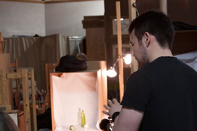
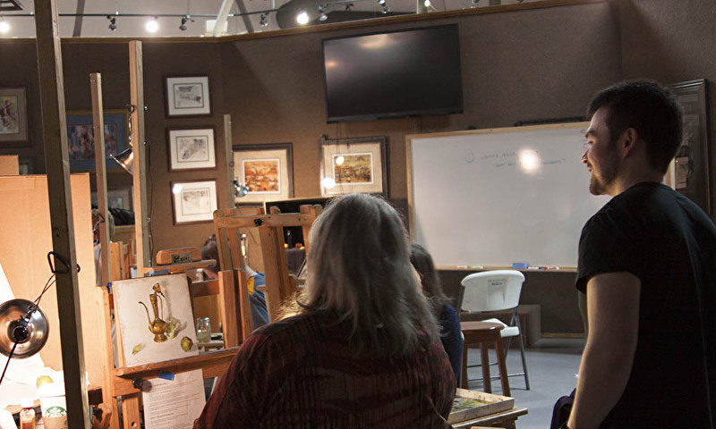
If you're an artist, you already know this. But for those who don't know, Jack Richeson & Co is a well-regarded art supply company. They also happen to have a gallery and school in the same building. I got a personal tour of the warehouse/factory. That was cool. Here are some pictures from the workshop.
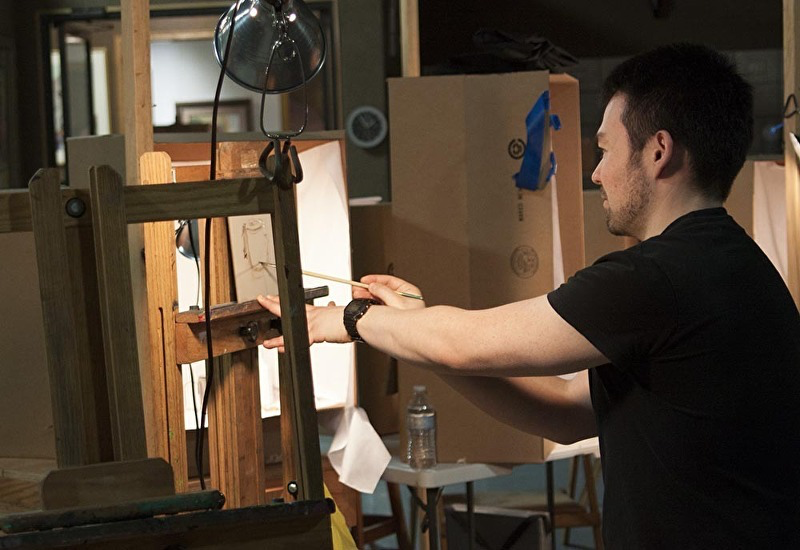
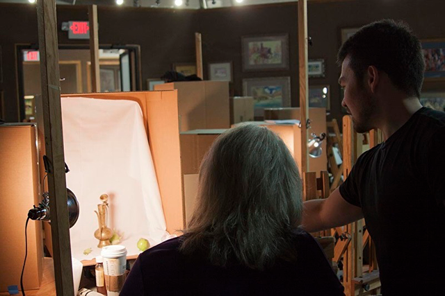
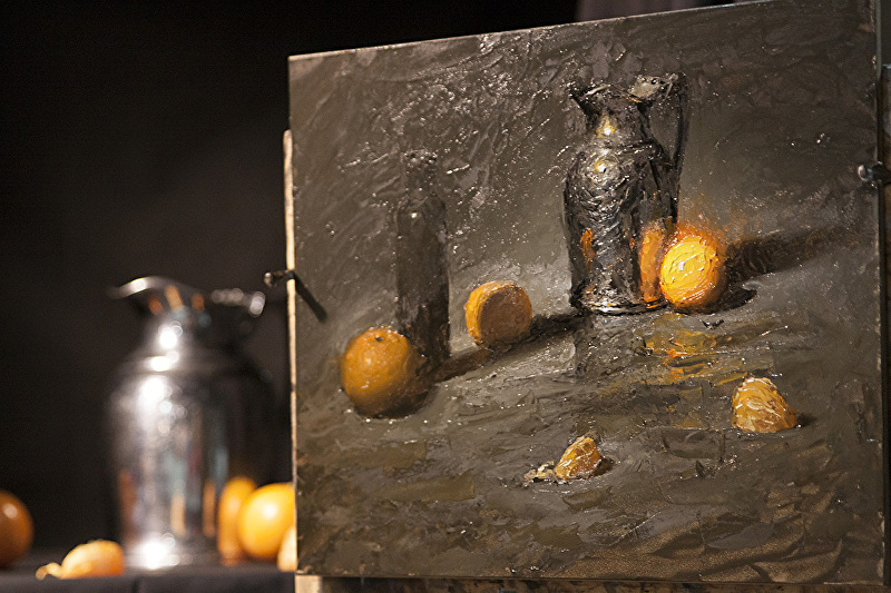
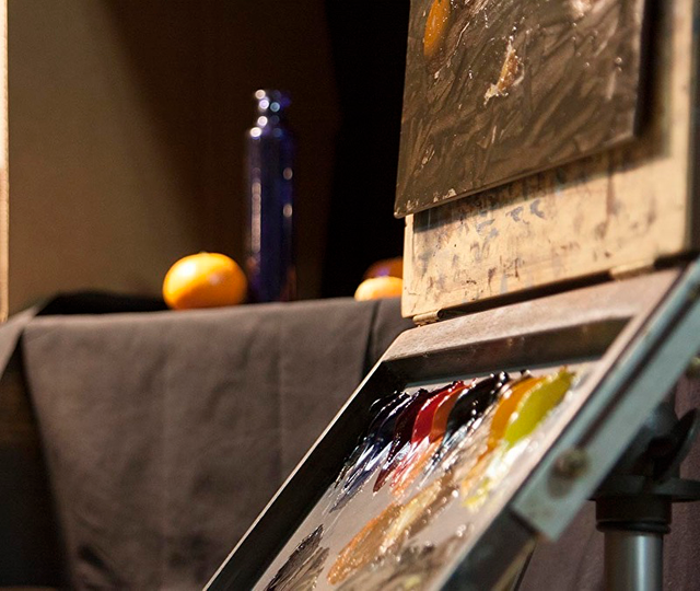
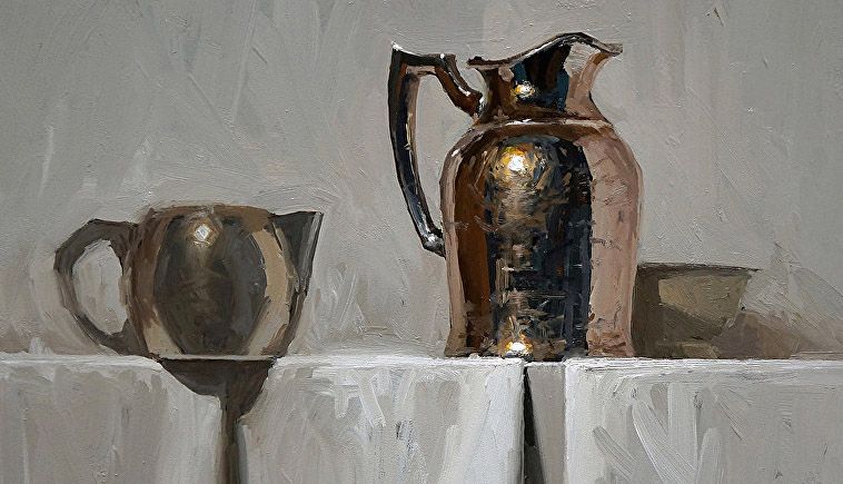
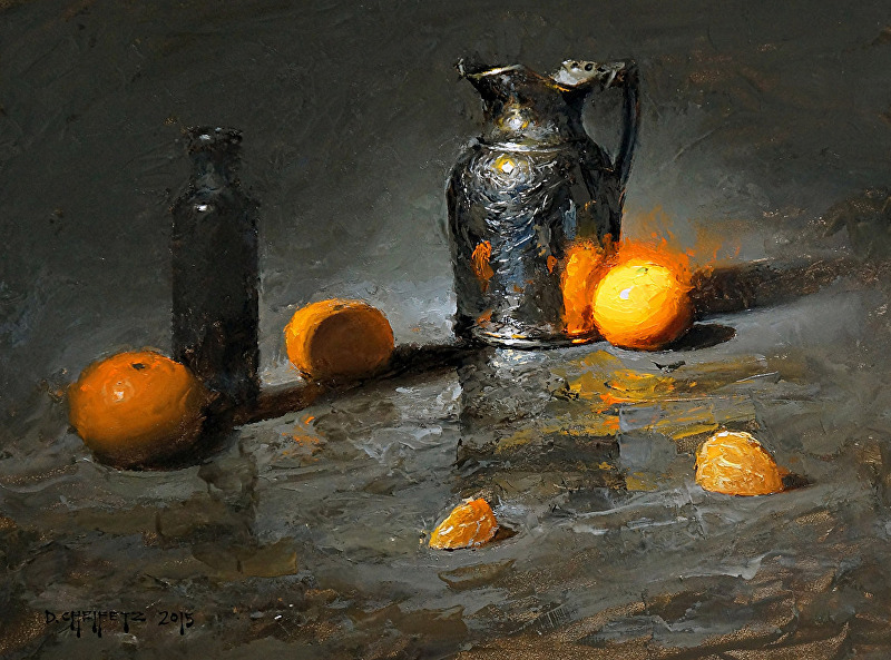
Here is the finished first demo:
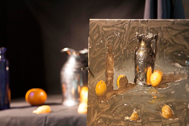
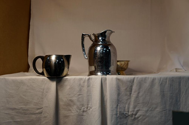
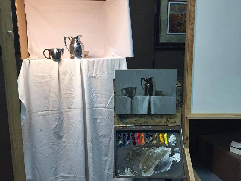
Here is the setup for my second demonstration. You'll notice that the values of the forward metal object (left) are altered in order to allow focus on the pitcher. My workshops are all about creating focus.
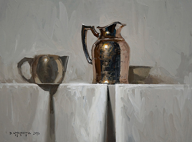
And here is the finished second demo:
During my tour of the gigantic warehouse, I got to see where they actually manufacture Richeson paint. I learned that they produce the paint in small batches to ensure quality and consistency. That's really nice. I now have some of their paints at home and I'm trying them out on my newest painting.
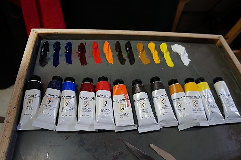
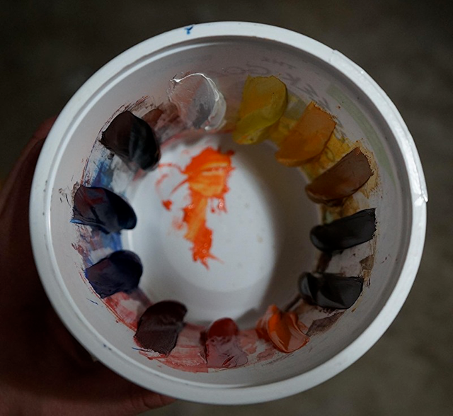
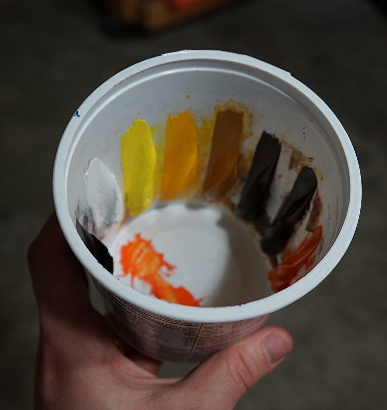
So far I'm enjoying the paint. It will take some time before I have a solid opinion, but it seems like great stuff, especially for the price. Good consistency and pigment. I'm particularly liking the cadmium red scarlet. Can't get much better. One exception is the cadmium orange. In my opinion it is weak. I prefer a much stronger orange. More orangey. Also this particular tube is really soupy, but that might be a batch issue. Honestly there is only one cad orange that I'm liking, and it is WN Artist's Oils. Some other popular brands of cad orange are crazy looking...almost neon...and way too red. WNAO cad orange is just right.
The titanium white was fine, on par with other decent whites, but lately I've been gravitating towards Permalba Original white because of Jonathan Linton's famous White Test, introduced to me by my artist friends in Virginia. Basically it stays more white over time. That is good. Also it has a good feel to it. Heavy and opaque. It has some body, and it stacks well.
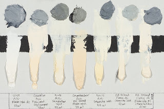
But I digress. Overall I am impressed by Richeson's quality paint and I will likely end up making some of their colors a part of my regular arsenal. I recommend.
This recap was written after the workshop in 2015. It has been a couple years since I visited the Richeson facility but I hope to do it again when I resume my teaching and traveling.
Thanks for reading! -David
