Color Matching When You're Color Blind
Graphic design has never really been my cup of tea, I'm just terrible with colors because I'm color blind (protan). There are times when I just have to compose an image myself, to use in one of my articles for example, so I need tools that can help me to match colors together.
Whenever I have to do some image editing, I launch Gimp and look for a public domain base image. Usually I'll have to modify these images a bit, by adding a matching background for example.
To find the correct matching color to use as a background, I'll select most prominent color on the image with the color picker tool (eyedropper). I'll then copy the the HTML (HEX) notation and input that into Paletton to get all the possible matching colors.
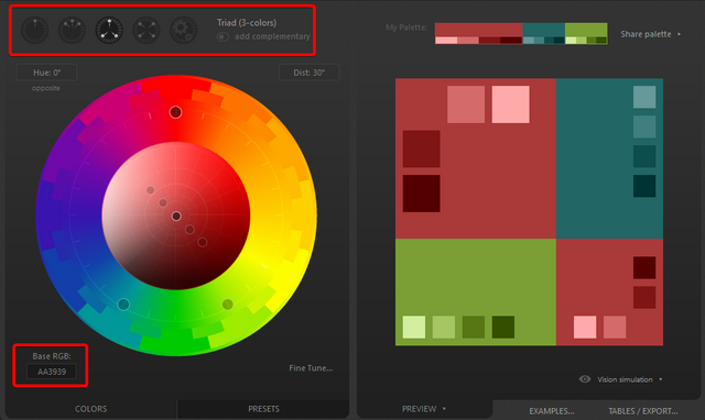
Once you've entered the Base color code into Paletton, you can pick different color schemes and easily copy the HEX color codes to use them in your image editing software.
Now, it's also possible to just use the color wheel in Gimp itself, but that's only useful if you want to get triadic color schemes. Paletton gives you a lot more options to choose from and it's very handy to be able to see all those different color schemes in front of you.
Even if you're not color blind, this is still a very handy tool to use for putting together your own color schemes. I'll give you an example of an image where I've added a matching background, to an image of a robot.

Here, I took the color of the robot (#64f3d5), entered that into Paletton and found the perfect matching blue color (#2a71db) to use as a background. I'm sure that I would have picked the wrong background color if I didn't use this tool to help me. I have no idea if my color blindness affects my color matching abilities, but now I don't have to second guess myself at least.
I'm sure that any professional graphic designer can do a much better job, but if you're just occasionally editing images to use as thumbnails or featured images on your articles, this could certainly help you out.
I hope this article was useful to you. Leave a comment if you have any questions or remarks!
Check out Mannabase if you want to receive a free basic income
Receive free Litecoins every 5 minutes
Get FREE basic income through Swiftdemand
Join STEEMFOLLOWER to gain more exposure on STEEMIT
The 4 links above are referral links and support this blog

I am lucky enough to not be colorblind, but I am not color aware shall I say My Wolfe says I am terrible and working on which colors go together well
That looks like a cool tool
This is an awesome tool. I am going to have to add it to my list. Although I am not color blind, I am not the best and determining which colors go best with others. This will be really useful! Thanks for sharing!
Yeah it's really handy for anyone who isn't a professional designer. Saves me a lot of headaches :P
My dad is colorblind and used to do a lot of web design stuff. This would have been perfect for him. He doesn't do it as much anymore though.
Hello @daan, thank you for sharing this creative work! We just stopped by to say that you've been upvoted by the @creativecrypto magazine. The Creative Crypto is all about art on the blockchain and learning from creatives like you. Looking forward to crossing paths again soon. Steem on!