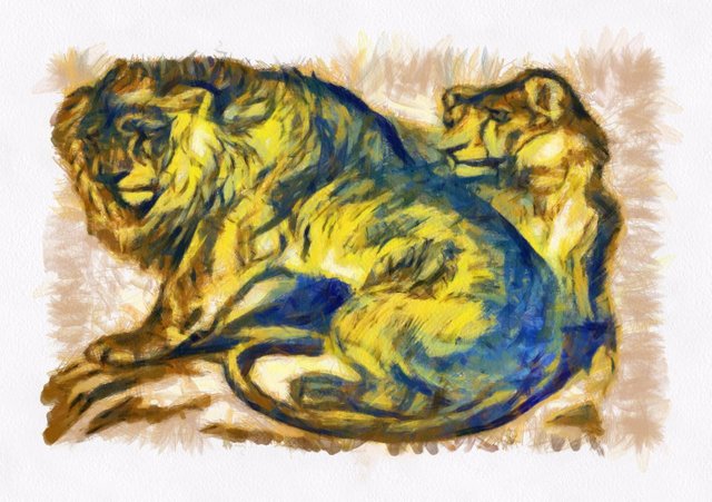
Original Art - Lion Country - Memories of a Visit to the Zoo - Watercolour

Lion Country - Memories of a Visit to Madrid Zoo
In June 2016 I stopped over in Madrid for a few days, during which I had an opportunity to do some ink and watercolour drawings at the zoo. The drawing I made of two of the resident lions is given below.

Two tone watercolour and ink sketch of two lions, completed whilst visiting Madrid zoological garden last June.
I normally take photographs in preparation for painting, but I was in artist mode at that moment, and as I was travelling alone I had plenty of free time to sketch. I did several sketches of different animals that day, and over the next few weeks I will work up some watercolours from them.
The aim was to produce a more colourful watercolour, with a definite "painterly" feel. That is with evident brushstrokes, and a thick paint texture, as the intention is to make evident to a viewer giving it a close examination that it was not a print of one form or another.
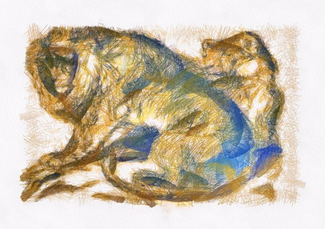
Working from my two tone sketch I followed my usual procedure of beginning by laying out the proportions and main features of the picture. I also began thinking about the colour, opting for drab desert colourings.

1. No guess work, I know from my preliminary sketch made at the zoo, where the components of the picture will go on the sheet. The main thing now is deciding on what colours to apply. Browns and yellows are rather obvious for a lion, but I decided shades of blue would make better for better shadow than black.

2. Marking in colour dispersal, and where the eyes and nose would feature. I can of course deviate from the draft drawing if I wish, but I am generally quite precise while copying from a draft. Why complicate things if the draft looks OK.

3. Carving out the features, and muscle highlights. No need for a great deal of detail, the intention is not to be photorealistic, but to imply power and potential danger.

4. Enough of the pencil work. Time to put some paint on the canvas. Note that I used soluble pencil which blends nicely into the paint. The paper by the way is pasted to a panel, this reduces the chance of the paper bubbling or distorting. I tend to use relatively thick paint, and with bold strokes, as I know where I am going so to speak. Having a preliminary sketch helps reduce hesitance.

5. Thickening up on the paint. Blue shadow is working well. Time for a tea break.

6. Facial features go in. Muscle structure emphasised. Need to be careful now, it would be very easy to overdo the detail on the face, thus distracting from the bold paint strokes used for the body.

7. Cleaned up the facial features, suggesting rather than emphasising. Blended in most of the soluble pencil marks, and used thicker yellow to bring out lion's mane and muscle structure on the hind leg. The female's face sharply emphasised as her body is largely hidden by the male's. Time to stop, it is always tempting to try to add more detail, but in the age of Photoshop and filtering it tends to have a negative effect on perceived value.
Thank you for your time. I hope you found this Steemit special worth your time. I am experimenting with spending some of my steem dollars on promoting this post, and it will be interesting to see if I at least cover the cost. Resteeming will of course be greatly appreciated.

This looks more like auto-painted than the previous one. Same pencil lines.
Check this article: https://steemit.com/art/@mikkolyytinen/real-paintings-or
You could ease people's minds by showing a photo of the painting/canvas material with a Steemit logo on a piece of paper in front of it.
Or make a video :)
Of course, didn't think of that.
Not a sketch. The two black circles on the bottom left indicate digital canvas. The long red lines show a line that should not be identical every time, but is. The tiny red dots highlight a pixel or two that should not be identical each time if this image was made by hand. Everything here is fucking bogus.
Once a fraud, always a fraud.
Embrace the digital art that you're creating, it's a very interesting process. But to call this acrylic / watercolour painting is very misleading. I would love to be wrong...
I don't see any point in getting into an argument over it. Looking at the postings of those raising the issue it seems evident that they have never received formal classes. Which is not a fault in itself, but explains their doubts over accuracy. If you really want to see what can be done in terms of realism then see this video
Oyy this response. I don't either.
What does "Oyy" mean? I tried googling it but, all I got was reference to a student university.
Here by the way, is a work I did do using Corel Paint.
https://steemit.com/art/@coldmonkey/original-painting-abstraction-4
When I use a digital technique, I say so. However, that is enough on the analogue/digital rift.
Whoops! Other people have also commented on the photorealism of some of the items I have posted. I am flattered and I appreciate your doubts, but the pictures are quite real, the fact that my pencil strokes are similar is simply technique. A straight line is a straight line, a brushstroke a brushstroke. In reality the paintings are not particularly photorealistic, if you want to see a really good photorealistic effect view Photorrealitic bulb. The pieces I do are small, they do not require much brush movement, and acrylic is an excellent medium for the produced effect.