Resolutiion: An Artist Dialog
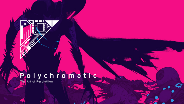
This conversation is an excerpt from Polychromatic — The Art of Resolutiion. Chris and Günther debate the philosophy’s behind Resolutiion’s aesthetic and how they learned to put one pixel next to another.
The artbook is a free DLC on Steam and comes with every purchase of the main game.
Enjoy the read.
Resolutiion was always about venturing into the unknown, creating something larger than ourselves, and sharing as much as possible in the process. In compiling this book we noticed that while the images and anecdotes revealed a glimpse into the evolution of the artwork, the philosophy behind it remained unclear. How and why did things go in one direction and not another? The following conversation between the art team, Günther and Chris, seeks to explain some of their creative choices and reveal a little more about how Resolutiion became the game it is today.
CHRIS I remember, in an earlier conversation, you said that Resolutiion is pixel art not so much out of design, but out of luck or necessity. Was this game always going to be pixels?
GÜNTHER I grew up in the 80s, so for me, video games and pixel art are synonymous. Those tiny lights stand for well-balanced mechanics, interesting stories, action, and interaction. There’s this ambivalence between clarity and interpretation in pixels that handpainted or 3D rendered games don’t have.
When we started Resolutiion, I expected pixel art to be quick and easy to create. But early on, my first test-renderings told me better: when working in low resolution, every piece of information counts. In pixel art, there was no room for errors, and this became especially apparent in my animations.
You, on the other hand, are clearly capable of finer arts. What made you first pick up that 1px pen?
CHRIS Ten years ago, my friend and I started to make a point and click adventure game. Due to our focus on story and puzzles, we weren’t really that bothered about the art style, whatever it was going to be, we just wanted it to look pretty. The quality of The Curse of Monkey Island’s animation was our dream, but with just me doing the artwork, we knew before we started that wasn’t happening. Then Sword and Sworcery came around and I thought, I can probably do that.
Like you, I severely underestimated the amount of time pixel art takes. How did you deal with that realization?
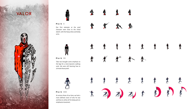
GÜNTHER Well, my first try at Valor’s walk had only two frames. Obviously, this looked horribly stiff, so a few weeks later I tried again, this time with slimmer limbs and more pixels moving overall. Step by step I revisited every character, enemy and moving object in the game, gradually adding more detail, more motion. As my animations slowly improved, so did Richi’s programming skills, which allowed us to push the art even further. What felt impressive to us in year one seemed amateurish twelve months later. So we continued to rework things, over and over.
Unfortunately, such a process is a dead end: you’ll never be satisfied when you are continually improving by increments, everything can always get a little bit better. So after three years, we decided Resolutiion would ship at the end of year four, regardless. This meant we stopped trying to further improve the visual quality and instead shifted our focus to quantity.
Anyways, at that point you joined the team and started to push the envelope all over again.
CHRIS I think our individual approaches to game art was almost at the opposite ends of a spectrum when I started with you guys. With my own projects, my friend and I would push for final quality at the first pass, so we were pretty good at getting nice looking things quickly. Our problem was we could never contain the story, and our games always got so big we just couldn’t finish them at the quality we had set and aspired to.
You and Richi felt a lot more kinda punk — like just smash it in, and we’ll fix it later. I think with Resolutiion’s maps you tried to push me into a “just add one more level of detail for now” mentality, it took me a while, but I think that’s started to stick.
But in my defense, I think I was right when it came to the animations. I remember when we started you wanted six-frame walking loops and I had to really push for eight. My feeling, at least, is that pixel art is so precise it’s almost harder to not aim for the final product right away, certainly with the animations.
GÜNTHER Haha, that is true. You pushed Resolutiion’s visual quality substantially. Not just that, but your work made mine improve much faster, just watching you. I’m very grateful for that.
For the first two years, we didn’t have any expectations or ambitions for Resolutiion. When we reached the point of “too big to stop”, we knew the story we wanted to tell, but not how. Everything had to be better, and there were too many blanks to be filled in for a single designer. So we started to look around for someone with a pixel-style that could connect to our amateurish endeavors, yet felt professional enough to be in a quality game.
Of the five we reached out to, one never replied, another was overbooked, two were too expensive and —lucky us— you asked for a quick and straightforward video call.
CHRIS Always good to hear you were hired by default.
The first thing I remember saying to you, based purely on screenshots, was that the game looked promising, and it reminded me of Sword & Sworcery and Hyper Light Drifter. It was a compliment, but even then I could tell you were tired of the comparison to HLD. And as we approach launch, we’re hearing it made quite frequently, but you’re taking it more positively now... How fair do you think the comparison is? Was HLD a big inspiration, or do you think this is just what any modern Zelda-like game is going to look like based on the current technology? Do you think we could have done more to distance ourselves from HLD, and if we could have, should we have?
GÜNTHER Well, Hyper Light Drifter has been this double-edged sword for a while. The comparison comes up frequently, positive and negative alike.
Sure, people on the internet try to judge Resolutiion’s whole experience based only on a few screenshots: both games share the same perspective, sci-fi setting, and a very vibrant color pallet. Gamers are passionate; I don’t blame anybody for such a comparison — the contrary is actually true: comparing one of the best looking pixel games of the decade, produced by an insanely talented team of seven, and a budget of $350.000, to our first, part-time, low-budget endeavor is just mind-boggling. I can not be more proud of that.
But as we said earlier, the general style of Resolutiion emerged by trial and error, our initial lack of experience, and plenty of inspiration from other games, including, but not limited to HLD.
CHRIS Lots of AAA games have very similar visuals to one another, and no one cares. On the flip-side, if an indie-game even vaguely resembles another, people are very quick to call rip-off. I wonder it’s maybe because they usually feel more like personal endeavors, so it’s probably natural that fans are more protective.
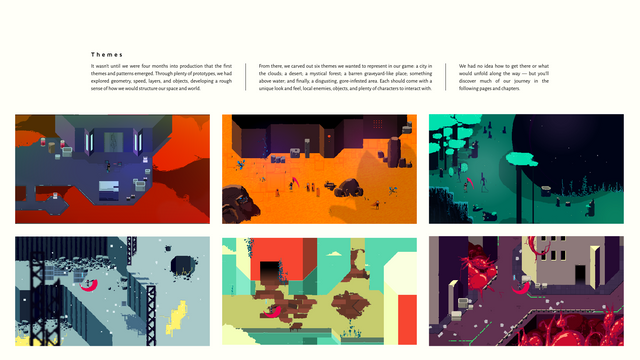
When I started on Resolutiion, the levels were quite sparse, but I think your vision was noticeably present. Although the maps lacked detail, they somehow still had a defined ambiance. The flat purples and blues in Cloud City had a kind of industrial feel before any details appeared. The flat oranges of the desert had the dry, barren look of sand.
You’d already established these two-tone color schemes for the maps which somehow gave them a lot of character without all the extra details. You certainly had the cyan and magenta established in the health and stamina indicators. Was there any reason for the dualistic color thing that runs throughout each element of the game?
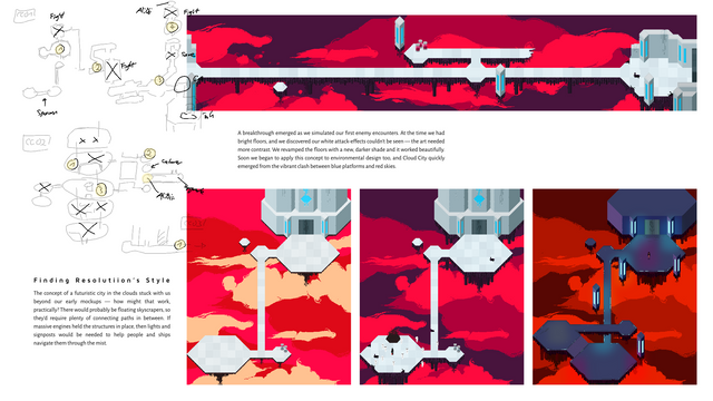
GÜNTHER The first mockups of Cloud City had muted hues: white floors, orange clouds, beige enemies, etc. But from past work, I knew that limits —even forced ones— are the key to creative work. So without hesitating, I simply decided to build each level with two core colors and plenty of nuances. With all possibilities on the table, you want to set yourself some healthy restraints to avoid option-death. That’s not just true for color-themes, but also everything else in the game. Saying that, technically balancing a set of fully saturated colors is hard work — that’s a beginner's mistake, but I think it worked out.
CHRIS Visually, this really worked for me in the desert most of all. There’s something about that area where I think everything comes together kind of perfectly. The combat, the stone giants, it all just works. It’s maybe not unique to Resolutiion, but when you walk through the giant’s mouth and pass through the ribs down into darkness like you’ve been swallowed ... it really sets the tone of the game.
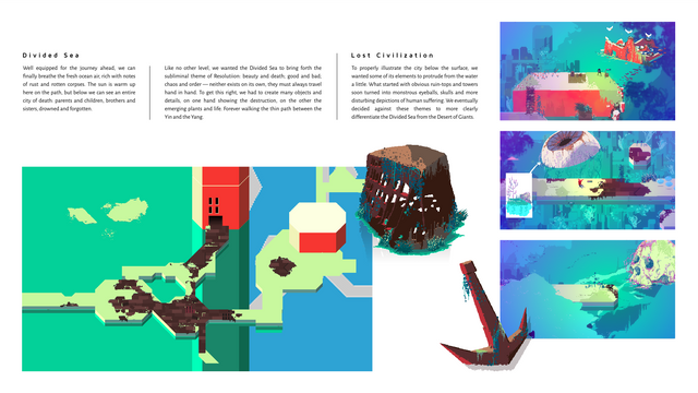
GÜNTHER The desert certainly carries plenty of character due to the giants and vibrant orange tones. I love it, but thinking about it, my favorite area would be the Divided Sea.
Plenty of scene changes, ravenous zombies, and bible fans. The reds and greens are also strong. But what strikes me most is that this level above all carries Resolutiion’s subliminal theme of “ambivalence”: beauty and decay; good and bad, chaos and order — neither exist on its own, they’re always together.
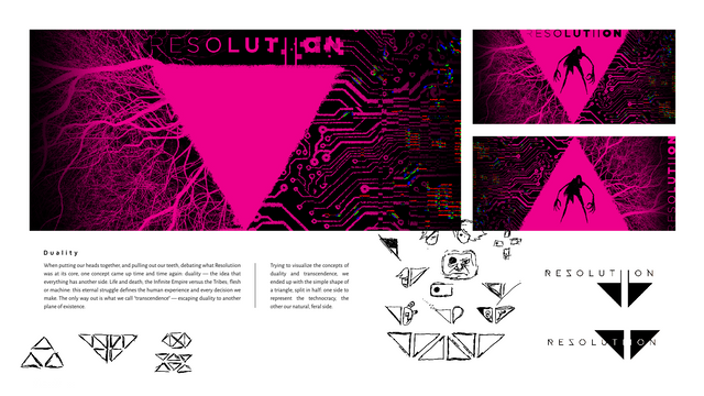
But the theme of duality is all over the place: as we said, each level is prominently colored in two hues, but whatever you do or whoever you talk to — you will soon encounter its opposite.
Talking about it now, I remember this all came up when we discussed the logo sometime in early 2019 — left, right, and transcendence from the duality, three points shaped into a triangle. You especially pushed this visual metaphor quite a bit, and also did the first take on the branding, right?
CHRIS I remember my first iterations of the logo were based more around organic and inorganic. Veins becoming electrical circuits, and that sort of thing. It eventually skewed to being more like folk art vs. circuitry, tradition vs. modernism. The circuitry side was cyan, to show that’s the realm of Alibii and the Infinite Empire, while the folky side was magenta, and that was supposed to represent the more human, rebellion side.
I wanted to develop that color symbolism more, really push it as a big part of the game, but we never did. Was it a creative choice on your part to be more ambiguous with the dual-color motif?
GÜNTHER Yeah, I remember. We tried to incorporate the cyan/magenta idea in a few areas of the game, like the menu, and some illustrations. But eventually, it just started to work against the brutally saturated color palette — this was when we went monochromatic for anything that was just “information”, eventually creating a clean distinction: color for anything diegetic, black and white for everything else.
That’s probably what I enjoyed most about us collaborating over the last two years: you going for the fancy detail, me just keeping it as simple as possible. Eventually, we’d find the right balance in every single area. There’s not one element in Resolutiion’s overall experience without at least a little bit of both of us — backgrounds, animations, key art, logo, etc.
Looking back over all those individual parts, would you have done anything differently?
CHRIS I definitely tend to want everything tied together in a really narrow thematic framework. You and Richi are much less uptight about that kind of thing, and tended towards stuff that felt right, looked cool, or was just interesting in its own right: you’ve got giant coffee equipment scattered around the maps, and your only explanation was that you liked it — I’d love to have that confidence.
So yeah, there’s definitely things I would have done differently along the way, but having seen the final thing come together, I don’t know if there’s anything I’d change now.
How about you? Is there anything you wish you had the time to change?
GÜNTHER Well, keeping in mind that when I started I was having to learn all these techniques, how to create game assets, I am crazy happy about how far we’ve come. I’d certainly go with a different workflow —more planning, documentation and smaller spaces to iterate on— that might result in a much faster asset pipeline, leaving more time for exploration, concepts, and variety.
To elaborate a bit more on this: extreme polishing was something Richi and I decided against very early on in the development. On one hand, we didn’t have the skills to compete with some of those amazing artists out there; on the other, we enjoy indie-games the most if they are rough around the edges and let the developer’s identity shine through. Polishing means that you are narrowing a game’s features closer to the average player’s expectations. Too often this results in politically correct characters, clichés or stereotypes — and I’m certainly not buying an indie-game to get bored with those.
CHRIS I generally tend to keep away from indie-games that lack visual polish because I think if the developers haven’t polished the art, the game will be low quality too. But the indie-games I do play are usually a bit uninspired… I’ve started looking at titles like Baba is You and hearing how good the game design is, so you might be right. But I got into games first to tell interesting stories, and second to draw nice pictures, so I find it hard to look past the value of these things.
GÜNTHER I’m with you on the “cool story and nice art” side of video games, but I’d add “amazing soundtrack” to the list. Luckily, Richi came in from the other side of human perception — fast action and fun mechanics. Honestly, his complementary approach made Resolutiion a full game, instead of a pretty but boring art showcase.
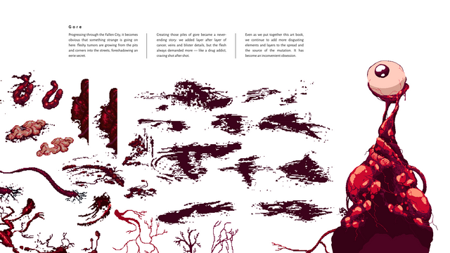
But since this is an art book, let’s not get too deep into anything other than the visuals. One of the last things I polished was the gore elements in the Fallen City using an epic sprite sheet you provided, filled with little details of pure disgust. How did you approach that kind of task — the growth in the Forest of Self, the rust inside Hallow Valdez (sunken ship), or the veins and bloodstains for said guts?
CHRIS In the early days, the levels looked a bit like they’d been put together with tile-sets. It was all about creating a space to test the mechanics. Platform edges were uniform, the ground was endless paths of single, solid colors. The few details present were almost like notes to your future self: put flowers here. I saw my job at being to disguise the patterns and make each space look hand-crafted.
You always had a first iteration on the details in the form of giant sprite sheets you’d made for the asset library. My initial step was always throwing these details all over the place and adding in a few additional entries of my own. But I guess the trick was to then add broad strokes of unique details around the scores of reused ones. Where I’d clustered a bunch of mushrooms I might add some slime that was specific to that spot, dripping down the wall, giving the fungi some context.
With the gore, I’d add spindly veins across the floor, I’d snake it around columns, or off the edge of a platform or up some stairs. It was all about trying to sell an illusion that these weren’t just the same assets repeated ad nauseam, floating on a color, but that they were in that space, interacting with the things around them.
GÜNTHER And you did one fantastic job there. Almost all amazing looking set-pieces in the game have your handwriting all over them.
I remember that we split work into two categories: “boring work”, which was all about repetition, patterns and additional layers of detail. And then there was the “fun work”, which was unique elements or little vignettes, that we scattered across the pixel landscapes to draw players through the game. We wanted there to always be something new and shiny to look out for.
Quickly shifting between the boring parts and the fun parts is certainly something that creates Resolutiion’s unique charm. But as designers, this meant we had to constantly change our mindset all the time, which is not easy. For the longest time, I had so many rough parts to polish to a decent level that I barely freed up the time to work on a unique, fresh set-piece. How did you deal with this challenge over those 24 months of collaboration?
CHRIS It was tough in the beginning because back then it was almost exclusively the boring stuff I was working on: adding cracks and rock details. But it got easier as we progressed. Eventually, working on areas started to feel more like expanding massive illustrations rather than a copy-paste collage of assets.
The Hallow Valdez, in particular, had quite an illustrative quality. The maps were big enough that we could have different types of details close together, yet small enough that the flow appeared to have a narrative.
GÜNTHER That’s true: the levels more and more changed from stitched together snippets of platforms, paths, furniture, and props, to fleshed out illustrations with variation and details at every corner. Another clear tale of how we learned to create a technical system, and slowly fleshed it out into a living and breathing world.
Hopefully, this artbook gets exactly this point across: be open to new challenges, apply what you have learned, and then just stick to it.
